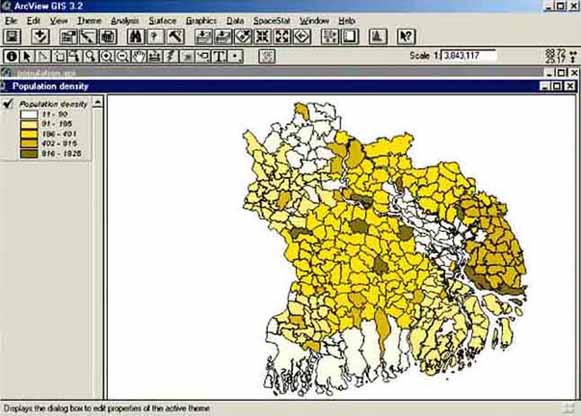
Start ArcView, Open a New Project, and Open a New View. Add the Theme ‘population density.shp’ from the folder ‘02_Graphical display’ on the CD. Check the Legend Checkbox. The map is a representation of data collected by the Bureau of Statistics of Pais Pesca presented on in gradual changing colours, whereby increasing red tones indicate a higher population density. (It is the same Theme as you worked with in the previous paragraph). The number of classes of colour tones as well as the colour itself can be changed easily by double clicking on the Theme legend, or by going via the menu bar to: Theme/Edit Legend, after which the Legend Editor window pops up (Figure 6.1). Click on the right downward arrow of the Color Ramps box and select ‘Yellow monochromatic’. Click on Apply, close the Legend Editor window. You will notice that all colours are changed into gradually changing Yellow (Figure 6.2). Try out changing the colours successively into: Yellow monochromatic; Blue monochromatic; and Magenta monochromatic.
FIGURE 6.1
The Legend Editor for changing the
properties of the graphical display of a Theme
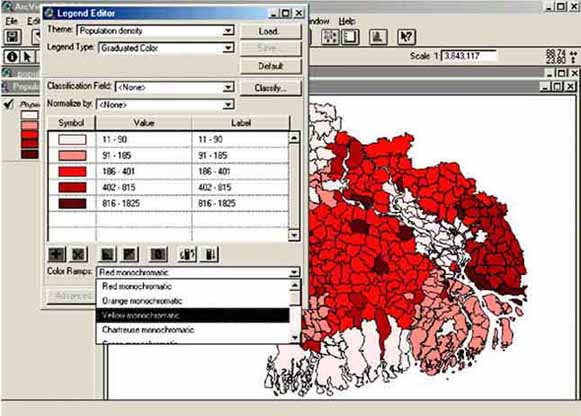
FIGURE 6.2
Changed colours of the population density
map
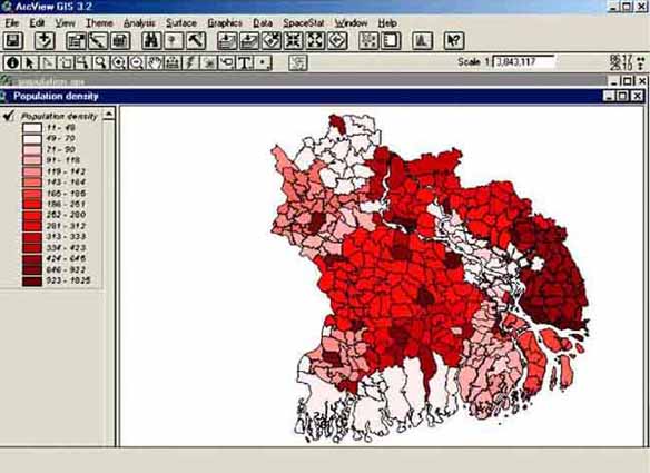
In the previous example, differences in the population for the different sub-districts were visualized by using only five classes, and it could be that more details become visible if a larger number of classes were used. Changing the number of classes over which the data are divided can be changed in a similar way as changing the colours. Double click on the Theme legend, or by going via the menu: Theme/Edit Legend, after which the Legend Editor window pops up. Click on Classify after which the Classification window pops up. Select 15 classes after opening the Number of classes screen with the small arrow on the right (Figure 6.3). Click OK, Apply, and close the Legend Editor window. The new classification will be displayed (Figure 6.4).
FIGURE 6.3
Selecting the number of
classes
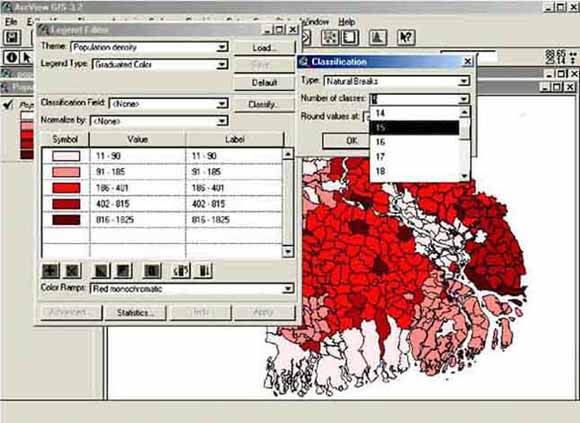
FIGURE 6.4
Population density map with a higher number
of classes used
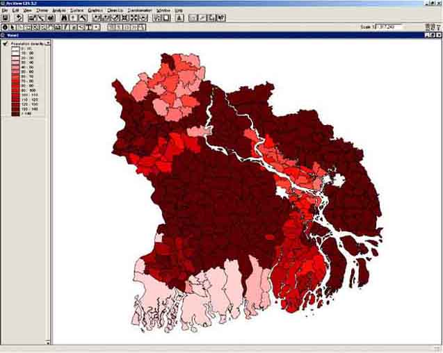
Besides changing the number of classes, as you have done in the previous exercise, it is also possible to change the values of the classes. This as you might be interested in other intervals than ArcView has assigned to the classes. Changing the values of classes can be done in a similar way as changing colours or number of classes of a legend: double click on the Theme legend, or by going via the menu: Theme/Edit Legend, after which the Legend Editor window pops up. You want to change the values of the intervals, to do this you need to type the desired values in the Value boxes. Go with the pointer to the top box under Value, where is written 1148 (Figure 6.5). Type ‘0-10’, and press Enter on your keyboard. You will notice that the values in the box under Label also changes into ‘0-10’, and the box below (where is written 49-70) becomes active. Replace these values with ‘10 - 20’. Continue replacing the next values in 20-30, 30-40, etcetera. You will notice that the last class contains the values 923-1825. To display all the information of this Theme you will need to include the highest values of this Theme also. So in the last box you type ‘140-1825’. After you have pressed Enter on your keyboard you will notice that the top label in the Legend Editor becomes active. Scroll down to the last line and replace ‘140-1825’ with ‘>140’ (Figure 6.6). Press Apply, and close the Legend Editor window. The Theme will be displayed with the new classification. Note the legend, where what you have written in the Label box (‘>140’) is displayed (Figure 6.7).
FIGURE 6.5
Editing the values of the
classes
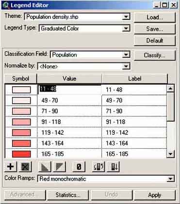
FIGURE 6.6
Changing the labels of a
legend
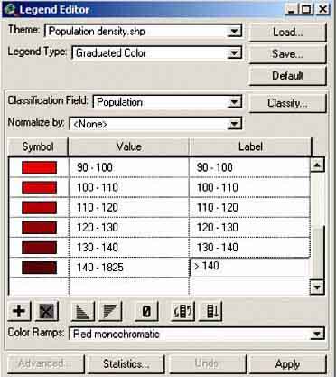
FIGURE 6.7
Changed Theme
Making a new legend with new colours takes considerable time. It is possible to save a Legend once you have made it, so that you do not have to make it again when you have new data. To save the legend that you have just made, you have to open the Legend Editor window by double clicking on the Theme legend, or by going via the menu: Theme/Edit Legend. Click Save..., after which the Save Legend window pops up. Select an appropriate folder to save your Legend in (for instance: C:\02_graphical display) and save the legend with an appropriate name (for instance: ‘population15.avl’), see Figure 6.8.
Please note that Legend files have the extension ‘.avl’.
The legend that was used at the beginning of the paragraph, where changing the colours of a legend was discussed, has been saved in the folder ‘02_Graphical display’. Try to load this Legend in your current Theme. To load a previously made legend, open the Legend Editor window (double clicking on the Theme legend, or by going via the menu: Theme/Edit Legend), press Load, go to the appropriate folder (here ‘02_Graphical display’), and select the needed file (here ‘population density.avl’, see Figure 6.9), press OK. The Load Legend window pops up, press again OK. You will see that the legend in the Legend Editor has changed to the original legend. Press Apply and close the Legend Editor window. The Theme will now display the data in the way it was displayed during the exercise on page 15. Try now to load the legend that you have just saved (‘population15.avl’).
FIGURE 6.8
Save Legend
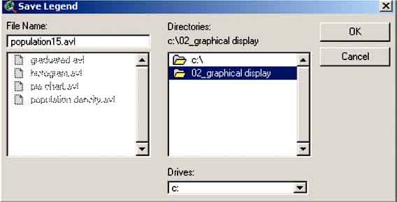
FIGURE 6.9
Load Legend

Until now the data in the maps were displayed with graduated colours filling the sub-districts. However, we could prefer a different graphic display, such as histograms or pie charts. Sometimes these displays are needed if we want to display two or more parameters in the same map.
Compare these different displays. Add ‘population density.shp’ two more times to the View.
The type of graphical display can be changed in a similar way as changing the colours, by double clicking on the Theme Legend after which the Legend Editor-menu pops up. Open the Legend Type box with the arrow on the right-hand side and select ‘Chart’ (Figure 6.10).
FIGURE 6.10
The menu for changing the graphical
display
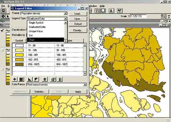
FIGURE 6.11
Adding a field or parameter for graphical
display
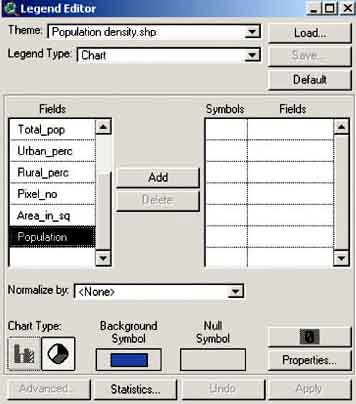
Now you see the Legend Editor and you have to select the Field or parameter you want to display (which is the population density per sub-district), select in the Fields box ‘Population’(representing the population density) and click ‘Add’ (Figure 6.11).
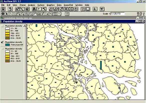
After adding ‘Population’, we see that this parameter appears in the right window, indicating a ‘symbol’, which is the colour and the form of the displayed parameter, and a ‘Field’ indicating the name of the selected parameter. Finally, you have to choose between a pie or histogram display, by clicking on the desired Chart Type button. Select Histogram, click Apply, and close the window. Automatically the data are displayed in Histogram form in Map View (Figure 6.12).

If you want to change the properties of the Histogram, i.e. colour or size, you open the Legend Editor again by double clicking on the Theme Legend.
FIGURE 6.12
Histogram presentation of the population
density of Pais Pesca
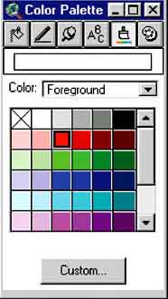
For changing the colour after opening the Legend Editor, double-click on Symbols in the right window and the Fill Palette screen pops up (Figure 6.13). Click on the Brush-button in the Fill Palette, and the Color Palette (Figure 6.14) pops up. Click a colour, click Apply, and close all menus. Obviously, to see a Theme with the changes you have made, the View Checkbox (Figure 4.7) of that Theme should be checked.
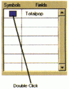
FIGURE 6.13
The Fill Palette
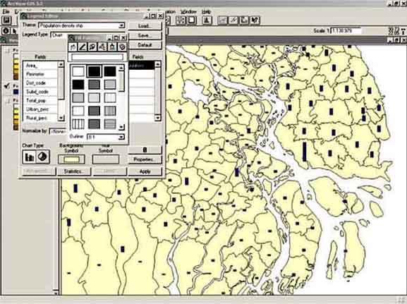
FIGURE 6.14
The Color Palette
For changing the style of the histogram, click in the Legend Editor window (after double clicking the Theme in the View table of contents, see Figure 4.11) on the Properties button, located below on the right side; the Column Chart Properties window will pop up where the height and width of the chart can be adjusted.
Try it: make a histogram of ‘Total_pop’, and a pie of ‘Total_pop’ in the two added Themes.

Note: The pie distribution of ‘Total_pop’ does not give valuable results. In general, pies are more suitable to visualize two or more related parameters.
Note: Make sure you are looking at the right theme! (check the view box, Figure 4.7).
After you made the histogram and pie chart, close everything and exit ArcView (you can save the project, so that you can have a look at this later on).
It can be that you want to display more than one parameter in one Theme, for example a set of different water-quality parameters, or income figures of different social strata. You can do this with histograms or pie charts.
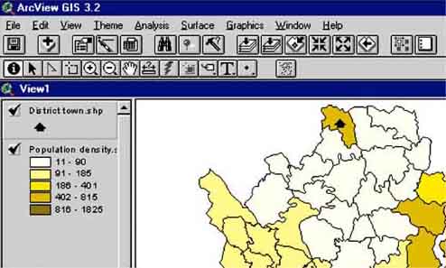
Open ArcView, a New Project (via menu bar: File/New Project), a new View (in the project window, press the New button). Add the Theme ‘District town.shp’, and add the Theme ‘Population density.shp’ from the folder: ‘03_More_Parameters_in_1_Theme’ in the CD. This last Theme contains, among others, socio-economic data of sub-districts in Pais Pesca. Of special interest for this exercise is the distribution between urban and rural population. Make sure the ‘District town.shp’ Theme is placed above the ‘Population density.shp’ Theme. If this is not the case, you can press the legend of ‘District town.shp’ with your mouse pointer, keep the mouse pressed, and move the Theme above the ‘Population density.shp’ Theme (in Windows terms: ‘drag and drop’). Do you notice that with the ‘District town.shp’ under the ‘Population density.shp’ Theme you can not see the ‘District town.shp’ Theme?
FIGURE 6.15
Moving the District town.shp Theme on
top
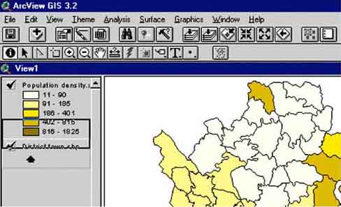
FIGURE 6.16
The District town.shp Theme on
top
Double click on the Theme Legend of the ‘Population density.shp’ Theme to open the Legend Editor; select Chart in the Legend Type select box; select in the Fields box ‘Rural_perc’ and ‘Urban_perc’ (representing the percentile distribution between rural and urban in the sub-district population), and press the Add button. Change the colour of the histogram bars using the Color Palette into blue for ‘Rural_perc’ and red for ‘Urban_perc’, you might want to change the background colour to light yellow to get the same picture as in Figure 6.17. Click on Chart Type on the Bar icon, adjust when necessary the histogram properties by pressing the properties button and changing the properties in the screen that pops up, click Apply and close the window. The double histogram will automatically be displayed (Figure 6.17).
FIGURE 6.17
Double histogram of the percentage of
urban and rural population
in the different sub-districts of Pais
Pesca
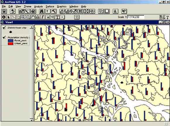
Note: What do you see with respect to the district towns, and the urban and rural population distribution?
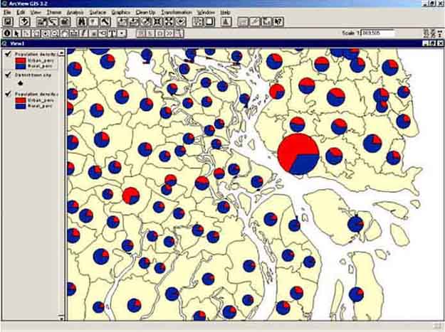
Another way to display this data is the ‘Pie chart’. The advantage of a Pie chart is that we can add one more parameter to the display of rural and urban population by relating the size of the pie to a third parameter in this case the total population per sub-district.
Add once more a Theme ‘Population Density.shp’ to the View, and select this Theme. Double click on the legend of this Theme. Select again Chart in the Legend Type box, add the fields ‘Rural_perc’ and ‘Urban_perc’, and select Pie with the Chart Type selection button.

Click on the Properties button; the Pie Chart Properties window will pop up (Figure 6.18).
Set the maximum and minimum size of the pie to 4 and 26, respectively, and select ‘Total_pop’ (representing the total population per sub-district) in the size field select box to relate the size of the pie to the population density of each sub-district. Use the same colour scheme as with the histograms (rural blue, urban red, background yellow). Click OK and Apply and the pie chart will be displayed (Figure 6.19). Close the project and exit ArcView.
FIGURE 6.18
Setting the properties of a pie
chart
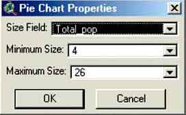
FIGURE 6.19
Rural and urban population displayed in
combination with the total population in each district
In 1998, the Department of Fisheries of Pais Pesca carried out a frame survey on inland fishers in all district of the country. All professional fishers of Pais Pesca were registered, i.e. people who get their main income from fisheries. Furthermore, all boats (large and small) were registered, and information on the annual income (US$/year) of the large boat owners/fishers, small boat owners, and fishers without a boat was collected. All data were digitized and linked with an ArcView Theme file: ‘Inland_frame_survey.shp’.
Open ArcView, a New Project, and a New View. Add the Theme ‘Inland_frame_survey.shp’ (from the folder: ‘04_Riverine_Frame_survey’ on the CD) to the View.
Use this file to make:
1. A graduated colour display of the total number of fishers as a percentage of the total population (‘PERC_FISH’).
2. A histogram chart of the total number of fishers as a percentage of the total population (‘PERC_FISH’).
3. A histogram chart with total population (‘TOTAL_POP’) and total number of fishers (‘TOTAL_FISH’).
4. A histogram chart with fishers with boat (‘WITH_BOAT’), and fishers without boat (‘WITHOUTBOA’).
5. A pie chart with fishers with boat, fishers without boat and the pie size related to the total number of fishers (minimum size 4, maximum size 26).
6. A pie chart with the number of large boats (‘LARGE_BOAT’), the number of small boats (‘SMALL_BOAT’) and the pie size related to the total number of boats (‘TOTAL_BOAT’).
7. A histogram chart with the income of large boat owners (‘INCOME_LAR’), small boat owners (‘INCOME_SMALL’) and the income of fishing labourers (‘INCOME_FIS’).
8. A pie chart with the income of large boat owners, income of small boat owners, and income of fishing labourers, with the pie size related to the income of fishing labourer.
Note: Sometimes the background colour of Pais Pesca in the created display is not convenient. You can change this by clicking on Background Color: Select Color button in the View Properties box (via the menu: View/Properties) and then select a convenient colour in the Color Picker box.