As indicated in the previous chapter (from page 59 onwards) querying of data grids in GIS can give you a first indication of relations between different factors. To get a more precise idea you have to carry out a statistical analysison the available data. Regression analysis is a simple statistical tool to look at correlations between two or more types of data and is the most commonly used statistical technique in fisheries biology. First a refresher of the basic mathematics of regression analysis.
Linear regression is a technique to quantify the relationship, which can be seen in a graph made between two variables. For example, Figure 15.1 presents the relationship between the number of the fishers and the number of gillnets in the different villages around Lake Kadim. It shows you a relationship; when the number of fishers increases, the number of gillnets in the villages increases too, this is called a positive relationship.
FIGURE 15.1
The relation between the number of fishers
and the number
of gillnets in the different villages around Lake
Kadim
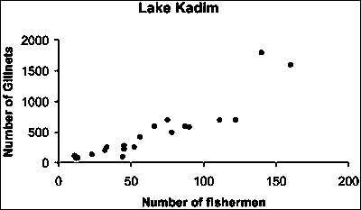
FIGURE 15.2
Relation between the number of fishers and
their annual catch of carps
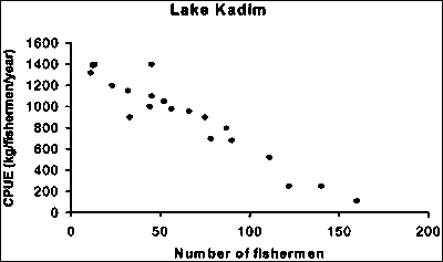
However, if you look at the annual carp catches of the individual fishers (Figure 15.2) you see a negative relationship where the catch decreases as the number of fishers increases.
It is nice to know that there is a positive linear relationship between the number of fishers and the number of gillnets at Lake Kadim, but our goal is to describe this relationship by a mathematical model or equation:
y = a+bx
In this equation y, the number of gillnets, is the variable on the vertical axis of the graph or the dependent variable, while x, the number of fishers, represents the variable on the horizontal axis or the independent variable. The value a (which can be negative, positive or zero) is called the intercept, while the value b (which can be positive or negative) is called ‘slope’ or ‘coefficient of regression’. The question is how to calculate the values of a and b. You will not be bothered with the details but in all statistical textbooks you will see that a and b can be calculated with the following equations:

and

Whereby;
x and y are the values of the different x and y pairs, n is
the number of pairs,  is the
average value of y, and
  is
the average value of x.
Have a look at the following data presented in Table 15.1.
TABLE 15.1
Data for the calculation of the regression
between the number of fishers and the number of gillnets at Lake
Kadim
|
Number of fishers |
No of gill nets |
x2 |
y2 |
x * y |
|
12 |
90 |
144 |
8 100 |
1 080 |
|
33 |
260 |
1 089 |
67 600 |
8 580 |
|
140 |
1 800 |
19 600 |
3 240 000 |
252 000 |
|
160 |
1 600 |
25 600 |
2 560 000 |
256 000 |
|
45 |
230 |
2 025 |
52 900 |
10 350 |
|
111 |
700 |
12 321 |
490 000 |
77 700 |
|
87 |
600 |
7 569 |
360 000 |
52 200 |
|
75 |
700 |
5 625 |
490 000 |
52 500 |
|
66 |
600 |
4 356 |
360 000 |
39 600 |
|
122 |
700 |
14 884 |
490 000 |
85 400 |
|
11 |
120 |
121 |
14 400 |
1 320 |
|
44 |
100 |
1 936 |
10 000 |
4 400 |
|
52 |
260 |
2 704 |
67 600 |
13 520 |
|
56 |
420 |
3 136 |
176 400 |
23 520 |
|
32 |
210 |
1 024 |
44 100 |
6 720 |
|
12 |
75 |
144 |
5 625 |
900 |
|
45 |
286 |
2 025 |
81 796 |
12 870 |
|
78 |
500 |
6 084 |
250 000 |
39 000 |
|
90 |
585 |
8 100 |
342 225 |
52 650 |
|
23 |
140 |
529 |
19 600 |
3 220 |
|
13 |
82 |
169 |
6 724 |
1 066 |
|
n = 21 |
|
|
|
|
Some basic calculations of means and sums are provided at the bottom of the table. Using these values and the formulas above, we can calculate our regression slope and intercept parameters:

and a = 479-9.7412 * 62 = -127.321
From this we can describe the relation; y = -127.3 + 9.74x or in words:
Number of gillnets = -127.3 + 9.74 * Number of fishers.
Notice that the slope of the line (9.74) is a positive number, indicating that this is a positive relationship. This agrees with our visual interpretation of Figure 15.1.
In Table 15.2 the data for the number of fishers and their annual catch of carp (CPUE) is provided. Calculate the regression relation
TABLE 15.2
Relation between the number of fishers and
the CPUE of carps in Lake Kadim
|
Fishers |
CPUE |
x2 |
y2 |
x * y |
|
12 |
1 400 |
144 |
1 960 000 |
16 800 |
|
33 |
900 |
1 089 |
810 000 |
29 700 |
|
140 |
250 |
19 600 |
62 500 |
35 000 |
|
160 |
110 |
25 600 |
12 100 |
17 600 |
|
45 |
1 400 |
2 025 |
1 960 000 |
63 000 |
|
111 |
520 |
12 321 |
270 400 |
57 720 |
|
87 |
800 |
7 569 |
640 000 |
69 600 |
|
75 |
900 |
5 625 |
810 000 |
67 500 |
|
66 |
960 |
4 356 |
921 600 |
63 360 |
|
122 |
250 |
14 884 |
62 500 |
30 500 |
|
11 |
1 320 |
121 |
1 742 400 |
14 520 |
|
44 |
1 000 |
1 936 |
1 000 000 |
44 000 |
|
52 |
1 050 |
2 704 |
1 102 500 |
54 600 |
|
56 |
980 |
3 136 |
960 400 |
54 880 |
|
32 |
1 150 |
1 024 |
1 322 500 |
36 800 |
|
12 |
1 390 |
144 |
1 932 100 |
16 680 |
|
45 |
1 100 |
2 025 |
1 210 000 |
49 500 |
|
78 |
700 |
6 084 |
490 000 |
54 600 |
|
90 |
680 |
8 100 |
462 400 |
61 200 |
|
23 |
1 200 |
529 |
1 440 000 |
27 600 |
|
13 |
1 400 |
169 |
1 960 000 |
18 200 |
|
n = 21 |
|
|
|
|
Result of the regression analysis: y = 1 465 - 8.6627x.
Nowadays regression analyses have become easier as they are included in all spreadsheet programmes such as Lotus 1-2-3 and Microsoft Excel. In Microsoft Excel regression analysis is carried out in graphs made with the datasets.
Lets do our Lake Kadim example in Microsoft Excel:
1. Start Microsoft Excel, Open the spreadsheet ‘Lake Kadim regression analysis.xls’, from the folder ‘15_Lake_Kad_regr’. You see the data set with the number of fishers, their CPUE, and two graphs.
2. Activate one graph by clicking on it.
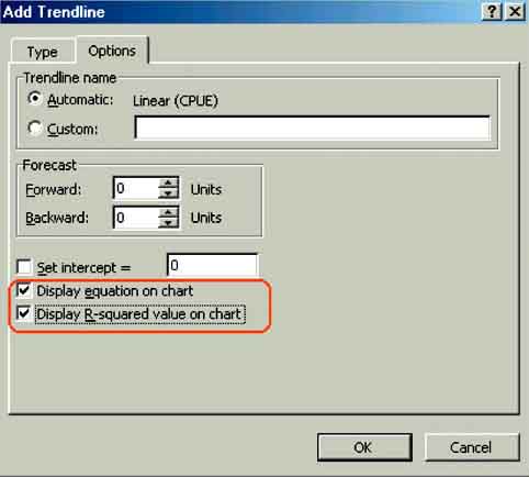
3. Go to Chart/Add Trendline via the menu bar. The Add Trendline window will popup (Figure 15.3) and you select linear by checking its box. Then click the Options tab in the Add Trendline window and check Display equation on chart and Display R-squared value on chart (Figure 15.4). Click OK.
FIGURE 15.3
The Add Trendline window
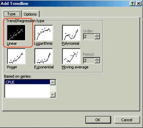
FIGURE 15.4
Checking Display equation on chart and
Display R-squared on chart
The Chart of the graph is displayed again. Now with a straight line (the calculated regression) and the relation y = -8.6627x + 1465.8, which you calculated previously displayed in the chart (Figure 15.5).
FIGURE 15.5
The Microsoft Excel regression between the
number of fishers and their CPUE in Lake Kadim
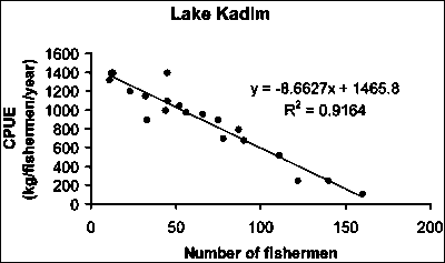
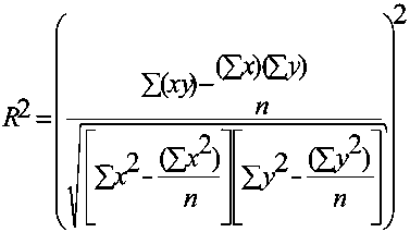
In the chart you also see another value: R2 = 0.9164. R-squared, or the coefficient of determination, is the square of the correlation coefficient R. It is a measure of the linear association between two data sets and reflects the amount of variation in the dependent variable which can be explained by variation in the independent variable. R-square values value ranges between 0 (reflecting absolutely no linear relationship between the variables) and 1 (indicating a perfect correlation). For example if R-squared = 0.25, we could say that the variance in the independent variable explains 25 percent of the variation of the dependent variable. The closer to 1 the higher the correlation between the two variables will be. R-square is calculated as (Figure 15.6):
FIGURE 15.6
The equation to calculate
R-squared
However a high value of R does not mean that the regression line is always statistically valid. The official way to look at this is to carry out a t-test on the regression coefficient b and test the calculated t-value, or to carry out an ANOVA (or Analysis Of Variance) and test the calculated value of the F-statistic. This can be done in any statistical software package.
Unlike Microsoft Excel, regression analysis is not an integral part of ArcView. Fortunately, ArcView provides an internal coding language which allows us to write these type of functions. Many custom functions, including regression analysis, have already been written by ArcView users and are available for public use (for example see ArcScripts at http://gis.esri.com/arcscripts/index.cfm).
A sample regression script is included with the data on the CD which allows for linear regression analysis. The available method is rather basic, can only be applied on shapefiles and has a limited scatterplot function. This application will be shown to you using the example of Lake Kadim and carrying out a regression analysis between the number of fishers and the number of Gillnets in villages around Lake Kadim.
1. Start ArcView, Open a New Project, and a New View. Add to the View the Themes (from the ‘15_Lake_Kad_regr’ folder): ‘Pais pesca country.shp’, ‘Lake kadim boundary.shp’, ‘Lake Kadim data.shp’ and ‘Fishing village lake kadim.shp’.
2. Check the projection and the working directory.
3. First you have to add the script. Close the View and open a new script in the Project window (Figure 15.7).
FIGURE 15.7
Opening a new script
4. You arrive in the Script window, where you have to open the avenue script ‘bvreg.ave’ This is a text file and for your convenience it is placed in the same folder as the Theme file, ‘15_Lake_Kad_regr’. Go to Script/Load Text File... (Figure 15.8).
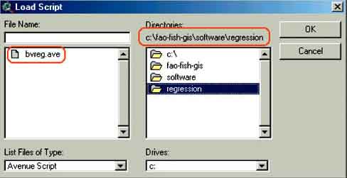
5. The load script window will appear. Go to the correct subdirectory and select the ‘bvreg.ave’ script and click OK (Figure 15.9).
FIGURE 15.8
Loading a script text file
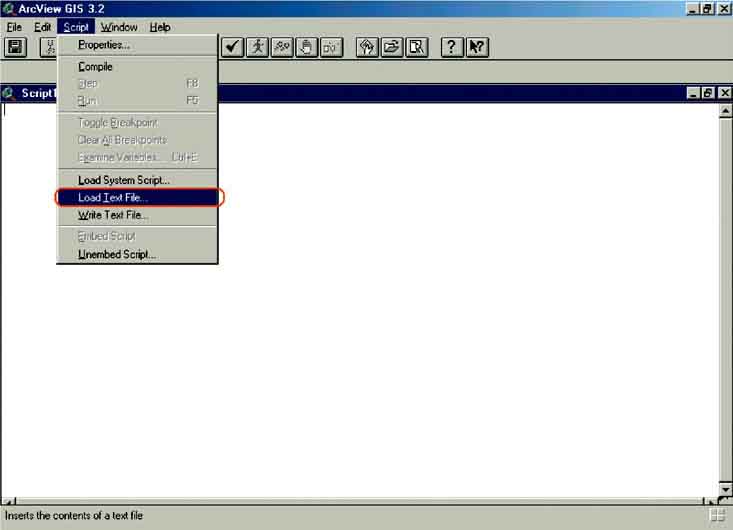
FIGURE 15.9
Selection of the regression
script
For running the script you have to know some tricks. First you must compile the script. ‘Compiling’ simply means that ArcView checks the code text for errors and then converts the code into a format that ArcView can run directly. After you click the ‘Compile button’(Figure 15.10) you will see the button next to it with the running person becomes active. This is the button for running the script. If you click on this button you will get an error message: ‘A(n) project does not recognize request GetActiveThemes’(Figure 15.11).
FIGURE 15.10
Compiling a script
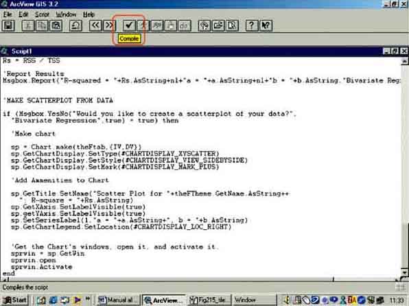
FIGURE 15.11
Regression error message
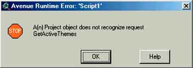
The basic reason we get this error message is that ArcView does not know where to look for the data to perform the analysis. The simplest way to tell it is to open the View, find the Theme which contains the data for the regression analysis, and make that Theme active. The way to do this seems complicated, but do not worry, it works and once you have done it several times you know the trick. Basically you have to tile the window so that the View and the Script window are visible. Then you can switch from one to the other.
6. Go in the script window to Window/Tile via the menu bar (Figure 15.12). You will get two windows on your screen. Open the view (Figure 15.13).
FIGURE 15.12
Tiling in the script view
FIGURE 15.13
Tiled script and view window
7. After opening your View, tile the windows again via Window/Tile in the menu bar. You should now see three open windows in your project, and your View window should be your active window. You can see this because the window bar of this window is blue. Your View should have four Themes listed. Click on the words ‘Fishing village lake kadim.shp’ (not on the checkbox) to make the Theme active. Now ArcView will know which Theme contains the data for regression analysis (Figure 15.14).
8. Go back to the script window by clicking somewhere inside it, and then click on the Run script button (Figure 15.15).
FIGURE 15.14
Activating the data theme for regression
FIGURE 15.15
Running the script
9. The Bivariate regression window will appear. First you have to indicate the independent variable (X): ‘Fishermen’ (Figure 15.16), after selecting ‘Fishermen’ click OK. In the next window you indicate the dependent variable (Y), ‘Gill_nets’ (Figure 15.17), and Click OK.
FIGURE 15.16
Selecting the independent variable
FIGURE 15.17
Selecting the dependent variable
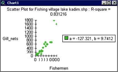
10. The Bivariate regression results window appears providing the results of the regression. In this case the results are similar to the calculation we made before, click OK. In the next window you will be asked if you want to create a scatter plot. Click Yes and the scatterplot with the calculated regression appears (Figure 15.19).
FIGURE 15.18
Bivariate regression
results
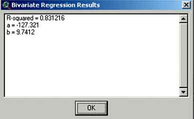
FIGURE 15.19
The scatterplot of the calculated
regression
Make the regression analysis between the number of fishers and the CPUE with data from the theme ‘Fishing villages of Lake Kadim’ and compare them with the results of the analysis carried out in Excel.
Make a number of regression analyses with the data from the Theme Lake Kadim data and fill in Table 15.3.
TABLE 15.3
Results of regression analysis of the raw
data of Lake Kadim
|
Parameters |
a |
b |
R-square |
|
Water depth - carp larvae |
|
|
|
|
Water depth - clupeid larvae |
|
|
|
|
Water depth - adult carp |
|
|
|
|
Water temperature - carp larvae |
|
|
|
|
Water temperature - clupeid larvae |
|
|
|
|
Water temperature - adult carp |
|
|
|
|
Chlorophyll - carp larvae |
|
|
|
|
Chlorophyll - clupeid larvae |
|
|
|
|
Chlorophyll - adult carp |
|
|
|
From this exercise you see that this script has limitations for the number of points in a scatter plot. The script works well if you want to make a quick regression between a small number of data. However, for a more profound analysis with large data sets it is easier to import the attribute table of the Theme into Excel and or into statistical software[24] such as SPSS, Minitab, Sysstat, or others, and carry out the analysis with these programs.
Regression between grids can be very interesting, especially if we think about the application of the Munro and Thomson plot (1983b) for surplus production models in GIS as demonstrated by Corsi (2000a, a copy of the article can be found on the CD, folder ‘Corsi_article’). These developments are very interesting, and will be discussed in the chapter: A Corsi type analysis of Hake data in the Mediterranean on page 130. However, as with the earlier example, there is no standard tool within ArcView to perform regressions between grids. The internet, at the time of writing this manual, also did not provide such a tool, so this tool called Grid Regression[25] was developed[26].
The Grid Regression extension carries out a regression analysis between pixels at the same location in two different grids. First each pixel at the same location in both grids is given the same Identification number and then the values of the pixels are attached to this ID number. Once this is done regression analysis becomes straightforward as we have an ID number each with a data pair (Figure 15.20).
FIGURE 15.20
Two grids with values for a regression

The Grid Regression extension has two modes of operation;
Vector based, which means it is first generating a Point shapefile with separate fields for the Independent and Dependent values, then doing field calculations to generate the regression statistics.
Grid based, which means the extension is directly multiplying and dividing the grids themselves.
The results of both modes are similar. The Grid based mode tends to go faster than the vector mode, while the vector mode produces more of the intermediate data such as seen in Table 15.1 and Table 15.2 on pages 78 and 79.
Install the extension by copying the file ‘grid_regression.avx’ from CD1 to your ArcView folder: ‘..AVGIS_30\ARCVIEW\ext32\’ directory. Then, after you started ArcView, go to File/Extensions... via the menu bar and check the one called ‘Grid Regression’. In your View screen, you should see now a new icon that looks a little like a blue regression line.

Grid regression of data from Lake Kadim with the Grid Regression extension
1. Copy the file ‘grid_regression.avx’ from the Extension folder on your CD to your ArcView ‘..AVGIS_30\ARCVIEW\ext32\’directory.
2. Open a New Project, New View. Check the projection (Equal-Area Cylindrical), working directory and properties settings (Distance Units: Meters).
3. Add the following Themes from the ‘16_Lake_Kad_regr_tool’ folder from CD2 (with as Data Source Type: Grid Data Source): ‘Kadimbnd’, ‘adultcarp’, ‘carplarvae’, ‘chlorophyll’, ‘clupeidlarvae’, ‘secchidepth’, ‘waterlevel’, and ‘watertemp’. Also Add the Themes (with Data Source Type: Feature Data Source): ‘fishing village lake kadim.shp’, ‘lake kadim boundary.shp’, ‘lake kadim data.shp’, and ‘pais pesca country.shp’. Legends of all Grid Themes can also be loaded (from the same folder).
4. Go to File/Extensions... via the menu bar and activate the Grid Regression extension.
5. You see that all these Themes are the same as the ones you generated during the exercise: Protection of fish stocks and the creation of protected areas in Lake Kadim, Pais Pesca, on page 70. By querying the different grids you got an idea about the mechanisms behind fish distribution in Lake Kadim. Now check these ideas with the Grid Regression extension.
6. First the relation between water depth and Clupeid abundance. Open the Grid Regression extension by clicking the icon.
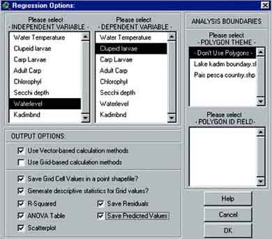
7. The Regression Options window appears (Figure 15.21). First you select the independent variable Waterlevel, then the dependent variable Clupeidlarvae. Do not use a boundary or barriers for your analysis, so in the - POLYGON THEME - box, select - Don’t Use Polygons -.
8. Carry out a vector based analysis only, Check all the boxes as indicated in Figure 15.21, because all different parameters and grids need to be calculated and click OK.
FIGURE 15.21
The Regression Options
window
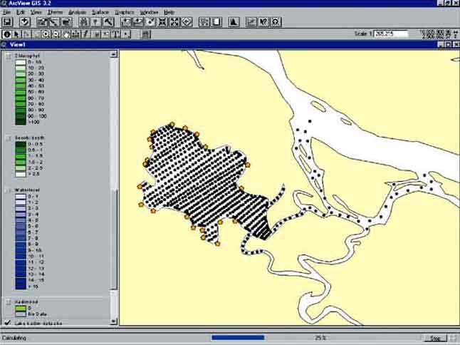
At the bottom of the screen a regression analysis progress bar will appear (Figure 15.22).
FIGURE 15.22
The regression analysis progress
bar
9. You will be asked where to save the files and give it a name. Do this and click OK.
FIGURE 15.23
The analysis progress
window
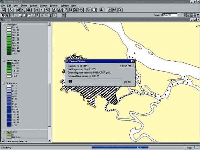
FIGURE 15.24
The model and ANOVA table, and the
scatterplot of the analysis
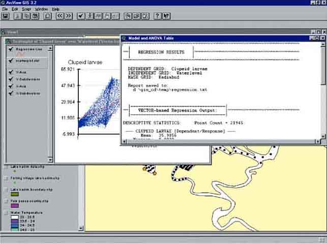
After this the regression analysis progress window will appear (Figure 15.23). Here you can see which calculations are made and the progress of the analysis. The analysis will take some time, depending on the size of the grids. Different Themes will be automatically added to the View and the regression is finished once you see on your screen Model and ANOVA Table and the scatterplot of the analysis (Figure 15.24).
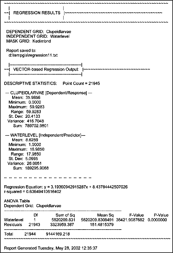
The results of the regression analysis are summarized in the Model and ANOVA table (Figure 15.25). It first indicates the grids used, and in your case you see (if you continued to work from page 70 onwards) that there was a grid used as a mask; ‘Kadimbnd’. You used this grid as a mask during the interpolation of the different grids of Lake Kadim. In the present analysis you forgot[27] to remove this mask from the Analysis Properties.
Then the table presents the descriptive statistics of both grids used in the regression, and you see that the regression was carried out over 21 945 data pairs. Then follows the results of the linear regression: y = 3.19x + 8.44 or Clupeid abundance = 3.19*Waterlevel + 8.44 and the regression has an R-squared of 0.64, which is significant with P<0.000001.
FIGURE 15.25
The Model and ANOVA table
If you close the Model and ANOVA table you see the scatterplot of the 21 000 pairs of depth and clupeid density used in the analysis (Figure 15.26). From this figure you see immediately there is a positive relation. The higher the waterdepth, the higher the density of clupeid larvae. The red line represents the values of the calculated regression. It fits the values reasonably but from the scatterplot and the calculated regression you see also that a more S-like regression fit would provide better results as the highest values of the clupeid density tends to reach an asymptote. In principle your fit overestimates somewhat all low waterdepths and underestimates somewhat at medium waterdepth around 10 metres.
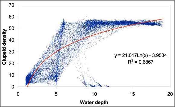
The Grid Regression extension only performs a linear regression. The data set is saved in your project and can be imported in any statistical or curvefit software. For example, a simple logarithmic plot carried out in Excel improves R-square already somewhat (Figure 15.27).
FIGURE 15.26
Scatterplot between Depth and Clupeid
made with the Grid Regression extension
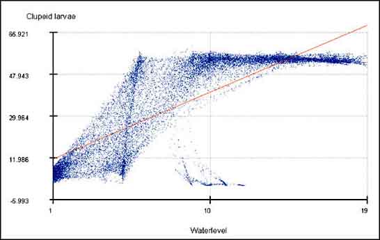
FIGURE 15.27
Scatterplot between Depth and Clupeids
made in Microsoft Excel
If you open the View again you see that the Grid Regression extension has added 3 themes to the View (Figure 15.28); the ‘Grid_depclu.shp (VECTOR - based)’ (this name depends on the name you have given the Grid values shapefile in the beginning), the ‘Regression grid (Vector based)’and the ‘Residuals grid (Vector based)’.
FIGURE 15.28
Themes added by the Grid Regression
extension to View
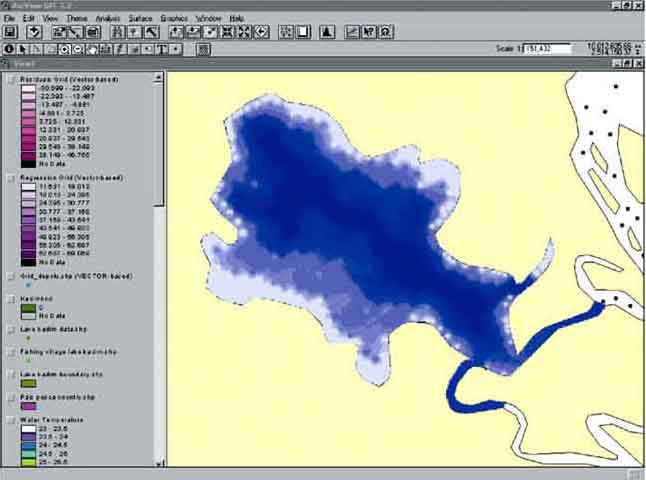
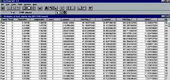
The ‘Grid_depclu.shp (VECTOR - based)’ - Theme consists of a set of points located at the cell centres of the grids, and contains all the data from the grids. If you open the attribute table of this Theme (Figure 15.29) you see the different columns with the data for each pixel pair; ‘Independent’ which in this case is the water depth; ‘Dependent’, the Clupeid density; ‘model’, which is the expected Clupeid density value, given the regression model that was calculated by the Grid Regression extension, and ‘Residuals’, which is the difference between the expected Clupeid density and the actual Clupeid density.
FIGURE 15.29
The attribute table of the data used in
‘Grid Regression’
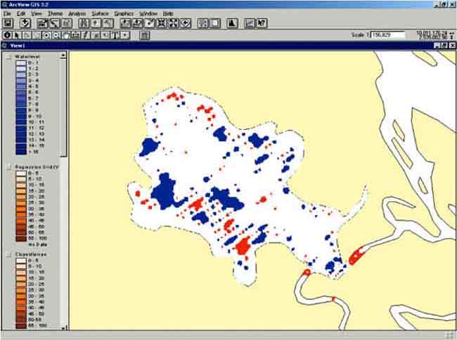
‘Regression grid (vector based)’ contains the calculated values of the Clupeid density for each pixel and the ‘residuals grid (vector based)’ contains the residual for each pixels. Both grids and the scatterplot allow you to get an idea of the reliability of the calculated regression. The original data (clupeid density), water depth, the calculated values, and the residuals are plotted in Figure 15.30, Figure 15.31, Figure 15.32, and Figure 15.33. From the results you see that the calculated distribution follows the real distribution reasonably well. From the residuals you see that the major difference is found in the medium water depth (6-12 metres), where the density is underestimated which you saw already from the scatter plot (Figure 15.26).
FIGURE 15.30
Clupeid density in Lake Kadim (original
measurements)
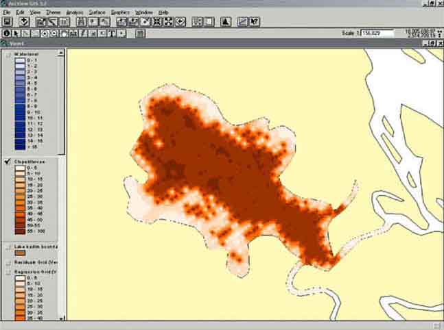
FIGURE 15.31
Water depth of Lake Kadim
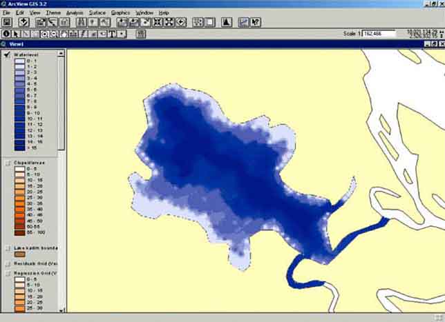
FIGURE 15.32
Calculated clupeid density
(Model)
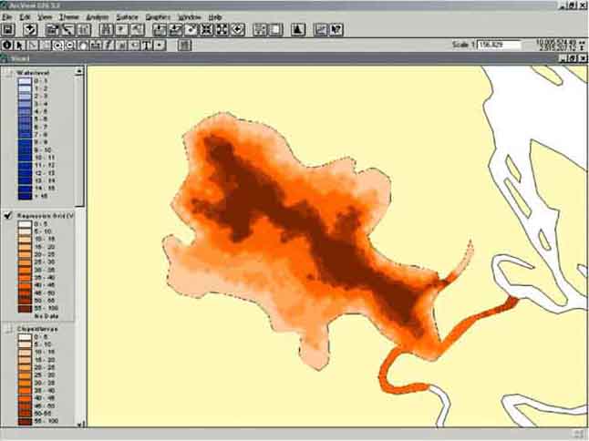
FIGURE 15.33
Residual plot between the original and
calculated densities
Make regression analysis between the different data grids of Lake Kadim and fill in Table 15.4 Results of the Grid regression between the different data grids of Lake Kadim.
TABLE 15.4
Results of the Grid regression between the
different data grids of Lake Kadim
|
Parameters |
a |
b |
R-square |
Acceptable |
|
Water depth - carp larvae |
|
|
|
|
|
Water depth - clupeid larvae |
8.47 |
3.19 |
0.634 |
Yes |
|
Water depth - adult carp |
|
|
|
|
|
Water temperature - carp larvae |
|
|
|
|
|
Water temperature - clupeid larvae |
|
|
|
|
|
Water temperature - adult carp |
|
|
|
|
|
Chlorophyll - carp larvae |
|
|
|
|
|
Chlorophyll - clupeid larvae |
|
|
|
|
|
Chlorophyll - adult carp |
|
|
|
|
Attention!: A warning about grid regression:
Although the above examples illustrate the usefulness and utility of grid regression, it should be noted that some aspects of it may violate some of the assumptions of basic regression statistics. The end results of these violations would likely be that your estimated parameters (i.e. your slope, y-intercept and R-square values) are probably a little bit off, and in particular your R-square value is likely to be slightly less than the calculated value. This may not be a problem in many cases because it is still a good method for identifying relationships between our independent variable and our predictor variables, and therefore helps us to predict what our independent variable will likely be doing in different areas based on our predictor variables. We do, however, have to be careful to report that there is some uncertainty about our model because of these violations, and be cautious when our R-squared value is near the limits of what we consider to be significant.
In particular, the violations are:
We did not measure at every point: The fact that we are using grids usually implies that we know more about our independent variables than we actually do. We are regressing data using sample points that completely cover the entire area, and it is rare that we have actually measured all our variables at every one of these sample points. In fact, grids are generally created by some interpolation method in which values are only measured at a few points, and the rest of the region is estimated (or interpolated) based on the values at these sample points. Different grids may even be generated from different sets of sample points, at different resolutions, or by different interpolation methods. Therefore we are often not as certain of the true variable values at each sample point as we would be if we actually measured at that point.
Lack of Independence: Most statistical techniques assume that each sample point is independent of the others, such that the values you measure at that point are completely unrelated to those points around it. This is not the case with most spatial phenomena, however, and it is even more pronounced with grid data. In fact, the interpolation methods often used to generate grids rely on the fact that locations near a point are likely to be more similar to that point than locations farther away, and the interpolation process uses that relationship to estimate what the values should be in the locations that were not measured. The concept that points close to each other are often more similar than points that are far away is referred to as ‘spatial autocorrelation’, and the degree to which a dataset is spatially autocorrelated can actually be useful information in its own right.
Additional Reading:
For those students who would like to learn about regression in depth, there are many texts available that cover it thoroughly. Two such texts that the authors recommend are:
Applied Linear Statistical Models, 4th ed. by Michael H. Kutner, Christopher J. Nachtschiem, William Wasserman and John Neter (1 408 pages, published by McGraw-Hill/Irwin, 1996).
Applied Regression Analysis, 3rd ed. By Norman R. Draper and Harry Smith (706 pages, published by Wiley-Interscience, 1998).
For those students who would like to learn more about spatial autocorrelation, some of the classic references are:
Spatial Statistics, by Brian D. Ripley (252 pages, published by Wiley Series in Probability and Mathematical Statistics, 1981).
Spatial Autocorrelation, by A.D. Cliff and J.K. Ord (178 pages, published by Pion Limited, 1973).
Spatial Processes: Models and Applications, by A.D. Cliff and J.K. Ord (266 pages, published by Pion Limited, 1981).
| [24] Free statistical software
can be downloaded at http://members.aol.com/johnp71/javasta2.html#General. [25] The Grid regression tool can be downloaded at http://www.jennessent.com/arcview/arcview_extensions.htm. [26] by Jeff Jenness, Jenness Enterprises, http://www.jennessent.com. [27] Or we forgot to instruct you to remove this mask. |