![]()
![]()
Part A: Organising and presenting data
Part B: Analysing data from samples
References
Previous modules in this Section have shown how different types of data can be collected during the diagnostic phase of livestock systems research. They have also stressed that data collection must never be an end in itself - it should always be directed towards making useful research and/or policy recommendations. This module has been written for that purpose.
The examples used in the text relate specifically to livestock systems research in Africa. The reader is encouraged to work carefully through them and to refer for details on the methods of statistical analysis described in this module to such widely available statistics textbooks as Dagnelie (1973; 1975), Cochran (1977), Draper and Smith (1981), Gomez and Gomez (1984), Casley and Lury (1987) and others given in the reference list at the end of this module.
To facilitate the interpretation and analysis of survey results, data should be organised and presented properly. Tables, graphs and charts are normally used for this purpose.
GENERAL. Table l is an example of a data set which contains a lot of information which is very difficult to interpret. It shows that the mere representation of results in tabular form may mean very little. If, however, the same information were organised in another way, it might be very useful. For instance, the pattern of cattle holdings in the area can be more clearly presented in a simple one-way table grouping sample households into categories or class intervals by herd size (Table 2).
The information in Table 2 could, of course, be presented in other ways: for instance, more (or fewer) categories could be used or the information could be abbreviated to mean and range values (Table 3). In other tables where the categories have no natural order, the categories should be arranged in descending order by frequency.
Table 1. Cattle held by households in area A.1
|
1 |
10 |
0 |
3 |
7 |
7 |
22 |
1 |
0 |
4 |
1 |
2 |
9 |
12 |
|
5 |
12 |
1 |
2 |
5 |
2 |
0 |
4 |
1 |
0 |
19 |
5 |
3 |
0 |
|
3 |
5 |
20 |
8 |
4 |
15 |
20 |
5 |
4 |
0 |
3 |
0 |
16 |
1 |
|
1 |
4 |
9 |
16 |
0 |
8 |
1 |
4 |
6 |
7 |
4 |
0 |
1 |
3 |
|
21 |
5 |
11 |
0 |
0 |
0 |
2 |
6 |
5 |
23 |
13 |
0 |
1 |
4 |
1 Sample size = 70 households.
Table 2. Cattle holdings in area A, grouped by herd-size category.1
|
Herd size category |
Number of households |
|
0 |
13 |
|
1-5 |
34 |
|
6-10 |
10 |
|
11-15 |
5 |
|
16-20 |
5 |
|
21-25 |
3 |
|
Total |
70 |
1 Sample size = 70 households.
Table 3. Mean and range of herd size in area A.
|
|
Herd size |
|
|
Mean |
Range |
|
|
Sample size (70) |
5.67 |
0-23 |
Table 2 is a frequency distribution table, because it shows the 'frequency' of values occurring in each category or class. The mean in Table 3 is known as a 'measure of location' and the range as a 'measure of dispersion'. More will be said about measures of location and dispersion later.
FREQUENCY DISTRIBUTION TABLES. When frequency distribution tables are being constructed, the following points about class intervals should be noted:
· A frequency table with many class intervals gives more information about the data than one with fewer intervals, but it is more difficult to understand quickly.· Too few class intervals can over-simplify the data and reduce its interpretive value.
· Class intervals need not be equal in size. Their size will largely be determined by the spread of the values obtained. If these are skewed or concentrated at one end of the distribution, more intervals may be needed at that end than at the other.
For instance, the first category (zero cattle) in Table 2 is smaller than the other categories, each of which have class intervals of five head of cattle. Also, since the number of households falling within the intervals 16-20 and 21-25 is small, those intervals could be combined.
· Setting class intervals for discrete data poses few problems, because there are definite breaks in the possible values a variable can take.
For instance, it is not possible to have a herd size of 1.7. Other examples of discrete variables are litter size, household size etc.
· When the data are continuous, it is necessary to create an artificial break for each class interval because there are no definite breaks in the possible values a variable can theoretically take.
Continuous data may be presented in such intervals as:
1-4.99
5-9.99 etc
Examples of continuous data intervals are liveweight, feed intake and height. In practice, continuous variables are measured in discrete units such as grams, centimetres etc.
|
Note: For practical purposes, most survey data are treated as discrete. |
· The number of intervals used will depend on the range and the amount of the data (number of observations), but it is common to use between 7 and 15 intervals.
RELATIVE AND CUMULATIVE FREQUENCY DISTRIBUTION TABLES. The frequency distribution table is commonly expanded to include additional information about the percentage and the cumulative percentage of sample units in each class interval. The percentage in each class interval is known as the 'relative frequency' and the cumulative percentage as the 'relative cumulative frequency'. Table 4 shows how these measures could be added to Table 2 to improve the interpretive value of the data.
Table 4. Frequency of cattle holdings in area A.
|
(A) |
(B) |
(C) |
(D) |
(E) |
|
Category (No.) |
Frequency (No.) |
Relative frequency (%) |
Cumulative frequency (No.) |
Relative cumulative frequency (%) |
|
0 |
13 |
18.6 |
13 |
18.6 |
|
1-5 |
34 |
48.6 |
47 |
67.1 |
|
6-10 |
10 |
14.3 |
57 |
81.4 |
|
11-15 |
5 |
7.1 |
62 |
88.6 |
|
16-20 |
5 |
7.1 |
67 |
95.7 |
|
21-25 |
3 |
4.3 |
70 |
100.0 |
|
Total |
70 |
100.0 |
|
(n = 70) |
Whether all the columns shown in Table 4 are actually presented will depend on the purpose of the frequency table, as any of the columns B to E can be calculated from any of the others. Cumulative frequencies are simply the total of the frequencies up to that point, and are only relevant when the data categories have a sensible order. Relative frequencies are just the frequency in a category expressed as a percentage of the total number in the sample.
For instance, for the category 6-10 the cumulative frequency is 57 (= 13 + 34 + 10), i.e. there are 57 households with 10 or fewer cattle. Expressing this as a percentage of the sample size (n = 70) gives 81.4%.
Relative figures can be used to make comparisons between samples of different sizes. They also tell us quite a lot about the sample itself.
|
Example: Table 4 tells us that in area A: · about 20% of households in the sample hold no cattle at all |
In livestock systems research it may also be important to examine equity relationships. For this purpose, data on livestock holdings (such as those given in Tables 1-4) can be used, since in many African rural areas, wealth tends to be closely correlated to the number of stock owned or held. Table 5 shows that:
· about 19% of households (column D) in area A hold no cattle at all· 67% of households (column D) hold 5 or fewer head of cattle. As a whole, this group holds only one quarter of the cattle in the area (column G), and
· 14 % of households hold about half of the cattle in the area (columns D and G).
From this information, we might conclude that cattle holdings are not equitably distributed within the area, i.e. relatively few of the households own a large proportion of the cattle while a substantial proportion hold none. Inequitable distribution of livestock holdings is fairly common in Africa, and similar distributions are found for income received and/or assets held (Module 2, Section 1). Households with larger livestock holdings also tend to have greater access to resources such as water points (Module 10), but policies which aim to correct inequities of this nature are generally fraught with problems (Module 10, Part B).
Table 5. The inter-household equity of livestock holdings in area A.
|
(A) |
(B) |
(C) |
(D) |
(E) |
(F) |
(G) |
|
Number of cattle |
Frequency (No. hhlds) |
Relative frequency (% hhlds) |
Cumulative relative frequency (% hhlds) |
Number of cattle held/category (A x B) |
Percent of cattle held/category (%) |
Cumulative percentage of cattle held/category (%) |
|
0 |
13 |
18.6 |
18.6 |
0 |
0 |
0 |
|
1 |
10 |
14.3 |
32.9 |
10 |
2.5 |
2.5 |
|
2 |
4 |
5.7 |
38.6 |
8 |
2.0 |
4.5 |
|
3 |
5 |
7.1 |
45.7 |
15 |
3.8 |
8.3 |
|
4 |
8 |
11.4 |
57.1 |
32 |
8.1 |
16.4 |
|
5 |
7 |
10.0 |
67.1 |
35 |
8.8 |
25.2 |
|
6 |
2 |
2.9 |
70.0 |
12 |
3.0 |
28.2 |
|
7 |
3 |
4.3 |
74.3 |
21 |
5.3 |
33.5 |
|
8 |
2 |
2.9 |
77.1 |
16 |
4.0 |
37.5 |
|
9 |
2 |
2.9 |
80.0 |
18 |
4.5 |
42.0 |
|
10 |
1 |
1.4 |
81.4 |
10 |
2.5 |
44.5 |
|
11 |
1 |
1.4 |
82.9 |
11 |
2.8 |
47.3 |
|
12 |
2 |
2.9 |
85.7 |
24 |
6.0 |
53.3 |
|
13 |
1 |
1.4 |
87.1 |
13 |
33 |
56.3 |
|
15 |
1 |
1.4 |
88.6 |
15 |
3.8 |
60.4 |
|
16 |
2 |
2.9 |
91.4 |
32 |
8.1 |
68.5 |
|
19 |
1 |
1.4 |
92.9 |
19 |
4.8 |
73.3 |
|
20 |
2 |
2.9 |
95.7 |
40 |
10.1 |
83.4 |
|
21 |
1 |
1.4 |
97.1 |
21 |
5.3 |
88.4 |
|
22 |
1 |
1.4 |
98.6 |
22 |
5.5 |
94.2 |
|
23 |
1 |
1.4 |
100.0 |
23 |
5.8 |
100.0 |
|
Total |
70 |
100.0 |
|
397 |
100.0 |
|
Notes: Columns A-D are essentially the same as columns A-D in Table 4, except that the number of categories has been increased. Column E provides information about the total number of cattle per category. The total of column E shows that there are 397 cattle covered by the study. Columns F and G give the relevant percentages of cattle, based on a total of 397 head.hhld = household.
The large quantity of data contained in Table 5 makes it difficult relate the information between columns. Alternative methods of data presentation which give the same information more concisely and in a simpler form may therefore be preferred, such as the Lorenz curve and other graphs.
TABLES WITH MORE THAN ONE CLASSIFICATION. All the tables given so far have been concerned with only one classification (herd size) and are largely descriptive in the function they perform. However, in livestock systems research it is often useful to consider two or three classifications simultaneously in order to examine the relationships which might exist between them. To facilitate this, data can be presented in simple two- or three-way cross-classification tables.
For instance, herd size and household size may both be recorded for a sample of households and presented in a two-way table. Such a table would have one 'cell' for each combination of herd size and household size (e.g. one cell might be households of five adults with 6-10 head of cattle). Each cell could contain either the number of households or the mean of some other variable, such as number of cattle sold.
|
Example: |
|||
|
|
|||
|
Table 6. Average numbers of goats by category of cattle holder and communal area, North Gwanda District, Zimbabwe, 1982. |
|||
|
|
|||
|
Category |
Communal area |
||
|
A |
B |
||
|
Cattle holders |
4.7 |
6.7 |
|
|
Non-holders of cattle |
2.2 |
3.6 |
|
|
|
|||
|
|
Source: Zimbabwe Government (1982). |
||
|
|
|||
|
There are two classifications in this table - cattle holding and communal area - and each has two categories, giving a table with four cells. The information given suggests that, on average, cattle-holding households hold more goats than non-holders. Also, farmers in area B have more goats than those in area A. |
|||
The statistical methods which can be used to test the significance of differences such as those shown in Table 6 are discussed briefly in Part C below and in many statistics textbooks.
|
Summary Some hints to make tables easier to interpret: · Keep tables as simple as possible. Do not include irrelevant rows and columns. · Clearly label the rows and columns. · Do not use too many digits for presenting numbers. If necessary, change the units of measurements and round the number of decimal places.1 For instance, 12,647 g should be converted to 12.647 kg and then rounded to 12.6 or even 13.0 kg, depending on the context. · If there is no natural order for the rows, sort the rows in the order of the most important column in the table, so that the first row of that column has the highest value and the last row the lowest. · Organise table to facilitate visual comparisons between rows, which are easier to make than comparisons between columns. For instance, in Table 6 it is (slightly) easier to compare cattle holders with non-cattle holders than it is to compare areas A and B. For more details on organisation of tables see the first few chapters of Ehrenberg (1975). |
1 This advice applies to data presented in a tabular or graphic form, not to data stored for further analysis.
The types of graphs and charts most commonly used to present statistical data in livestock systems research are:
· histogram
· cumulative frequency curve
· Lorenz curve
· bar chart, and
· two-dimensional graph or scatterplot.
Each of these graphs and charts is briefly described below. Their derivations and use are described in detail in most of the elementary statistical textbooks cited in the reference list.
Histogram
A histogram is the graphical equivalent of the frequency distribution table. Figure 1 is the histogram for the data given in Table 2 earlier, omitting the first category (zero cattle).
Figure 1. Herd size in area A for a sample of 57 cattle-owning households.
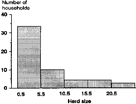
The principles to be followed when drawing histograms are:
· Dividing points for each interval are marked on the horizontal axis. Frequencies or relative frequencies are marked on the vertical axis.· For discrete data, the midpoint between the upper and lower values of two adjacent intervals is used as the dividing point.
For instance, in Table 2, the dividing point between intervals 5-10 and 11-15 is (10 + 11)/2 = 10.5. The determination of intervals for continuous data is discussed on page 256 of this module.
· The frequency per standard interval determines the height of each bar. This is to avoid distortion and is best explained by an example.
|
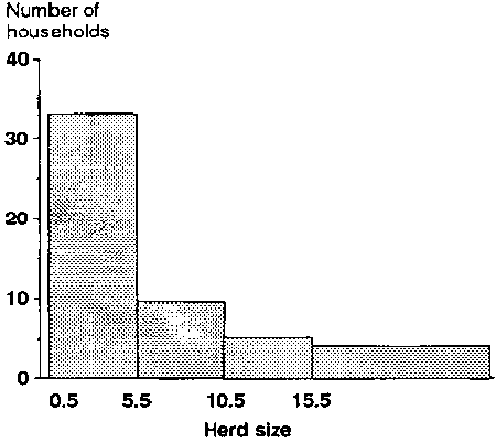
Example: In Table 2, all intervals except the first (zero cattle) are equal, having 5 units (cattle) in width. We can combine the last two categories (i.e. 16-20 and 21-25) to give an interval of 16-25 which is 10 units wide and contains 8 households (i.e. has a frequency of 8). This is equivalent to a frequency per standard interval of 4, which should be the height of its bar in the histogram, as shown in Figure 2. The height of the bar for the combined 16-25 interval is the average height of the two bars in the previous histogram, rather than the total of their heights. Note that if we had used a bar height of 8 for the combined interval, the histogram would give a distorted picture. To obtain the frequency for the combined interval from the graph, multiply the height of the bar (4) by the number of standard intervals contained in this larger interval (2). The answer is 8 which corresponds with the number of households in interval 16-25. |
Figure 2. Redrawn version of Figure 1, combining categories 16-20 and 21-25 into a single category.
Cumulative frequency curve
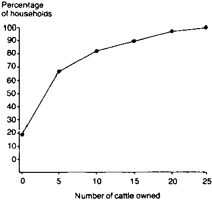
The cumulative frequency data derived for herd size in Table 4 can be represented graphically, as shown in Figure 3 which relates the cumulative proportion of households holding cattle to the number of cattle held (herd size).
The figure can be interpreted by reading from the horizontal to the vertical axis. For instance, for a herd size 10, the corresponding cumulative frequency figure is approximately 80%, which means that about 80% of households hold 10 or fewer head of cattle. Table 4 gives the exact answer of 81.4%.
Note: Graphs give a very good visual impression, but are difficult to read accurately. Tables, on the other hand, give much better accuracy.
Figure 3. Cumulative relative frequency curve of herd sizes for 70 sample households in area A.
Lorenz curve
Information on equity relationships, such as that given in Table 5, is more easily interpreted when presented graphically. This is done in Figure 4 where a Lorenz curve is used to relate the proportion of households (column D, Table 5) to the proportion of cattle held (column G. Table 5).
The plotted Lorenz curve in Figure 4 is compared with a 45° line drawn from the origin. If the plotted curve were to follow this line exactly, a situation of perfect equity with respect to cattle holdings would exist in the area, i.e. 10% of the cattle would be held by 10% of the households, 20% of the cattle would be held by 20% of the households etc. The more bowed the curve from the 45° line, the more inequitable the situation. The magnitude of the bow is normally indicated by dotting in the area between the 45° line and the Lorenz curve, as shown. The graph is interpreted by reading from the horizontal to the vertical axis or vice versa.
Figure 4. The distribution of cattle holdings for 70 sample household in area A.
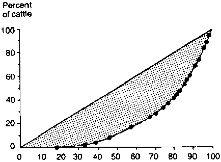
For instance, in Figure 4, 60% of the households with the smallest herds hold approximately 20% of the cattle, while 80% hold roughly 40% of the cattle etc. Note that Figure 4 relates cattle ownership to all households in the sample. If we were interested in the equity of holdings for only those households which own cattle, a different curve would have to be drawn, omitting the 13 households without cattle.
Bar charts
Frequency data are not always graphed by using a histogram. This is particularly so when the data have only a limited range of values and, therefore, grouping data into fewer classes is likely to be both undesirable and unnecessary. Table 7 gives an example of this kind of data.
The data in Table 7 fall naturally into a few clearly deemed or discrete classes and further refinement is unnecessary. Such data can be presented by using a bar chart or left in tabular form.
Table 7. Frequency of parturitions in a herd of 153 cows.
|
Number of parturitions |
Number of cows |
Relative frequency (%) |
Cumulative relative frequency (%) |
|
0 |
26 |
17 |
17 |
|
1 |
38 |
25 |
42 |
|
2 |
47 |
31 |
73 |
|
3 |
24 |
15 |
88 |
|
4 |
18 |
12 |
100 |
|
Total |
153 |
100 |
|
When a bar chart is used (Figure 5), data shown on the horizontal axis can only take discrete values. All bars are of exactly the same width and are separated from one another to emphasise the fact that the data can only take on the values actually marked on the horizontal axis. The height of each bar corresponds to the (relative) frequency of the value it represents. Alternatively, it could correspond to the mean (or total) of another variable of interest.
Figure 5. Bar chart of parturition data from Table 7.
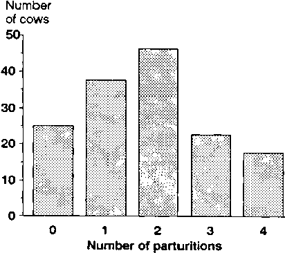
When the categories in question have a natural sequence (as in Figure 5, from 0 to 4), they should be arranged in that order on the horizontal axis. If they do not have a natural order, it is often useful to arrange them in such a manner that the bars are in descending order of height, i.e. the first category is the one with the highest bar and the last with the shortest bar. Alternatively, if the frequency of occurrence of different diseases is being plotted, for instance, the most common disease could be shown as the first bar and the rarest disease as the last bar.
Line graphs and scatterplots
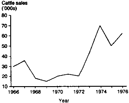
Graphs derived by plotting one variable against another are commonly used in economic and scientific literature to examine relationships between two variables. Figure 6 gives an example of a time series line graph derived from data in Table 8 and showing the volume of cattle sales over time. Since the amount of data is quite small, and we would expect a continuous trend, the plotted points are joined by a line.
Table 8. Cattle sales and annual rainfall in the Kajiado District, Kenya, 1966-76.
|
|
Year |
||||||||||
|
1966 |
1967 |
1968 |
1969 |
1970 |
1971 |
1972 |
1973 |
1974 |
1975 |
1976 |
|
|
Sales ('000) |
30 |
36 |
18 |
15 |
20 |
22 |
20 |
43 |
70 |
50 |
62 |
|
Rainfall (mm) |
450 |
450 |
550 |
450 |
600 |
500 |
450 |
450 |
600 |
500 |
150 |
Source: Meadows and White (1979).
Figure 6 shows that the volume of sales increased dramatically from 1972 to 1974. Figure 7 is a modified version of Figure 6, with the rainfall data from Table 8 plotted against cattle sales on the same frame. This allows a comparison of the trend in sales with the trend in annual rainfall.
By comparing several variables at once in graphs of this kind, cause and effect relationships can sometimes be tentatively hypothesised and then subjected to further testing by the statistical methods outlined in Part B of this module.
Figure 6. Annual cattle sales in the Kajiado District. Kenya 1966-76.
With time series data, relationships plotted over a relatively short time period may lead to spurious conclusions. There is a large subjective element in the interpretation of such limited data; apparently strong relationships in the short term may prove to be insignificant in the long term.
The time period used in Figure 7 is probably too short to draw useful conclusions about the relationship between annual rainfall and annual cattle sales in the Kajiado District of Kenya. Another, possibly more useful, way of examining such relationships is to draw a scatterplot of sales versus rainfall, as was done in Figure 8.
Figure 7. Annual cattle sales and rainfall. Kajiado District. Kenya 1966-76.
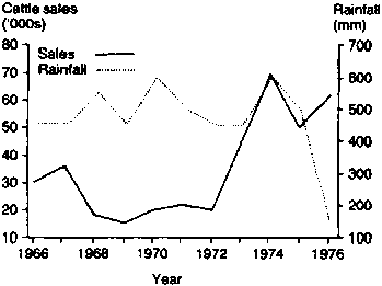
Figure 8. Plot of cattle sales against rainfall.1
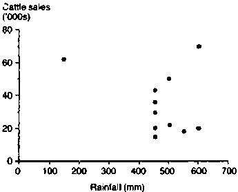
1 Rainfall data taken from Table 8.
In a scatterplot, the points are not joined by lines, and it can be seen from the figure that a line graph would be totally unsuitable. Drawing graphs like this can be a useful starting point in the analysis of relationships in livestock systems research.
In Tables 2 and 4, frequency distribution was used to describe the distribution of cattle holdings in area A. The following discussion concentrates on statistical measures commonly used to concisely characterise a frequency distribution or even substitute for it. Such summary statistics may be classified into two groups:
· measures of location (or averages), and
· measures of dispersion (or variability).
Measures of location
If a frequency distribution can be represented by some central value, different distributions can be compared by comparing these values instead of the distributions themselves. Three measures of central location are commonly used to describe frequency distributions. They are:
· the arithmetic mean
· the median, and
· the mode.
Each is defined briefly below. Examples are given based on the data listed in Table 1, and the relative merits of each measure are also discussed. All elementary statistical texts discuss these measures in greater detail.
THE ARITHMETIC MEAN. For a variable X with values x1, x2, x3...xn, the arithmetic mean is defined as:
Arithmetic mean 
which is normally abbreviated as:

where the S means the 'sum of '.
The arithmetic mean is normally called the 'average' or the 'mean'. The mean for the data in Table 1 is 5.67.
Let us now assume that a survey was conducted in an adjacent area (Y) and that the distribution of cattle holdings was found to be similar to that in area A. In such a case, a comparison of the two distributions on the basis of the mean alone is valid and meaningful (Figure 9a), but not comprehensive in the information it provides. If the distributions of cattle holdings in areas A and Y were not similar, comparisons on the basis of the mean alone would be less reliable (Figure 9b), because the mean (or any single summary statistic) would omit useful information.
Figure 9. Comparisons of distributions on the basis of the arithmetic mean.
a. Valid comparison
b. Invalid comparison
Similar distributions
Dissimilar distributions
The mean is affected by all observed values in the data set. When the distribution is 'skewed', extreme values will have a large influence on the calculation.
|
Example: Take the data set in Table 1 and assume that the two households with a recorded cattle holding of 20 animals, in fact, have 50 animals each instead. The mean for the sample is now 6.53 animals, not 5.67, which means that, by including the extreme values, it has increased by almost one animal per household. |
THE MEDIAN. When the distribution has extreme values and is skewed, the median is generally a more appropriate measure of central location than the mean.
The median is the value that divides the frequency distribution exactly in half, i.e. 50% of the observations are above the median and 50% are below. In terms of Table 1 this means that half the households will hold less than the median number of cattle and half will have more. Starting from the lowest value and working upwards it will be the value which lies between the 35th and 36th households in the sequence, i.e. 4. Such a value is relatively simple to determine when a complete listing of data is available.
Note that the median value is lower than the mean by approximately 1.7 animals per household. This is because the distribution is skewed to the right, and the mean is influenced by the large herd sizes more than the median. When the distribution is perfectly symmetrical, the two values are exactly the same.
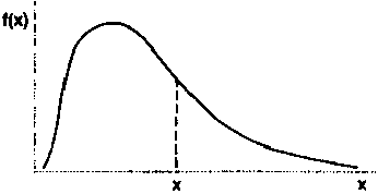
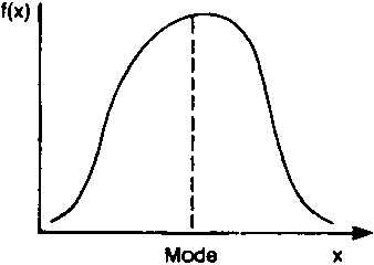
THE MODE. The mode of a frequency distribution is the value of the variable which occurs most frequently. If there is only one peak in the distribution, there is only one mode (which occurs at the peak) and the distribution is unimodal (Figure 10a).
For instance, in Table 5, which lists the frequencies corresponding to all cattle holdings, the mode occurs at 0 where the frequency is highest.
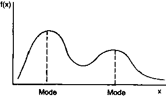
If there are two peaks, there are two modes and the distribution is said to be bimodal (Figure 10b).
For a unimodal distribution which is skewed to the right, the mode is always less than the mean and the median.
Figure 10. Unimodal and bimodal distributions.
a. Unimodal distribution
b. Bimodal distribution
Measures of dispersion
The mean, median and mode locate a distribution but provide no indication of the variation or the dispersion of the variable X (e.g. herd size). Two distributions may have the same mean (or median or mode), yet their values maybe dispersed very differently. A measure of dispersion will therefore improve our understanding of the characteristics of the distribution. The measures of dispersion most commonly used are:
· the range
· the variance
· the standard deviation, and
· the coefficient of variation.
THE RANGE. The range is the span between the extreme values of the distribution. For Table 1, for instance, the range is from 0 - 23. The problem with the range is that we know nothing about the scatter of other values within the extreme limits, and that it is very sensitive to a single extreme value. Moreover, the range has few useful mathematical properties.
THE VARIANCE. Each value in a distribution deviates from the mean by an amount measured as:
Deviation = xi -
where xi represents the ith value of the variable X (say herd size) and  is the mean value.
The magnitude of the deviation will depend on the characteristics of the distribution - the greater the variation, the greater the size of the deviation. The variance is calculated to provide a measure of the average deviation from the mean. Since some deviations are positive and some negative, the simple arithmetic mean of the deviations will always be zero. The way around this problem is to square all the deviations first, and then average them as follows:
Variance s2 = 
For simpler calculation, note that the term S (xi -x)2 - often referred to as the sum of squares, and abbreviated as ss - can be more easily obtained from the formula:
ss =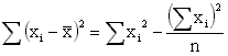
then, the variance s2 = ss/(n-1).
The variance is a very common measure and has useful mathematical properties, but, because it is measured in squared units, it is not very useful for presenting results.
THE STANDARD DEVIATION. To avoid the problem of unhelpful units of measurement for the variance, the standard deviation (abbreviated as SD or s) is often used. The standard deviation is the square root of the variance, and is measured in the same units as the original variable.
Standard deviation (s) =
Many simple pocket calculators now have the facility to calculate the standard deviation for a set of data, and can save a lot of time.
|
WARNING: A number of calculators use a slightly different formula from the one given here. This difference may be important for small samples. |
THE COEFFICIENT OF VARIATION. The coefficient of variation (CV) expresses the standard deviation as a percentage of the mean, and is calculated as:
CV =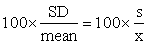
Care is needed when interpreting coefficients of variation, since a large coefficient of variation can be the result of either a large standard deviation or a small mean. Two distributions with the same standard deviation will have different coefficients of variation if their means are different.
|
Example: Table 9 gives offtake rates for a small sample of 10 cattle-holding households in a survey area. It also shows the variance and the standard deviation for the sample, which are calculated as follows:
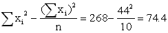
The mean (4.4) is subtracted from the original data (column 2, Table 9) to give the deviations in the third column. The deviations are then squared to give the fourth column. The total of this column is: ss = Alternatively, ss can be calculated using S xi2 = 268 from the fifth column in Table 9 as: ss = The variance s2 is then s2 = ss/(n-1) = 74.4/9 = 8.27. The standard deviation s = The coefficient of variation CV = 100. s/ |
Table 9. Examples of calculations of variance and standard deviation.
|
Household (i) |
Percentage offtake rate (xi) |
Deviation (xi- |
Squared deviations (xi- |
(xi)2 |
|
1 |
1 |
-3.4 |
11.56 |
1 |
|
2 |
2 |
-2.4 |
5.76 |
4 |
|
3 |
3 |
-1.4 |
1.96 |
9 |
|
4 |
4 |
-0.4 |
0.16 |
16 |
|
5 |
6 |
+1.6 |
2.56 |
36 |
|
6 |
10 |
+5.6 |
31.36 |
100 |
|
7 |
3 |
-1.4 |
1.96 |
9 |
|
8 |
2 |
-2.4 |
5.76 |
4 |
|
9 |
5 |
+0.6 |
0.36 |
25 |
|
10 |
8 |
+3.6 |
12.96 |
64 |
|
Total S |
44 |
0.0 |
74.40 |
268 |
Standard errors
Confidence intervals
Testing for differences between two groups - The t-test
Testing for relationships between categories - The chi-squared test
Linear correlation and regression
Standard errors and confidence intervals of regression coefficients
Some general comments about linear regression analysis
It is not possible in this manual to provide a comprehensive discussion of the main techniques of statistical analysis used to analyse data obtained from surveys and other sources. What follows is a brief outline of the basic statistical techniques used during the diagnostic phase of livestock systems research,2 plus a few practical examples for the purposes of illustration. The user should refer to the reading list at the end of Module 11 for additional support material on the topics discussed.
2 The techniques (paired 't' tests end analysts of variance) which are most applicable to on-farm trials are discussed in Module 3. Section 2.
When analysing data from samples, it is necessary to consider:
· standard errors
· confidence intervals and sample size
· testing for differences between two groups (t-test)
· testing for relationships between categories (chi-squared test), and
· linear correlation and regression.
Suppose we wish to estimate the average herd size per household for a population of pastoral cattle holders in area A. The actual value of the mean could be obtained by conducting a census, but this may be impractical for logistic and cost reasons. We might, therefore, decide to use an appropriate sampling method (Part C of Module 2, Section 1) and to obtain an estimate of mean herd size by survey.
Our actual sample of herds is only one of many of the possible samples that could have been obtained. Therefore, our estimate is only one of many estimates that could have been obtained. If we repeated the same survey with a different sample we would (in all likelihood) obtain a different estimate. If it were possible to repeat this procedure over and over again, we would thus get a whole series of estimates which would be distributed roughly as in Figure 11 if the sample size in each instance were large enough.
Figure 11. Frequency distribution of sample estimates for the mean of a population.
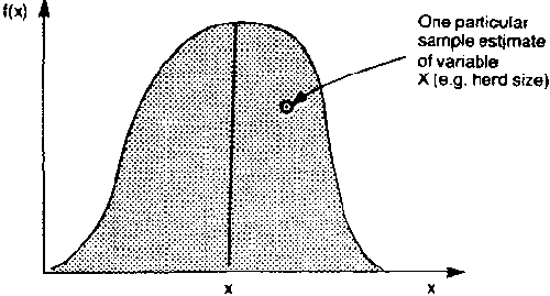
The shape of the distribution curve would approximate what is known as the 'normal distribution' and the mean of all the possible estimates would approximate the actual mean herd size per household for the area.
The problem is that one sample gives only one estimate and we need to know how reliable/accurate this particular estimate is. To determine this, the standard error (SE) is used. The standard error is deemed as the standard deviation of all the estimates that could be obtained from all possible samples of a given size.
Obviously we cannot directly determine the standard deviation of all the possible values, but we can use the sample data to estimate the standard error. From this estimate, we are then able to make inferences about the population as a whole.
The manner in which the standard error is calculated will vary with the method of sampling adopted (e.g. simple random sampling and multistage sampling). The formulae used and their mathematical basis are not discussed here but are dealt with by most statistics texts which deal with sample selection and estimation (e.g. Kish, 1965; Cochran, 1977; Yates, 1981).
In simple random sampling, the standard deviation for the particular sample is used in calculating the standard error of the estimate of the population mean. The following formula can be used in simple random sampling to calculate the standard error:
SE =
where:
n = sample size (number of observations), and
s = the sample standard deviation for the variable in question.33 If the sample is a large proportion of the population (10%) then this formula will give too large a value for the standard error.
In most cases, the distribution of all possible sample estimates is approximately Normal. It is therefore possible to make inferences about the population from the value estimated by sampling. We can, with a degree of confidence, make statements about the actual population mean on the basis of the sample itself.
In terms of Tables 1 to 3 this means that we can state within certain limits what the actual average herd size is for pastoralists in area A, even though the 70 households are only a sample. Such inferences are often expressed in the form of a confidence interval:
 ± t.SE
i.e. the interval from - t.SE to  + t.SE
where:
t = a value taken from statistical tables of 'Student's t-distribution' for a given probability level (see Table 10 below).
A 95% confidence interval is the most conventional level to use, and for this, the l-value for 5% is required. (For a 99% confidence interval, use the 1% l-value etc). The value of t depends on the sample size: in fact, it depends on a quantity known as the 'degrees of freedom' (df) which, in this case, is n -1, i.e. the sample size minus 1.
|
Note that for any reasonable sample size (n > 20), the 5% t-value is close to 2, and this is a useful approximation to keep in mind. |
A confidence interval indicates that the true population mean will lie within the given range with a certain probability (see example below). This assumes that the estimate is unbiased and that the distribution of all the possible estimates is approximately Normal.
The standard error and the confidence interval are both measures of the accuracy of the sampling procedure. Note that the larger the sample size (n), the smaller the standard error and the narrower the confidence interval. This reinforces the common-sense idea that a larger sample will give better accuracy than a smaller one.
Table 10. Critical values for the 't' statistic.
|
df (= n-1) |
5% |
1% |
0.1% |
|
1 |
12.70 |
63.70 |
637 |
|
2 |
4.30 |
9.92 |
31.60 |
|
3 |
3.18 |
5.84 |
12.90 |
|
4 |
2.78 |
4.60 |
8.61 |
|
5 |
2.57 |
4.03 |
6.86 |
|
6 |
2.45 |
3.71 |
5.96 |
|
7 |
2.36 |
3.50 |
5.41 |
|
8 |
2.31 |
3.36 |
5.04 |
|
9 |
2.26 |
3.25 |
4.78 |
|
10 |
2.23 |
3.17 |
4.59 |
|
12 |
2.18 |
3.05 |
4.32 |
|
15 |
2.13 |
2.95 |
4.07 |
|
20 |
2.09 |
2.85 |
3.85 |
|
25 |
2.06 |
2.79 |
3.73 |
|
30 |
2.04 |
2.75 |
3.65 |
|
40 |
2.02 |
2.70 |
3.55 |
|
60 |
2.00 |
2.66 |
3.46 |
|
100 |
1.98 |
2.63 |
3.39 |
|
Æ |
1.96 |
2.58 |
3.29 |
Note: This table gives a limited range of critical values for the 't' statistic. More extensive tables can be found in many statistical textbooks.
|
Example: Suppose that we have taken a simple random sample of 50 households in area A which has a total of 1000 households. We have estimated from the survey that the average time spent per household per year on herding operations is 500 man-days and that the standard deviation is 120, i.e.: n = 50
s = 120 From this data the standard error would be calculated as follows: SE = s/ To calculate a 95% confidence interval, df = 49 and the appropriate l-value can be taken as 2.01 (half way between the values for 40 and 60 df in Table 10). The confidence interval is then:
We can therefore state, with 95% confidence, that the average time spent per household per year on herding operations in area A is in the range 500 man-days +34 man-days, i.e. between 466 and 534 man-days. |
We can also use the formula for confidence intervals either to predict the accuracy likely to be obtained in a sample of a given size or, conversely, to estimate the size of sample required to obtain a given accuracy.
However, to be able to do this, we need prior information about the population standard deviation. Usually such information is not available (if it was, we would not need to carry out a study). In practice, though, it may be possible to make a reasonable guess for the standard deviation, either from similar previous studies or from knowledge of the likely range of the data.
If the size of a proposed sample has already been determined by factors such as cost, manpower or time constraints, and if a reasonable guesstimate of the standard deviation is available, then it is possible to predict what the confidence interval is likely to be, by using the sample size, n, and the guesstimated standard deviation, s, in the formula for a confidence interval. This then gives the accuracy with which the proposed sample will estimate the mean of the variable concerned.
If this accuracy is not adequate, the value of carrying out the study could be seriously questioned. More resources would be necessary in order to increase the sample size, and, consequently, increase the accuracy to an acceptable level. On the other hand, if the predicted accuracy is much greater than needed, the size of the study could be reduced, thus saving money or time, while still achieving acceptable results.
The converse of this argument can be used to estimate the sample size which would be necessary to achieve a specified accuracy.
|
Example: Assume again that we wish to estimate the true population value for the average amount of time spent on herding operations per household per year in area A. We want to be 95% confident that the estimate we obtain does not differ by more than 30 days from the true population value, i.e. we want to estimate the population mean with an accuracy of + 30 days. How big a sample must we choose, given that simple random sampling will be used? In order to answer this question, we need to find the sample size for which t.SE = 30. This means that t Simple algebra gives We might have to guesstimate a value for s (say s = 150) from previous similar data, and the value of t can be taken as 2 unless the sample size turns out to be small. We then have:
Therefore, we would estimate that a sample of about 100 households would probably give us the required accuracy. |
|
Note: If a value for the deviation (s) cannot be obtained (guessed) prior to the survey, then it will be impossible to predict the accuracy or the required sample size by statistical methods. |
In livestock systems research we are often interested in making comparisons between different groups within the same or different populations. For example, we may be interested in comparing different management systems in order to see whether management practices have an effect on output levels. Or we may wish to test the benefits of veterinary measures by comparing vaccinated and untreated animals. Such comparisons are usually based on testing for a significant difference between the means of the two different groups, and this is done using a t-test.
Table 11. Mean and standard deviation of household size for cattle sellers and non-sellers.
|
Group (i) |
Number of households (ni) |
Mean size household |
( |
|
Sellers |
22 |
11.3 |
1.03 |
|
Non-sellers |
17 |
8.9 |
0.78 |
|
Example: Suppose that we are interested in testing whether there is a relationship between household size and the sale of cattle. Our expectation might be that as household size increases, so will the need to sell cattle to meet cash needs. We conduct a simple random sample survey to determine, among other things, whether a relationship of this kind exists. The results are given in Table 11. We want to test if the mean household size for seller The first step is to estimate the mean difference (d) which is simply one mean minus the other. d= In this example, d = 11.3 - 8.9 = 2.4, i.e. on average, the household size of sellers is 2.4 greater than the household size of non-sellers. We now need to calculate the standard error of this difference, but to do this, we first have to estimate the standard deviation of the combined data, called the 'pooled standard deviation'. It is an assumption of the t-test that the standard deviation (and variance) is the same in both groups. If this is not the case, a more complicated test is needed. The pooled variance is calculated as a weighted average of the variances of the two groups. (For mathematical reasons we average the variances and not the standard deviations). The weights used are the relevant degrees of freedom ni - 1. The formula for the pooled variance (s2) is: s2 = The pooled standard deviation (s) is now the square root of the pooled variance:
Now, the standard error for the difference between two means (SED) is: SED = s In this example, the pooled variance is: s2 = and the pooled standard deviation is: s = with 37 degrees of freedom. This pooled standard deviation lies between the two individual standard deviations. The standard error for the difference (SED) is now: SED = To test if the difference in household size between sellers and non-sellers is statistically significant, we calculate a value, t, as follows:
and this is then compared with tabulated values of Student's l distribution (as in Table 10, for instance). In our example: t = (11.3 - 8.9)/0.30 = 2.4/0.30 = 8.0 Note that the larger the difference between the two means, the larger the value of t. Consulting Table 10 for 37 df (40 is close enough) at the 5% level gives a t-value of 2.02. We can then conclude that our calculated value of 8.0 is larger than the tabulated value and, therefore, the difference between sellers and non-sellers is significant at the 5% level. This is often denoted as P < 0.05. (The tabulated values for 1% and 0.1% are 2.70 and 3.55, respectively, so our difference is also significant at the 0.1% level - P < 0.001). More formally, if there was no difference between sellers and non-sellers, we would only calculate a t-value greater than 2.02 in 5% of samples. Therefore, either there is a genuine difference or our sample is quite unusual, and so we conclude that the difference is probably genuine. |
It is essential to distinguish between statistical significance and practical importance. Statistical significance implies that our survey or trial can detect a difference which is larger than that which could be expected due to random variation alone. This does not imply that this difference is large enough to be relevant for practical or economic purposes. With a very large or very precise survey, it is possible to detect quite small differences. On the other hand, if a difference between two groups is not significant, this does not imply that there is no difference between the groups: it could mean that our survey was too small and imprecise to detect the difference.
It is usually useful to construct confidence intervals for the true difference between two groups (similar to those on pages 271-273). In this case the formula for the confidence interval for the difference (d) is:
d ± t.SEDwhere t is the value from Table 10 (not the calculated value).
A 95% confidence interval for the difference in household size between sellers and non-sellers is:
2.40 ± 2.02 x 0.30
i.e. 2.4 ± 0.6 or from 1.8 to 3.0
Therefore, we can estimate that sellers have a mean household size of between 1.8 and 3.0 larger than non-sellers.
One further point should be made in this context. It relates to the study of cause and effect relationships. From samples, we can never actually state that a set of data proves anything - only that it supports/does not support a particular hypothesis. This means that if we get a highly significant positive relationship between, say, stocking rate and mortality rates in livestock, we cannot conclude that increases in the stocking rate cause death - only that the data obtained by sampling support the claim.
|
Note that the examples given are based on standard-error formulae used for simple random sampling. When other sampling methods are used, we calculate the standard error of the difference by taking the square root of the sum of the standard errors squared for each sample: SED = In each case, the standard error must be determined by the formula appropriate to the method of sampling used. |
In livestock systems research we will often wish to classify observations on the basis of several characteristics at once.
For instance, cattle-holding households in a sample may be classified on the basis of whether they sold/did not sell cattle and whether they lost/did not lose cattle through death. In another instance, cattle may be classified by which herd they belong to and whether or not they are infected with a specific disease.
Suppose we want to test whether or not the level of infection depends on the herd. In other words, we wish to test if the two classifications (herd and disease status) are independent. Table 12 gives relevant data for 103 animals in two herds.
Table 12, with essentially two rows (herds) and two columns (infected/not infected), is referred to as a 2 x 2 contingency table. It can be looked at in two ways.
|
Example: | ||||
|
| ||||
|
Table 12. Disease rates in two herds. | ||||
|
| ||||
|
Herd |
Number of infected cattle |
Number of uninfected cattle |
Total | |
|
1 |
18 |
27 |
45 | |
|
2 |
15 |
43 |
58 | |
|
Total |
33 |
70 |
103 | |
|
| ||||
|
|
Note: Each of the 103 animals is in one of four categories: | |||
|
| ||||
|
|
- Herd 1: Infected | |||
|
|
- Herd 1: Uninfected | |||
|
|
- Herd 2: Infected | |||
|
|
- Herd 2: Uninfected | |||
Firstly, overall 33 out of 103 cattle (32%) are infected. This rate, though, is 18 out of 45 (40%) for Herd 1 and 15 out of 58 (26%) for Herd 2. Alternatively (and less usefully in this case), overall 45 out of 103 (44%) of cattle are in Herd 1, but this proportion is 18 out of 33 (55%) for infected animals and 27 out of 70 (39%) for uninfected animals.
We may wish to test for an association between herd and disease incidence, i.e. does the disease incidence differ between herds? This can be tested using (Pearson's) chi-squared test. In this test, the first step is to calculate the frequencies which would be expected if there was no association. The difference between these expected frequencies and the actual observed frequencies is then tested, as shown below.
|
Example: Given that the overall infection rate was 33/103 = 32%, then, applying this rate to Herd 1, we would expect 32% of the 45 animals in the herd, i.e. 14.4 animals, to be infected, whereas we observed 18. In general, the expected value for the cell in row i and column j of a table is calculated as: expected value = For instance for Herd 2, the cell for infected animals is row 2, column 1 in Table 12. The row 2 total is 58, the column 1 total is 33 and the overall total is 103. Therefore, the expected frequency for this cell is: (58 x 33)/103 = 18.6 The other observed and expected values for our example are given in Table 13. |
Table 13. Observed and expected values for disease rates in two herds.
|
|
Infected cattle |
Uninfected cattle |
| ||
|
Herd |
Observed |
Expected |
Observed |
Expected |
Total |
|
1 |
18 |
14.4 |
27 |
30.6 |
45 |
|
2 |
15 |
18.6 |
43 |
39.4 |
58 |
|
Total |
33 |
33.0 |
70 |
70.0 |
103 |
|
The formula a for the chi-squared (Pearson's X2) statistic is: X2 = where the value inside the square brackets is summed over all cells in the table. In our case, the value (observed - expected) is the same magnitude for every cell, and has the value ± 3.6. For a 2 x 2 table only, this is reduced by 0.5 (the so-called continuity correction), giving the value ± 3.1. The chi-squared test then is: Pearson's X2 = |
Note: The greater the difference between the observed values in each cell and their expected values, the larger the value of Pearson X2. The calculated values are compared with appropriate values from tables. If the calculated value is larger than the tabulated value, the deviation of the observed from the expected is statistically significant, and the assumption of independence is probably wrong, i.e. there is statistically significant dependence between the two classifications.
Table 14 gives the tabulated values of the chi-squared distribution in a limited number of cases. More extensive tables are printed in many statistical textbooks. The degrees of freedom for consulting this table is calculated as:
df = (No. of rows - 1) x (No. of columns - 1).
Table 14. Critical values for the chi-squared distribution.
|
Degrees of freedom (df) |
Significance level |
||
|
5% |
1% |
0.1% |
|
|
1 |
3.84 |
6.64 |
10.8 |
|
2 |
5.99 |
9.21 |
13.8 |
|
3 |
7.82 |
11.35 |
16.3 |
|
4 |
9.49 |
13.28 |
18.5 |
|
5 |
11.07 |
15.09 |
20.5 |
In our case, with two rows and two columns, df = (2 -1) x (2 -1) = 1, and the tabulated value at the 5% level is 3.84. The calculated value was 1.74, which is less than the tabulated value, and so there is no significant relationship between infection rate and herd, i.e. the difference in infection rate between herds is not statistically significant.
Note that we have used a 2 x 2 contingency table. However, more than two categories can be included in a contingency table. We may, for instance, wish to test for a dependency relationship between the level of cattle holdings and the use or non-use of veterinary inputs. If the levels of cattle holdings were to be broken into four categories, we would use a 4 x 2 contingency table to analyse the results.
Rule of thumb: When doing the chi-squared test, one rue of thumb should always be borne in mind, namely that all the cells in the table should have a reasonably large expected frequency. If the expected frequency in any cell is less than 5 and the difference between the observed and expected values for that cell is large, there is good reason not to trust the results obtained.
Simple linear relationships
In the foregoing discussion, most analyses have been concerned with only one variable. In livestock systems research, however, interactions/relationships between two or more variables need to be examined. Graphs and tables can be useful in this respect. They can be used to indicate the strength and nature of a relationship between two or more variables, as shown on pages 264-265 of this module.
Another example is in Table 15 which gives the glutathione peroxidase activity and whole-blood selenium concentration in 10 sheep.4 The data are also plotted in Figure 12 which shows that the two variables are related in a linear (and apparently fairly predictable) manner.
4 Selenium deficiency is known to cause a number of health disorders in sheep.
Table 15. Whole-blood selenium concentration (Y) and glutathione peroxidase activity (X) in 10 randomly selected sheep.
|
Sheep |
Whole-blood selenium (gram atoms/106/litre) |
Glutathione peroxidase (EU/mg Hb)1 |
|
1 |
2.6 |
22.1 |
|
2 |
3.1 |
32.8 |
|
3 |
1.3 |
10.1 |
|
4 |
3.2 |
35.4 |
|
5 |
2.0 |
21.2 |
|
6 |
0.4 |
4.8 |
|
7 |
2.7 |
21.2 |
|
8 |
3.8 |
37.9 |
|
9 |
1.2 |
8.3 |
|
10 |
3.6 |
35.1 |
1 EU/mg Hb = enzyme units per milligram of haemoglobin.
Figure 12. Plot of whole-blood selenium concentration against glutathione peroxidase activity in 10 sheep.
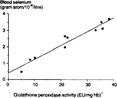
1 EU/mg Hb = enzyme units per milligram of haemoglobin.Source: Putt et al (1987).
The degree to which a straight line describes the relationship between two variables (X and Y) can be measured by the correlation coefficient (r). This coefficient has a value between -1 and + 1. A positive value indicates a positive relationship, i.e. large values of X are associated with large values of Y. and small values of X with small values of Y. A negative correlation means that large values of one variable are associated with small values of the other. A correlation of zero implies that there is no linear relationship between the variables (although in rare cases there may be a non-linear relationship). A value of exactly ± 1 implies that there is a perfect linear relationship between the two variables.
To calculate the correlation coefficient (r), it is first necessary to calculate the sum of squares for both variables in the same way as when calculating the variance. It is also necessary to calculate the sum of cross-products. The relevant formulae are:5
Sum of squares of X (SSX) = S x2 - (S x)2/n
Sum of squares of Y (SSY) = S y2 +-(S y)2/n
Sum of cross - products (SXY) = S xy - (S x) (y)/n
Then the correlation coefficient r is:
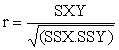
For Figure 12, the calculations are:
|
S x= 228.9 |
S x2 = 6578.65 |
|
SSX = 6578.65-228.92/10 = 1339.13 |
|
|
S y = 23.9 |
S y2 = 68.59 |
|
SSY = 68.59 - 23.92/10 = 11.47 |
|
S xy = (22.1 x 2.6) + (32.8 x 3.1) +... + (35.1 x 3.6)
= 667.45
SXY = 667.45 - (228.9 x 23.9)/10 = 120.38
r = 120.38/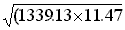 = 120.38/123.94 = 0.971
5 A number of pocket calculators can perform these calculations.
A correlation coefficient of 0.97 is very close to the maximum value of 1, and implies that there is a very strong relationship between glutathione peroxidase activity and whole-blood selenium. There are tables to test the statistical significance of the correlation coefficient, an abbreviated version of which is given in Table 16.
Table 16. Critical values for the correlation coefficient..
|
n |
Significance level |
n |
Significance level |
||
|
5% |
1% |
5% |
1% |
||
|
3 |
0.997 |
1.000 |
15 |
0.514 |
0.641 |
|
4 |
0.950 |
0.990 |
20 |
0.444 |
0.561 |
|
5 |
0.878 |
0.959 |
25 |
0.396 |
0.505 |
|
6 |
0.811 |
0.917 |
30 |
0.361 |
0.463 |
|
7 |
0.755 |
0.875 |
40 |
0.312 |
0.403 |
|
8 |
0.707 |
0.834 |
50 |
0.279 |
0.361 |
|
9 |
0.666 |
0.798 |
75 |
0.227 |
0.296 |
|
10 |
0.632 |
0.765 |
100 |
0.197 |
0.257 |
The calculated correlation coefficient has to be larger than the tabulated value to be statistically significant. (For negative correlations, the minus sign is ignored). For samples, a small correlation coefficient will be significant, which means that with large samples, weak relationships can be detected. Whether or not such a correlation is of practical significance will depend on the context and on the objectives of the study.
For instance, in our example, where r = 0971 and n = 10, the correlation coefficient is significant (P<0.01).
Linear regression
A correlation coefficient measures how closely a straight line represents the relationship, while linear regression is used to estimate the equation of the 'best' straight line. The resulting equation can then be studied and used, if desired, for prediction.
Regression assumes that the causal direction of the relationship is known by the researcher, i.e. which of the two variables studied influences the other. Let us now assume that the glutathione peroxidase activity influences the whole-blood selenium. In regression terminology, whole-blood selenium is called the dependent variable (Y), and glutathione peroxidase activity is called the independent variable (X).
The general equation of a straight line relating Y and X is:
Y = a + bX
where:
a = the intercept, and
b = the regression coefficient.
In this equation, when X = 0, then Y = a. Also, an increase of 1 unit in X results in an increase of b units in Y.
If we have data from a sample for which both X and Y are measured, then linear regression will estimate the values for a and b which give the best-fitting straight line.6 Once such a line is estimated, it can be used to predict a value of y for a given value of X.
6 A number of pocket calculators can perform these regression calculations.
|
Example: Using the sums of squares and cross-products calculated for the correlation coefficient on pages 279-280, the estimates for a and b are:
If SXY = 120.38, SXX = 1339.13
then b = 120.38/1339.13 = 0.090 So the estimated linear equation of the relationship between whole-blood selenium (Y) and glutathione peroxidase activity (X) is: Y = 0.33 + 0.090X This is the line drawn on Figure 12. Note that when X = 0, Y = 0.33, and if X is increased by 1, then Y is increased by 0.09. The equation Y = 0.33 + 0.090X can now be used to predict the whole-blood selenium (Y) from the glutathione peroxidase activity (X). For instance, when X = 30, the predicted value of Y is: Y = 0.33 + (0.090 x 30) = 3.03 |
Predictions such as that demonstrated above may be subject to considerable sampling variation. The calculation of standard errors and confidence intervals for these predictions is necessary but beyond the scope of this manual.7 Also, predictions become less accurate the further the X-value is from the mean of the sample X-values.
7 Details on such calculations can be obtained from standard textbooks, e.g. Snedecor and Cochran (1980), Steel and Torrie (1980), Draper and Smith (1981) and Mead and Curnow (1983).
Residual
Looking at Figure 12, it is obvious that the actual observed points do not lie exactly on the fitted line: they vary about the line in a random fashion. The difference between an observed value of y and its value as predicted by the equation is called the residual and is calculated as:
residual = observed Y-value - predicted Y-value
|
Example: If we take sheep 7 in Table 15, X = 21.2 and the observed Y = 2.7. The predicted Y = 0.33 + (0.090 x 21.2) = 2.24. The residual for this sheep, therefore, is 2.7 - 2.24 = 0.46, which means that the observed y-value is 0.46 higher than the value predicted from the regression equation. |
Residual variance
To measure how well the line fits the data, we measure the random variation about the line using the variance (or standard deviation) of residuals, known as the residual variance or error variance. The variance is also used in estimating the accuracy with which we have estimated the regression parameters a and b. The residual variance can be calculated using the sums of squares and cross-products which were calculated previously for the correlation (see page 280), as follows:
residual sum of squares RSS = SSY - (SXY2/SSX)
residual variance s2 = RSS/(n - 2)
|
Example: In our example with sheep, n = 10, SSY = 11.47, SSX = 1339.13 and SXY = 120.38. Therefore: RSS = 11.47 - (120.382/1339.13) = 0.649 s2 = RSS/(n- 2) = 0.649/8 = 0.081 and the residual standard deviation is: s = |
The regression line in Figure is only an estimate of the true line. If another sample of 10 sheep were to be taken, the resulting regression line (i.e. its coefficients) would be different. The estimates are, therefore, subject to sampling error.
The intercept (a) plays a minor role in many applications of regression, but the slope (b) is of considerable importance since it measures the response in Y to a-unit change in X. The standard error of b is a measure of the accuracy with which we estimate the true value, making it possible to determine a confidence interval for b. It is analogous to the standard error of the mean described on page 270-271 of this module, and the formula for its calculation is:
SE (b) =
where s2 = residual variance.
In our example:
s2 = 0.081
SSX = 1339.13
therefore:
SE(b) = (0.08/1339.13) = 0.0078
Confidence interval can now be calculated using the forumla:
b + t.SE(b)
where t = the tabulated l-value with (n-2) degrees of freedom.
|
Example: In our example, n = 10, the 5% l-value for 8 degrees of freedom from Table 10 is 231, and the estimate of b = 0.090. Therefore, a 95% confidence interval for b is: 0.090 + (2.31 x 0.0078) = 0.090 ± 0.018 i.e. it is between 0.072 and 0.108. |
Multiple linear regression analysis
When one dependent variable is related to one independent variable to examine the relationship which exists between them, the regression used is a simple linear regression. However, it is often desirable to relate the dependent variable (Y) to several independent variables (X) simultaneously, and this is known as multiple linear regression. The general formula for this regression, with p independent variables X is:
Y = a + b1X1 + b2X2 +... + bpXp
In this equation, bi is the regression coefficient for the ith independent variable Xj. It measures the increase in Y if Xj is increased by 1 unit and other independent variables are held constant. The parameter (a) is again called the intercept, and it is the value of Y when the independent X variables all have a value of zero.
|
Example: We may wish to determine from available data the effect of price (P), rainfall (R) and off-farm remittances (O) on the offtake rate of cattle (Y) by traditional producers in an area. The independent (or explanatory) variables in this case would be P. R and O. and the dependent variable would be the offtake rate (Y). The equation for a multiple regression model in this case would be: Y=A+ b1P b2R+ b3O The term b1 in this equation denotes the effect on offtake rate of a change of one unit in price, given that rainfall and off-farm remittances remain constant. The terms b2 and b3 are interpreted similarly. |
Estimating the effect of one of the independent variables on the dependent variable (while holding all other influencing variables constant) is, infect, one of the chief objectives of multiple linear regression analysis. Derived equations can then be used - as in simple linear regression - for predictive and explanatory purposes. The analysis is, however, far more complex than for simple linear regression, and computer packages will be needed in most cases to estimate the parameters and their standard errors.
It is beyond the scope of this manual to provide a detailed description of the technique; the reader should, therefore, refer to the literature, e.g. Snedecor and Cochran (1980), Steel and Torrie (1980), Draper and Smith (1981), Mead and Curnow (1983) and Gomez and Gomez (1984).
There are a number of traps in linear regression analysis which users should bear in mind, including:
· influential points
· non-linear relationships
· dangers of extrapolation
· mis-specification
· multi-collinearity, and
· auto-correlation.
Influential points. Examine Figure 13. It shows a regression line using the same data as Figure 12, but with just one additional point included (at X = 55, Y = 1.5). Note that this single point has an enormous influence on the regression line, completely distorting the results. The 'outlier' is easy to spot in a small data set, provided that a graph of the data has been drawn. With larger data sets, and with multiple regression, influential points may not be so obvious.
A useful and simple way of checking for such outliers is to calculate residuals for each point and plot them against the fitted values and against each of the independent variables (see Draper and Smith (1981) for examples).
Non-linear relationships. So far we have assumed that the relationship can be represented by a straight line. In biological and social systems, however, such linear relationships are often the exception rather than the norm. Nevertheless, a straight line in such cases may give a reasonable approximation over a limited range of data. If this is not possible, more complicated non-linear regression techniques may be needed. The linearity assumption can be easily checked for simple linear regression with a limited data set by plotting a graph. In more complicated situations, plots of residuals (as discussed in the previous paragraph) will prove useful.
Figure 13. Figure 12 with an added outlier
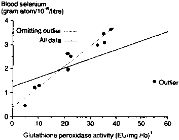
1 EU/mg Hb = enzyme units per milligram haemoglobin.
Dangers of extrapolation. You may have noticed that in Table 15 and Figure 12, the values of glutathione peroxide activity (X) are limited to the range 0 to 40. We concluded that, for this region of observation, X and Y (whole-blood selenium) were highly correlated, and that the relationship was linear.
These statements are satisfactory, provided that we confine them to the indicated region of observations. If, however, we should attempt to extrapolate for values which are well beyond the bounds of this region, we must be very cautious about making statements on the basis of our initial regression line. Such extrapolations should only ever be done when there are very strong grounds to assume that the linear relationship extends beyond the region originally studied.
Mis-specification. An implicit assumption underlying regression analysis is that the model has been correctly specified in the first place. It is assumed, for instance, that both the choice of the X variable(s) and the functional form which relates them to Y is correct. (An X variable should not be included in the equation unless there is a logical explanation for its effect.) If incorrect, such assumptions may mean that the conclusions drawn are not valid.
One way of checking for mix-specification is to try fitting alternative models which involve:
· examining the effect of dropping variables from the regression equation· testing non-linearity by adding the squared value of an independent variable to the model
· fitting non-linear relationships by assuming that independent variables have multiplicative (or proportional) effects (not additive, as is the case in multiple regression) and taking logarithms of the variables to give a more realistic model, and
· checking for 'interaction' effects by multiplying two of the independent variables to create an additional independent variable.
Multi-collinearity. In multiple linear regression, the isolation of the effects of each explanatory variable (Xi) on the dependent variable Y is often the prime objective. If the Xi variables are themselves related to one another and vary together as a result, isolating individual effects is virtually impossible. This is known as the problem of muti-collinearity. It commonly occurs in economic data which have a common underlying time trend.
Auto-correlation. The problem of auto-correlation occurs in a regression relationship where each residual is related to the residuals of neighbouring observations which are not independent of each other. This commonly occurs in the use of time series data. Auto-correlation can be detected by using the Durbin-Watson test (Draper and Smith, 1981).
Failure to account for the effects of auto-correlation can result in confidence intervals which are much narrower than they should be, and the results give an overly optimistic impression of the worth of a model because of the incorrect significance tests. More complicated statistical techniques than linear regression are needed to handle data with this problem.
Casley D J and Lury D A. 1987. Data collection in developing countries. Second edition. Clarendon Press, Oxford, UK 225 pp.
Cochran W G. 1977. Sampling techniques. Third edition. John Wiley and Sons, New York, USA. 427 pp.
Dagnelie P. 1973. Théorie et méthodes statistiques: applications agronomiques. Vol. 1. La statistique descriptive et les fondements de l'inférence statistique. Les Presses agronomiques de Gembloux, Gembloux, Belgium. 378 pp.
Dagnelie P. 1975. Théorie et méthodes statistiques: applications agronomiques. Vol. 2. Les méthodes de l'inference statistique. Les Presses agronomiques de Gembloux, Gembloux, Belgium. 463 pp.
Draper N and Smith H. 1981. Applied regression analysis. John Wiley and Sons, New York, USA. 709 pp.
Ehrenberg A S C. 1975. Data reduction. John Wiley and Sons, New York, USA. 391 pp.
Gomez K A and Gomez A A. 1984. Statistical procedures for agricultural research. Second edition. John Wiley and Sons, New York, USA. 680 pp.
Kish L. 1965. Survey sampling. John Wiley and Sons, New York, USA 558 pp.
Mead R and Curnow R N. 1983. Statistical methods in agriculture and experimental biology. Chapman and Hall, London, UK 335 pp.
Meadows S J and White JM. 1979. Structure of the herd and determinants of offtake rates in Kajiado District in Kenya, 1962-1977. ODI Pastoral Network Paper 7d. ODI (Overseas Development Institute), Agricultural Administration Unit, London, UK 28 pp.
Putt S N H. Shaw A P M, Woods A J. Tyler L and James A D. 1987. Veterinary epidemiology and economics in Africa: A manual for use in the design and appraisal of livestock health policy. ILCA Manual 3. ILCA (International Livestock Centre for Africa), Addis Ababa, Ethiopia. 130 pp. [Translated into French]
Snedecor G W and Cochran W G. 1980. Statistical methods. Seventh edition. Iowa State University Press, Ames, Iowa, USA. 507 pp.
Steel R G D and Torrie J H. 1980. Principles and procedures of statistics: A biometrical approach McGraw-Hill Book Company, New York, USA. 633 pp.
Yates F. 1981. Sampling methods for censuses and surveys. Fourth edition. Charles Griffin and Co Ltd. London, UK. 458 pp.
Zimbabwe Government. 1982. Communal Area Development Report 3: South Matabeleland. South Gwanda Baseline Survey, 1982. ARDA (Agricultural and Rural Development Authority), Harare, Zimbabwe. 81 pp.
The Livestock systems research manual is divided into two volumes.
Volume 1 contains:
Introduction (to the manual)
Module 1: Baseline data and explanatory surveys in livestock systems research
Module 2: Diagnostic surveys in livestock systems research
Module 3: Labour inputs
Module 4: Household budgets and assets
Module 5: Animal production
Module 6: Range resource evaluation
Module 7: Animal nutrition
Module 8: Animal health
Module 9: Livestock marketing
Module 10: Management pratices
Module 11: Organisation, presentation and analysis of resutls
Volume 2 contains:
Introduction (to Section 2)
Module 1: Definitions, problems and initial consideration in planning livestock on-farm trials
Module 2: design, implementation, monitoring and evaluation of livestock on-farm trials
Module 3: Analysing data from on-farm trials
International Livestock Centre for Africa
PO Box 5689, Addis Ababa, Ethiopia
Tel: (251-1) 61-32-15 · Telex: 21207 ILCA ET · Telefax: (251-1) 61-18-92 · Cable: ILCA/ADDIS ABABA
ISBN: 92-9053-173-2
![]()
![]()


 =
=  = 2.88
 = 100 x 2.88/4.4 = 65.5%
 )
) )2
)2 = 500, and
 = 120/
 = 17.0
 = 30
= 30
 = t
= t
 =
=  = 10 or n= 100
 i) Standard deviation (Si)
 1 = 11.3) is significantly different from that for non-sellers (
 2 = 8.9). In this context, the word 'significant' has a specialised statistical meaning. A difference is said to be statistically significant if there is a small probability that the difference could be caused by sampling variation.
 1 -
1 -  2
2
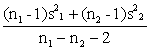
 . This value has n1 - n2 - 2 degrees of freedom.

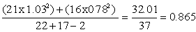
 = 0.93
 =0.93 x 0.104= 0.30
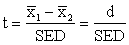
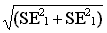
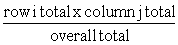
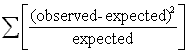
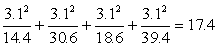
 and a =
 = 22.9, and
  = 239
= 239
 = 0.29