The Fisheries Department of the Food and Agriculture Organization of the United Nations keeps track of fisheries productions throughout the world. This data is stored in the FISHSTAT program. Acopy is available through:
1. The world wide web: http://www.fao.org/fi/statist/FISOFT/FISHPLUS.asp.
2. E-mail: [email protected].
3. Normal mail: Senior Fishery Statistician, FIDI, FAO, Viale delle Terme di Caracalla, 00100 Rome, Italy.
Obviously the preferable way to get the program is to download it from the internet, so that you can work with the data immediately and have the most up to date data. A summary file has been compiled for use with this manual (the file ‘world fisheries production.dbf’, in the folder: RW_01_World_fisheries). This file contains the following fields:
Joincode (a number, specific to the country);
Country (containing the country names);
Total (containing the total fisheries production of the country [all data in this file concern with the year 1999 and are in metric tonnes]);
Inland_cap (containing the inland capture fisheries production of the country);
Marine (containing the marine capture fisheries production); and
Aquacultur (containing the aquaculture production of the country).
Join this file to the Theme ‘World.shp’ (in the folder: ‘RW_01_World_fisheries’). The ‘World.shp’ Theme contains the world map that was used during the World Food Summit in 1995. Per country the map contains one polygon. Furthermore the file contains per country the following data (fields), among others:
Shape (here a polygon);
Cntname (unique abbreviation of the country name);
Country_name;
Ha (the total area of the country, including economical zones, in hectares);
Pop95 (estimated size of population in 1995);
Join_code (a unique number specific to the country, equal to the joincode number in World fisheries production.dbf) (Figure 17.1).
FIGURE 17.1
Attributes of
‘World.shp’
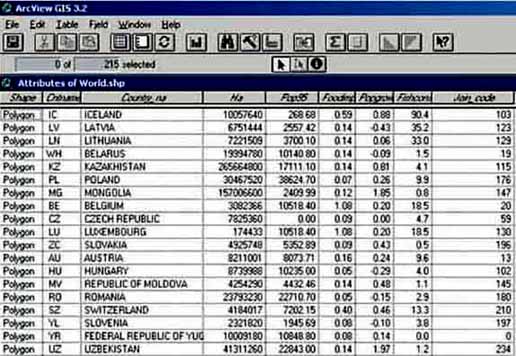
Add the Theme ‘World.shp’, open the attributes table and verify whether or not you see all fields mentioned above. Add the file ‘world fisheries production.dbf’ to the tables, open it and check whether or not all above mentioned fields are there. Now we are ready to join ‘attributes of World.shp’ and ‘world fisheries production.dbf’. Join both tables with the Joincode and Join_code fields. (remember that the ‘world fisheries production.dbf’ file is the file that contains the data [the source table] you want to join). If you do not remember how to join tables, please review chapter Joining data with location on a map, on page 23.
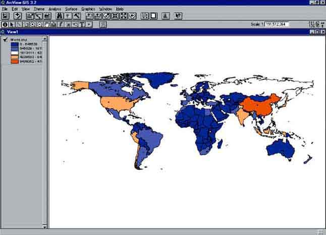
After joining both tables, go to View and have a look at the map (Figure 17.2). Change with the legend editor the legend type into Graduated Color, with as classification field Total and Blues to Oranges dichromatic in the color ramp. By doing this the result will be a world map with the countries with the lowest fisheries production in Blue and the countries with a high fisheries production in Orange.
FIGURE 17.2
World fisheries production
Filtering
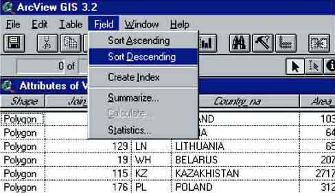
The produced map shows clearly that China had the highest fisheries production in the world in 1999. Have a look at the data in more detail. Open the ‘Attributes Table of World.shp’(Figure 17.3) (either by pressing the Attributes button in the Tool bar, or by going to the project screen [close the view window], clicking on the tables icon, and then clicking on ‘Attributes of World.shp’). After opening the ‘Attributes of World.shp’ table we’ll see: You need to sort the data according to Total fisheries production. First press the field heading ‘Total’. Now sort the data descending, so that China will be on top of the list. Click on Field/Sort Descending via the menu bar (Figure 17.4).
FIGURE 17.3
Attributes of
‘World.shp’

FIGURE 17.4
Sort Descending menu
The window that pops up shows the ‘Attributes of the world.shp’ table sorted on total fisheries production. The country with the highest production in the world is China, with a production of 47 499 759 metric tons of fish in 1999. Peru follows as second in the list with 8 439 351 metric tons. The production of China is more than 5.5 times higher than second placed Peru. This will have an effect on the way we can see differences between the countries.
What if you want to produce a map without China, so that you will get a clearer picture about the differences between the other countries? Have a try: first close the ‘Attributes to world.shp’ table, and go to the view of ‘World.shp’. Now click on: Theme/Properties via the menu bar (Figure 17.5).
FIGURE 17.5
How to get to the Theme Properties
window
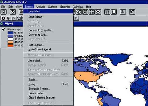
The Theme Properties window pops up. Make sure there’s a square around the Definition Icon.

Press the Query Builder button. 
The Query Builder window will pop up. Here you will be able to filter which countries are going to be shown (or will not be shown). Filter on the field [Country_na], in other words: double click on [Country_na] in the Fields select box. You will see that [Country_na] will appear in the bottom Query Builder box. Now select (double click) the sign <>, which means ‘unequal to’. Also this will appear in the Query Builder box. The last action will be to select (double click) ‘China’ from the values screen (Figure 17.6).
FIGURE 17.6
A built query
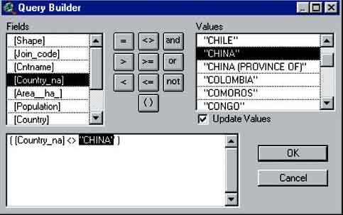
Verify that the Query Builder looks the same as the above example. Now press OK. The Query Builder will disappear and you will see the view of ‘World.shp’ with the Theme Properties window on top of that. Press OK in the Theme Properties window. Anew view appears, a map of the world without China (Figure 17.7).
FIGURE 17.7
View of the world without
China
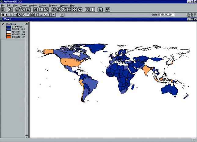
FIGURE 17.8
World fisheries production without
China
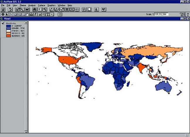
The map didn’t change in its legend, so there’s still no clear difference between the different countries in the world. Let’s change that. Go to the Legend Editor, change the Classification field to None, and back to Total. Make sure the Color Ramps are still on Blues to Oranges dichromatic and press Apply, close the Legend Editor and have a look at the result (Figure 17.8).
Now it becomes clear that after the high producer China, the other high producers are to be found in Asia and the Americas. Striking is that the countries in Africa all belong to the low producers.
To get the complete worldmap back you simply remove the query in the Theme Properties by pressing the Query Builder button, deleting the Query, Press OK, again press OK in the Theme Properties screen, re-edit the legend in the legend editor.
Calculate
You have seen how to make a world map with the world fisheries data, clarify this map by removing the country with the highest fisheries production (China), but what about the productions per capita? If we want to see those, we first have to do some calculations which also can be done in ArcView.
From the view of ‘World.shp’ go to the (new, joined) attributes of this Theme. First we have to add a field where we can put the results of our calculations. Go to: Table/Start Editing via the menu bar (Figure 17.9).
FIGURE 17.9
Start editing attributes table of
‘World.shp’
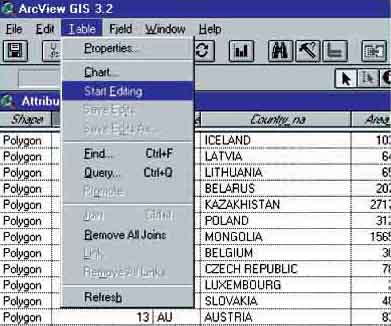
When you do that, you will see the lettertype of the field headers change from italic to normal (only the fields that are shown with normal lettertypes can be edited). Now we can edit the table. To add a field we go to Edit/Add Field. A Field Definition box pops up where we can define the different properties of the new field (Figure 17.10). In the Name field we’ll put the name: ‘Production per capita’, Type field is ‘Number’, Width is 16, and for ‘Decimal Places’ we will put 3.
FIGURE 17.10
Field definition pop-up for added
field
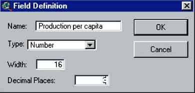
After pressing OK you will get a message saying: ‘Field name too long. ArcView will truncate field name and use original name as alias. Continue?’. Press Yes and see the new field appear at the right end of the table. You can also see that the header is ‘pressed’(Figure 17.11).
FIGURE 17.11
Attributes table of World.shp with added
Field

Now the calculation can start. Make sure the header of the field production per capita is ‘pressed’. Press the calculate button. The Field Calculator window pops up.
The field calculator has four parts; ‘Fields’ where you can choose with which fields you make your calculations, ‘Type’ which defines the fields with which you do the calculations, ‘Requests’ where you can define which calculations you want to make, and a field where you see the formula that you make. For the field production per capita we want to calculate how much fish is produced per capita in each country in kg/capita. So you have to divide the field Total by the field Pop95. First double click in the Fields part on [Total]. You will see [Total] appear in the bottom field. After this you go to the Requests part and double click a /. Also the slash you will see appearing in the fourth part. Now the last field we’re going to put in, double click on [Pop95] and see it appear in the fourth part (Figure 17.12).
FIGURE 17.12
The Field calculator ready to perform the
calculation
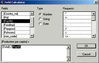
Press OK.
You will notice that the numbers in the production per capita field are very low. Why is this?
As you might have guessed we have calculated the production in metric tons per capita, while we want to get kg/capita. So we have to do the exercise again. Follow the above described procedure, after putting the [Population] in, also type *1000. By doing this you calculate the production per capita in kg/capita. If you now look at the attributes you will see that the figures are changed.
It is now possible to make a map with the production/capita (production per capita) figures. Go to View and go to the legend editor (Theme/Edit Legend). Change the Legend Type into Graduated color, the Classification Field into ‘Production per capita’ and press Apply.
What strikes is that China isn’t among the high producers anymore, but that now Iceland, Greenland and Chile immediately show up on the map as having a high production per capita. If in the legend editor you go to Classify and there change the Type into Equal Area[28], press OK and Apply you will see the map change into (Figure 17.13).
FIGURE 17.13
World fisheries per capita
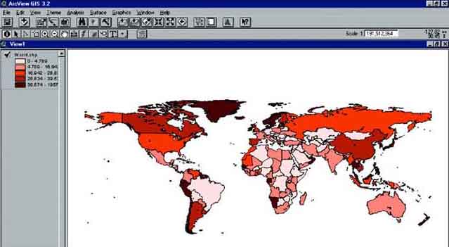
Try now to make maps which show Aquaculture production per capita (kg/capita), Inland Water capture fisheries production per hectare (kg/ha), and Marine capture fisheries production per country.
This exercise is based on the work of de Graaf and Ofori-Danson (FAO, 1997b) in the FAO project: Integrated development of artisanal fisheries (IDAF). Lake Volta (Figure 16.14) was formed as a result of the damming of the Volta River by the Akosombo dam in 1964. The created lake has a surface area of about 8 400 km2 or 3.6 percent of the surface area of the country, a shoreline length of 4 800 km, a maximum depth of 70 m and a mean depth of 19 m. Trees were not removed before the creation of the basin and the existing tree stumps have a considerable impact on fisheries and navigation on the lake. It was early realized that the building of the dam would have major effects apart from power production. These effects were primarily the effects on public health, transportation and the development of a new fishery.
From its creation in 1964 till 1977 fisheries was monitored thoroughly by a number of projects and Institutes. A first full frame survey, carried out in 1970 and repeated in 1975, indicated that 13 800 canoes were operated by 20 600 active fishers. The catch of Lake Volta was monitored since 1969 with a stratified catch and effort monitoring system, whereby the lake was divided in seven strata. Total catch during the period 1969-1977 is presented in Table 17.1.
TABLE 17.1
Estimated catch of Lake Volta
1969-1977
|
Year |
Estimated catch |
|
1969 |
61 700 |
|
1970 |
39 200 |
|
1971 |
39 000 |
|
1972 |
36 000 |
|
1973 |
35 900 |
|
1974 |
37 300 |
|
1975 |
41 900 |
|
1976 |
40 700 |
|
1977 |
38 300 |
After 1977 the monitoring system on Lake Volta deteriorated and in 1995 major questions were:
How many fishers are present at Lake Volta?
What is the fisheries production?
IDAF set up, and carried out a full frame survey in Stratum 7 of Lake Volta, which lies between longitude 0° 10’ west to 1° 05’ west and latitude 8° 8’ north to 8° 20’ north and extends for about 60 km south and 50 km north of Yeji (Figure 17.14).
FIGURE 17.14
Lake Volta with stratum 7 (in
red)
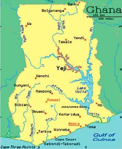
During the frame survey all villages were visited. In the villages interviews were held with groups of fishers. The following information was collected:
Name of the village, when it was created and the number of ethnic groups in the village.
Number of families, number of people per family, number of fishers per family.
Number of canoes, number of winch boats, number of gill nets per canoe, crew number, major fishing gear, and target species.
Transport facilities to the main market of Yeji and schooling for children.
The number of ovens used to smoke the fish and the number of Chokor ovens.
Description of the situation in the stratum 7 of Lake Volta
The fisheries can be characterized by the use mainly of two types of boats:
A canoe, owned and operated by a family using gillnets, hook and line, traps, or similar equipment.
A Winch-boat, mostly owned by large traders and operating with a hired crew of around 10 people, using a small purse seine in the deeper water.
There are almost no roads in the area and most of the transport of goods and people is done with large transport boats. Almost all fish is smoked or salted and sold once a week to large traders at the fish market of Yeji. Most of the fish is smoked in traditional ovens which use a considerable quantity of wood. Deforestation of the shorelines is a major problem and risk for Lake Volta. Therefore the project introduced the use of the Chokor oven which uses less fuel wood. All data are digitized and can be used to carry out a preliminary analysis in GIS in the following exercise.
1. Open ArcView, Open a New Project, and Open a New View. Set the working directory. Make sure the extension MrSid Image Support is installed (go via the menu bar to: File/Extensions..., and check the box of MrSid Image Support). This extension makes it possible to work with satellite images.
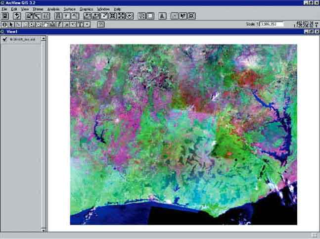
2. Add the Theme ‘N-30-05_loc.sid’ from the ‘RW_02_Lake_Volta’ folder to the View. Make sure you have ‘Image Data Source’ in the Data Source Types: selection box. Check the legend checkbox of the Theme, and wait a while, as this is a very big file. After waiting you will see Figure 17.15. This is a picture of west Central Africa, and if you look on the right hand side, you will see Lake Volta. Compare this picture with Figure 17.14.
FIGURE 17.15
After loading the
‘N-30-05_loc.sid’ Theme
You are now requested to make an analysis of the situation in Stratum 7 of Lake Volta, the part where the IDAF project was situated. This analysis should include:
An ArcView-project with which people can get an impression with photographs of the fisheries in Lake Volta.
A Theme indicating the canoe, winch boat distribution over the villages, where also the number of fishers per village is indicated.
A Theme (or several maps) showing socio-economic data (like average family size per village, the number of fishers per family per village, villages with chokor ovens).
A Theme (or several maps) showing fisheries data (like distribution of gillnets and beach seines over the villages, indicating which villages target Tilapia, or Chriysichtys, average number of crew per canoe over the villages, the number of gillnets per canoe over the villages).
A Theme which shows the position of the Akosombo dam downstream of Lake Volta.
For this you have the following data available in the ‘RW_02_Lake Volta’ folder: N-30-05_loc.sid: The satellite image you have opened before of Central west Africa, with Lake Volta on the right-hand side.
DATA_FRAME_SURVEY.xls[29]: The file containing the data of the frame survey done by the IDAF project. For a description of the data, see the description of the frame survey on the previous page.
Stratum 7.shp: The Stratum 7, The area of the IDAF project.
Chokor.bmp: A photograph showing the Chokor oven, a fuel efficient oven to smoke fish.
Shoreline.bmp: A photograph showing the shoreline of Lake Volta. Pay special attention to the bare trees on the wateredge.
Brush park.bmp: A photograph showing the nifa nifa system. This system is specific for Lake Volta to catch Tilapia. At night the nets are lowered, after which the Tilapia gets stuck in the net, and can get harvested.
Yeji Market.bmp: The place where fish is being sold.
Landing catch.bmp: Close to Yeji market the fish is being landed, do you see the fisheries officer of IDAF collecting the data?
Photo_location.shp: A point Theme showing the locations where the above three pictures were taken.
Roads.shp: The roads close to the Stratum 7 area.
Sinaloa (Figure 17.16) is one of Mexico’s major fishing states. It ranks first in terms of commercial value of output and fourth place in terms of volume of the catch. The shrimp catch, which accounted for more than one third the national total in the past five years, is of prime importance.
The state’s fishing industry is primarily a supplier of fresh products. Approximately 95 percent of output is for direct human consumption, and the remaining 5 percent is processed in 119 plants. Spectacular growth has been seen in Sinaloa’s aquaculture in recent years. In 1987 there were only 27 fish or shirmp farms, in 1995, that number had climbed to 138. In the same period output of shrimp farms rose from 585 metric tons to 8 725 metric tons.
FIGURE 17.16
Sinaloa state
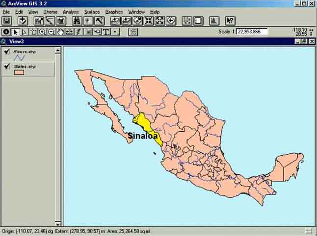
The artisanal marine catch of Sinaloa is recorded by 10 fisheries offices and data recorded over the period 1990-1999 can be analysed with GIS[30]. The major objective of this exercise is to show linking of data which is not covered in the first part of the manual.
To complete the exercise you will have to perform the following tasks:
Map the office locations onto a base map of Sinaloa State.
Link a data table of catch statistics to the map of office locations.
Create a map showing the average catch of selected species per office.
To complete the task, you will need to use the following ArcView Themes and data tables:
‘Sinaloa.shp’(map of Sinaloa).
‘Water.shp’(map of all water features (lakes, rivers etc.) in Sinaloa).
‘Fisheries Offices.shp’(map of fisheries offices and their location).
‘Catches.dbf’(data table of catch statistics).
1. Open ArcView, New project, new View.
2. Add the Themes ‘Sinaloa.shp’, ‘water.shp’ and ‘fisheries offices.shp’ from the ‘RW_Mexico’ folder.
3. Close the new View and Add the table ‘Catches.dbf’ from the ‘RW_Mexico’ folder.
4. Open the ‘catches.dbf’ table and you will see that it contains 23 fields:
Ofcode - a code assigned to each office;
Year - year when catch data was recorded;
Bandera, Banqueta...Tiburon - catches (in tonnes) of fish per species, the Scientific and English common names are provided in Table 17.2;
Total - total catch (in tonnes) of all species.
The first step would be to join the fisheries data in the table with the location of the fisheries offices and this can be done by using the ‘Ofcode’ in both themes. However, if you do this the way explained in the chapter: Joining data with location on a map on page 22, you will see that not all data of the catch table will be joined with the attribute table of the fisheries offices. The problem is that the Catch data table contains more then one row (= a record) of data, one row for each year, for each office location (Figure 17.17).
FIGURE 17.17
Multiple data per fisheries
office
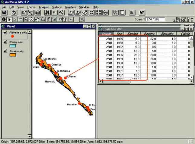
This is what in GIS is called a ‘One-to-Many’ relationship. If you join the ‘catches.dbf’ table with the ‘fisheries offices.shp’ Theme, ArcView will take the first related record from the table, and ignore the additional records for each office. In these cases, you should link the tables instead.
5. Open the ‘catches.dbf’ table, tile the window, open the ‘attribute of fisheries offices.shp’ table, tile the window. Activate in both tables the field name ‘ofcode’. To link the two tables, from the Table menu choose Link (Figure 17.18).
FIGURE 17.18
Linking two tables
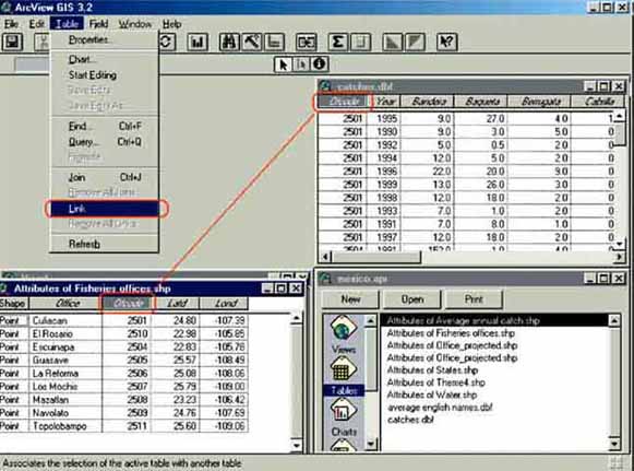
If you look at the ‘Attribute of Fisheries offices.shp’ table you will see that nothing has changed after this action. But the two tables are linked which you can see with the select feature tool:
6. Make the View window active and use the select feature tool
to select any of the offices, i.e. by clicking on the office locations in the view window. All linked records in the catches.dbf table will be selected (selected records are highlighted in yellow). Once an office and its associated records in the ‘catches.dbf’ table have been selected, they can be grouped together into a single block.
To do this, first make the ‘catches.dbf’ table active, and then click
the promote records button ![]() .
This moves all highlighted records to the top of the data table.
.
This moves all highlighted records to the top of the data table.
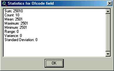
Statistics for the selected records are obtained by first clicking on a column header in the ‘catches.dbf’ table, then from the Field menu choose Statistics (Field/Statistics...) (Figure 17.19 and Figure 17.20). If no records are selected then statistics will be given for all records in the chosen column.
FIGURE 17.19
How to get statistics on selected
records
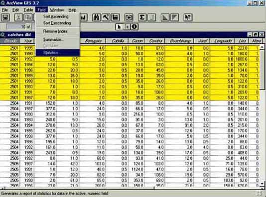
FIGURE 17.20
The statistics window
Please answer the following questions by selecting offices from either the table or the map and examining the associated catch data:
7. Find the mean catch of Berrugata recorded at the Los Mochis office for the years 1990 to 1999.
8. For the Mazatlan office, find the maximum recorded catch of Tiburon and the year when it was recorded.
9. Find the total recorded catch of all species at the Topolobampo office for the entire ten year period.
10. Which office recorded the highest catch of Lenguado in 1995, La Reforma or Guasave?
11. Lisa (Mugil cephalus) is the most common species caught by artisanal fishers in the coastal waters of Sinaloa. (You will need to examine the statistics of each office in turn to answer some of these questions).
12. Which office recorded the highest mean catch of Lisa over the entire ten year period?
13. How many offices recorded a mean catch of over 100 tonnes?
14. Is there a spatial pattern in the distribution of catches, e.g. high catches in the north, low catches in the south?
You may have noticed that some species are caught in greater abundance than others. The top three species or species groupings in terms of mean catches over the ten year period are:
Lisa, Mugil cephalus.
Cazon, juveniles of several shark species.
Tiburon, Carcharhinus spp.
The data for Lisa, Cazon and Tiburon will now be extracted from the catches data table and examined in more detail.
15. Make the ‘catches.dbf’ data table active and click on the column header labelled ‘Ofcode’. From the Field menu choose Summarise.... In the Summary Table Definition dialogue box that appears, select ‘Cazon’ from the Field: pull-down menu and ‘Average’ from the Summarize by: pull-down menu. Click Add. Repeat the procedure for Lisa and Tiburon. Click Save As, navigate to a folder where you can save the file and enter an appropriate file name. The Summary Table Definition dialogue box should something like this:
FIGURE 17.21
Summary Table Definition
16. Click OK to create the summary table file.
The summary table can now be joined to the ‘Fisheries offices.shp’ Theme. Click on the ‘Ofcode’ column header in the summary table and then the ‘Ofcode’ column header in the ‘Attributes of Fisheries offices.shp’ table. From the Table menu choose Join. The summary table should now be joined to the ‘Attributes of Fisheries offices.shp’ table.
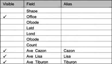
The table contains unnecessary data and can be tidied up. Make the ‘Attributes of Fisheries offices.shp’ table active. From the Table menu choose Properties.... In the Table Properties dialogue box make sure that a tick only appears alongside the ‘Office’, ‘Ave_Cazon’, ‘Ave_Lisa’, and ‘Ave_Tiburon’ fields by clicking in the ‘Visible’ column to remove ticks from unwanted fields. In the ‘Alias’ column, type ‘Cazon’ alongside the ‘Ave_Cazon’ field, ‘Lisa’ alongside the ‘Ave_Lisa’ field and ‘Tiburon’ alongside the ‘Ave_Tiburon’ field (Figure 17.22).
FIGURE 17.22
Cleaning up a table
17. Click OK to save the changes to the table properties.
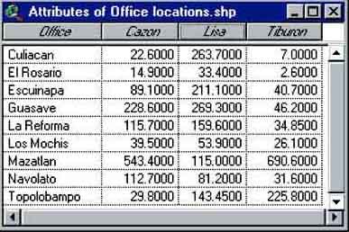
In the ‘Attributes of Fisheries offices.shp’ table increase the width of the columns so that all of the data and column headers are clearly visible. The table should now look like Figure 17.23.
FIGURE 17.23
The Attributes of office
locations
The data for ‘Lisa’, ‘Cazon’ and ‘Tiburon’ can now be plotted on the map of office locations (Figure 17.24).
FIGURE 17.24
The data of different fish species per
fisheries office
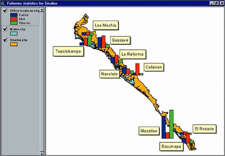
TABLE 17.2
Spanish, Scientific and English fish species
names
|
Spanish name |
Scientific name |
English Name |
|
Bandera |
Bagre Panamensis |
Chilhuil sea catfish |
|
Baqueta |
Epinephelus acanthistus |
Rooster hind |
|
Berrugata |
Menticirrhus panamensis |
Panama king kroaker |
|
Cabrilla |
Myctoperca rosacea |
Leopard grouper |
|
Cazon |
Nasolamia velox |
Whitenose shark |
|
Corvina |
Cynoscion nebulosus |
Spotted weakfish |
|
Guachinango |
Lutjanus spp |
Snapper |
|
Jurel |
Caranx latus agassiz |
Horse-eye jack |
|
Lenguado |
Hippoglossina tetropthalma |
Fourspot flounder |
|
Lisa |
Mugil cephalus |
Flathead mullet |
|
Mero |
Enicephalus itajara |
Itajara |
|
Pampano |
Trachinotus carolinus |
Florida pompano |
|
Pargo |
Lutjanus argentiventris |
Yellow snapper |
|
Pierna |
Caulolatilus princeps |
Ocean whitefish |
|
Rayas |
NA |
NA |
|
Robalo |
Centropomus undecimalis |
Common snook |
|
Ronco |
Pomadasys panamensis |
Panama grunt |
|
Rubia |
Lutjanus inermis |
Golden snapper |
|
Sierra |
Scomberomorus sierra |
Pacific sierra |
|
Tiburon |
Echeneis naucrates |
Live shark sucker |
Fisheries in Bangladesh[31]
Fish plays an important role in the daily life of many people in Bangladesh, as it is a country of rivers and floodplains, with a high potential of aquatic resources. The Bengali expression ‘Mache bhate Bengali’, or ‘Fish and rice make a Bengali’, expresses this importance. Bangladesh produces 1 500 000 tonnes of fish annually (FAO, 2000). Inland capture fisheries and aquaculture are the main contributors to this production. About 12 millions people depend on fisheries, of which 1.2 millions are fulltime dependent on fish and fishing activities (de Graaf et al., 2001).
Fish production in Bangladesh, as in other floodplain areas in the world, cannot be properly considered without knowing the specific characteristics. Reproduction and growth of fish and prawn in Bangladesh are strongly related to the sequence of flooding (Junk, Bayley and Sparks, 1989). The floodplains, which are inundated during the monsoon season, are nutrient and food rich and play a significant role for 4-5 months of the year. Larvae, juveniles and adults grow in this habitat, after which they migrate back to rivers or depressions at the end of the monsoon, when waters recede. In this period the fish are more vulnerable to fishing.
Habitat stratified fisheries monitoring
Inland fisheries are traditionally monitored through so-called catch and effort monitoring systems. Where effort (F) is the number of fishers, or the number of gears, operated in a waterbody, and catch (CPUE) is the daily catch harvested per fisherman, or gear. The total catch (C) is obtained by multiplying the catch per fishers (or gear) (CPUE) with the total number of fishers (or gears) (F). A prerequisite for a catch and effort monitoring system is that the total effort (F, the total number of fishers (or gears) operated) is known.
This would mean for floodplain fisheries monitoring that an incredibly large number of households would have to be followed throughout the year, because most of the catch is not landed centrally, but is taken home and consumed (as for instance 60-70 percent of the rural population on the floodplains of Bangladesh is engaged in ‘subsistence fishing[32]). This large household survey would be very costly, making a traditional catch and effort monitoring system not an attractive option.
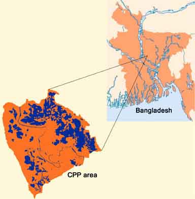
The Compartmentalization Pilot Project (CPP), a water management project in Bangladesh (Figure 17.25), developed a more practical monitoring system over the period 1992-2000. This habitat fisheries monitoring programme was based on traditional catch and effort data recording, and was combined with hydrological modelling developments[33], resulting in a final analysis in a GIS environment.
FIGURE 17.25
The CPP project in
Bangladesh
Basic principles of habitat stratified floodplain fisheries monitoring
The principle of the fisheries monitoring programme developed by CPP is a stratification of catch and effort monitoring. Stratification means that the area to be monitored is divided into different habitat-types. Of each different habitat type a small part was selected, becoming a representation for the habitat type. These standard sites were monitored closely with a normal catch and effort monitoring programme. The results of these small monitoring programmes were extrapolated, per habitat type, over the whole project area.
The estimation of the total catch followed three steps:
The Catch per Unit of Area (CPUA) for each type of habitat was determined as accurately as possible with traditional catch and effort monitoring.
The total flooded area (A) for each type of waterbody (or habitat type) was determined as accurately as possible with GIS.
The total catch per type of waterbody (or habitat type) was determined by multiplying the catch per unit of area with the actual area. (CPUA * A = total catch).
Stratification of the CPP area, or criteria and principles
The waterbodies/habitat types (Figure 17.25) in the floodplains of Bangladesh can be classified as:
Beels: These are the low-lying depressions in the floodplain (small lakes). They may have a permanent character, containing water throughout the year (permanent waterbodies) or dry out completely in the dry season, usually for a period of 4-5 months (seasonal waterbodies).
Floodplains: Land inundated during the monsoon because of rainwater congestion and river flooding.
Rivers and canals.
FIGURE 17.26
Cross-section of a typical floodplain
system in Bangladesh
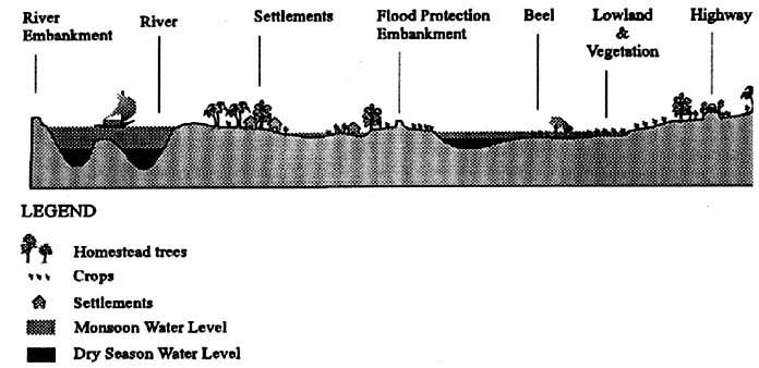
Classification and selection of rivers and canals is straightforward, but the classification and selection of beels and floodplains is more complicated, as they are hydrologically linked and very dynamic. The following figure shows this extremely dynamic character, where the floodlevels and the inundated area of the floodplain in the CPP area during the months April, June and September are presented.
FIGURE 17.27
Water level and inundated area of a
floodplain system at three moments during the year

In April, there is no inundated floodplain, and the average water depth in the beel, which covers an area of 100 ha, is 1 metre.
Two months later, in June, there is on average 0.3 metres of water in the floodplain, which at this time covers an area of 1 200 ha, while the average water depth in the beel has increased to 2 metres and the beel covers an area of 150 ha.
Another two months later, in September, there is on average 0.3-1.5 metres of water in the floodplain, depending on where you are, and an area of 2 000 ha of floodplain is inundated.
The time intervals in this illustration are quite big (two months), but even within one month during the flood season water levels may vary significantly. This phenomenon makes it difficult to use water levels as selection criteria for habitat fisheries monitoring, as it would mean that these habitats would not be fixed in one place. This was the reason why the fisheries team of the CPP project looked for other criteria to classify habitats. These criteria needed to be quantifiable, replicable, usable all over Bangladesh, and practical.
In Bangladesh all land is classified (by the Master Planning Organization, MPO) for suitability of agriculture practices. This MPO classification is well known by large groups of planners, scientists, departments, farmers, and could be described as a flooding risk classification of land. After careful consideration it was concluded that this system could be used for the habitat fisheries monitoring programme in the CPP project. The MPO classification classifies land according to the risk of flooding for three consecutive days with a certain maximum water level. This risk of flooding determines which type of crops can be grown during the monsoon season. The different classes with their criteria are in Table 17.3, you see that fishing is carried out mainly in the F3 and the F2 lands.
TABLE 17.3
Land classification according to the Master
Planning Organization, Bangladesh
|
Maximum flooding depth for three
days |
Landtype |
Risk of flooding |
Land use during the monsoon |
|
0-30 |
F0 |
Very low risk of flooding |
sugarcane, vegetables, rice |
|
30-90 |
F1 |
Low risk of flooding |
rice |
|
90-180 |
F2 |
High risk of flooding |
rice, floating rice, fish |
|
>180 |
F3 |
Certainly flooded |
floating rice, fish |
The landtypes in a certain area only change if the water management in that area is changed. This happened for instance with the CPP area. Before the 1970s, the CPP area was more or less an unprotected floodplain. Large areas were flooded annually, and large areas were classified as F3 and F2. An embankment around the area was built in the 1970s, which highly reduced the risk of flooding, resulting in a reclassification of a large area of land previously classified as F3/F2 into F2/F1.
The developers of the habitat-stratified floodplain fisheries monitoring programme assumed that data obtained from a landtype site was representative for the total flooded area of this landtype, irrespective of the actual water level measured at that site. For instance, if the catch in 10 ha of flooded F3 land was well monitored during a certain period, it was considered representative for the total area of flooded F3 land during this period. This assumption allowed concentrating on the fixed sites within the project area. As a result a sound analysis was possible, considering even the limited amount of resources.
The monitoring programme
The goal of the stratified monitoring programme was to estimate the monthly CPUA of the different habitat types (in this exercise the different landtypes, F2 and F3), and to estimate monthly what the flooded area was of the different habitat types (F2 and F3). With these figures it was possible to estimate the monthly catch per habitat type (CPUAFx * AreaFx = Catch of the habitat type Fx). Adding the results of the different habitat types resulted in the total catch from the floodplains of the project area (CatchF2 + CatchF3 = Total catch).
To be able to establish the monthly CPUA per landtype (F2 and F3) several sites were selected that were representative for all other sites with the same landtype. The area of these sites was measured accurately, so that after establishing the monthly catch per site, the monthly CPUA per landtype was easy to establish ([Monthly catch]/[Area] = CPUA).
Two surveys were done at the selected sites:
Catch assessment survey: provided information on the average monthly catch per fishers (CPUE) at a selected site. The daily catch of every individual fisherman was monitored regularly at each site. The numbers and weight of the dominant species in the catch were recorded. Furthermore, the gear-type, its mesh size, owner status and the number of units used per fisherman were recorded.
Frame survey: provided information on the average number of fishers (F) operating at a selected site. It consisted of regular standardized counting of the number of fishers, and gears used.
From these two surveys the average monthly catch could be established per site (CPUE * F = Catch), after which the CPUA of the landtype the site represented could be established ([Catch] / [Area] = CPUAFx).
Using GIS, the total inundated area per landtype was determined, after which it was possible to estimate the total catch ([CPUAF2 * AreaF2] + [CPUAF3 * AreaF3] = Total Catch).
Figure 17.28 shows the sites which were monitored for eight years in the CPP area. Data from the sampled sites you can find in Table 17.4 and Table 17.5.
FIGURE 17.28
Sampling sites of the fisheries
monitoring programme in the CPP project area
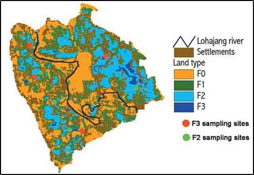
TABLE 17.4
Fisheries data (1997) from F3 sampling
sites
|
Month |
Number fishers per day |
Catch per fishers per
day |
Daily Yield in sampled Area |
Monthly yield |
Sampled Area |
CPUA |
|
January |
3 |
0.68 |
2.04 |
63.24 |
4.22 |
14.99 |
|
February |
3 |
1.07 |
3.21 |
89.88 |
3.60 |
24.75 |
|
March |
3 |
0.87 |
2.61 |
80.91 |
3.77 |
21.46 |
|
April |
3 |
1.06 |
3.18 |
95.40 |
7.19 |
13.27 |
|
May |
6 |
1.13 |
6.78 |
210.18 |
8.90 |
23.62 |
|
June |
6 |
1.41 |
8.46 |
253.80 |
10.01 |
25.35 |
|
July |
8 |
0.63 |
5.04 |
156.24 |
17.10 |
9.14 |
|
August |
5 |
0.75 |
3.75 |
116.25 |
17.80 |
6.53 |
|
September |
11 |
1.28 |
14.08 |
422.40 |
17.80 |
23.73 |
|
October |
15 |
3.06 |
45.90 |
1 422.90 |
12.23 |
116.35 |
|
November |
8 |
0.96 |
7.68 |
230.40 |
6.52 |
35.34 |
|
December |
4 |
0.91 |
3.64 |
112.84 |
5.63 |
20.04 |
TABLE 17.5
Fisheries data (1997) from F2 sampling
sites
|
Month |
Number fishers per day |
Catch per fishers per
day |
Daily Yield in sampled Area |
Monthly yield |
Sampled Area |
CPUA |
|
January |
9 |
0.74 |
6.66 |
206.46 |
11 |
18.77 |
|
February |
0 |
0.00 |
0 |
0 |
11 |
0 |
|
March |
0 |
0.00 |
0 |
0 |
11 |
0 |
|
April |
0 |
0.00 |
0 |
0 |
11 |
0 |
|
May |
0 |
0.00 |
0 |
0 |
11 |
0 |
|
June |
0 |
0.00 |
0 |
0 |
11 |
0 |
|
July |
5 |
0.56 |
3 |
86.80 |
11 |
7.89 |
|
August |
15 |
0.72 |
11 |
334.80 |
11 |
30.44 |
|
September |
13 |
1.25 |
16 |
487.50 |
11 |
44.32 |
|
October |
9 |
2.57 |
23 |
717.03 |
11 |
65.18 |
|
November |
15 |
0.85 |
13 |
382.50 |
11 |
34.77 |
|
December |
3 |
1.50 |
5 |
139.50 |
11 |
12.68 |
The data show that floodplain fisheries in the project area are highly seasonal with peak yields in October (Figure 17.29). This strong seasonality makes it essential that analysis of data and estimation of total catch is carried out on a monthly basis.
FIGURE 17.29
Seasonal variation in fishing effort and
CPUE in the floodplain (F3) of Bangladesh
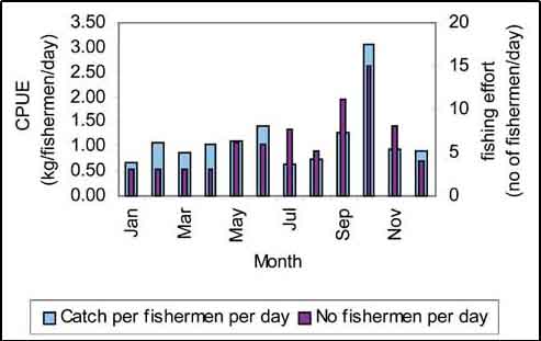
Table 17.4 and Table 17.5 show monthly Catch per Unit of Area (CPUA) for F3 and F2 landtypes, respectively. To calculate the total catch from these landtypes in the project area, you need to know the flooded areas of these landtypes in the project area. When you have these, the total monthly catch in the floodplains of the project area can be calculated by filling in Table 17.6.
TABLE 17.6
Frame for the estimation of the monthly
floodplain catch in the CPP project
|
Month |
CPUAF3 |
Area F3 flooded |
Total
CatchF3 |
CPUAF2 |
AreaF2 flooded |
Total catchF2 |
|
January |
14.99 |
|
|
18.77 |
|
|
|
February |
24.75 |
|
|
0 |
0 |
0 |
|
March |
21.46 |
|
|
0 |
0 |
0 |
|
April |
13.27 |
|
|
0 |
0 |
0 |
|
May |
23.62 |
|
|
0 |
0 |
0 |
|
June |
25.35 |
|
|
0 |
0 |
0 |
|
July |
9.14 |
|
|
7.89 |
|
|
|
August |
6.53 |
|
|
30.44 |
|
|
|
September |
23.73 |
|
|
44.32 |
|
|
|
October |
116.35 |
|
|
65.18 |
|
|
|
November |
35.34 |
|
|
34.77 |
|
|
|
December |
20.04 |
|
|
12.68 |
|
|
Determination of monthly inundated areas or monthly flood maps
Previously you made a flood map of Pais Pesca through interpolation of measured water levels, calculation of the water level by subtracting the generated grid from the available topographic level and finally you made the flood map by reclassifying the dry and flooded areas. This method was used to make floodmaps of the CPP area.
Next to fisheries data, water levels were measured weekly in a large number of sites throughout the project area. These waterlevels were used in a hydrological model to make a waterlevel map. A reliable topographic map or a Digital Elevation Model (DEM) was subtracted from this water level map to make monthly flood maps. Open the presentation (by double clicking the file in MS Explorer) ‘flood maps 92-99.pps’ in the ‘RW_03_Floodplain’ folder on the CD. Let it run and pay attention specifically to the change in water levels during the years (blue is water, yellow is land) to get an idea of the extend and the seasonality of flooding in the CPP project area.
Land in the CPP area was classified according to the MPO classifications (see Table 16.3 for the criteria) With the flood maps and the landtype map you can calculate the monthly flooded area per landtype by querying (Figure 17.30) the two with the criteria:
Give all areas with water in the flood map grid and which are F3 in the Landtype grid; and
Give all areas with water in the flood map grid and which are F2 in the Landtype grid.
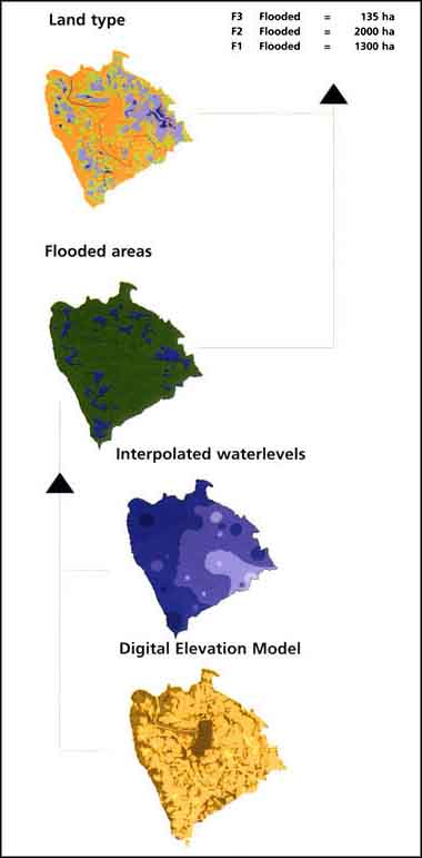
All steps for the analysis to arrive at the monthly flooded areas of the different habitats are summarized in Figure 17.31.
FIGURE 17.30
The principle of querying the floodmap
with the landtype map
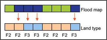
FIGURE 17.31
Pathway of determination of monthly
flooded area per habitat in the CPP project area
Estimation of floodplain fish catch in the CPP project area
The objective of this exercise is to estimate the annual catch in the floodplains of the CPP project area. For this you will calculate with GIS the missing data in Table 17.6 on page 114.
Making floodmaps
This exercise is similar to the exercise starting on page 70. You will have to make floodmaps of the CPP area showing dry and flooded land.
1. Start ArcView, New project, New View. Add from the folder rw_03_floodplain from CD2 the Feature Data Source Themes ‘Bangladesh.shp’, ‘CPP_outline.shp’, ‘Waterlevels.shp’, and the Grid Data Source Theme ‘Topography’ to the View. Make sure to load the legend of ‘Topography’.
2. Set the working directory to a directory of your choice (for instance D:\Bangladesh\temp\). Do not set the projection, but set the map units and distance units to meters.
3. Make a mask for the analysis from the ‘CPP_outline.shp’ Theme by converting it into a grid (menu bar: Theme/Convert to Grid...) (Output Grid Extent: Same As Display, Cell size: 10 metres).
4. Set the ‘CPP_outline’ grid Theme as a mask (menu bar: Analysis/Properties...)
Now you are ready to do a complete analysis, but for this exercise you will only do the month of January.
5. Interpolate the waterlevels for the month January (Surface/Interpolate Grid..., Output Grid Extent: Same as Display, Cell Size: 10 metres, Method: IDW, Z Value field: January). You can get the same legend as in Figure 17.32 by loading the legend: Theme/Edit Legend, press Load, locate the file ‘waterlevels.avl’ in the RW_03_floodplain directory.
FIGURE 17.32
Interpolated waterlevels for January in the CPP project
FIGURE 17.33
Calculating the waterdepth
6. Calculate the water depth using the map calculator, calculating Water depth = Surface from Waterlevel.shp - Topography (Figure 17.33).
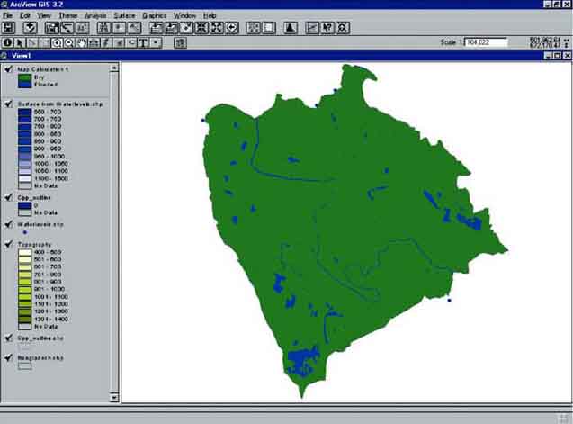
Make a flood map of the project area in January, showing dry and flooded land (negative values are dry land, positive values are flooded) by reclassifying the calculated grid, either via reclassifying the analysis (menu bar: Analysis/Reclassify...), or via the legend editor (Theme/Edit Legend...).
If you did everything correct you have made the grids as presented in Figure 17.34.
FIGURE 17.34
Calculated water depth for January in the
CPP project area
Monthly flooded area calculation
You need to calculate the monthly flooded areas of the different landtypes (F2 and F3) in the project area. This can be done by querying the flood maps with the land-type map.
7. Add the Theme ‘Landtype’ (from the folder ‘RW_03_floodplain’ on the CD) to the View. Load via the Legend editor (menu bar: Theme/Edit Legend...) the Legend ‘Landtype.avl’ from the RW_03_floodplain folder on the CD (Figure 17.35).
FIGURE 17.35
Landtypes in the CPP project
area
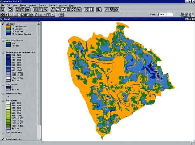
This landtype Theme you have to query with the monthly flood maps. You just made the flood map for the month January. the floodmaps for the other months are already made and are called ‘DWJAN’ for January, ‘DWFEB’ for February, ‘DWMAR’ for March, ‘DWAPR’ for April, etc.
8. Add the flood map for January (‘DWJAN’) to the View.
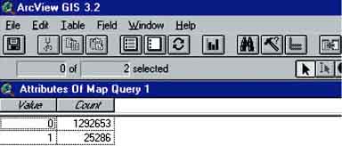
9. Query the ‘Landtype’ with the flood map of January (‘DWJAN’) for F3 Landtype (via Analysis/Map Query..., Figure 17.36). Open the Theme Table of ‘Map Query 1’ and you will see that there are 25 286 pixels fitting the criteria ‘F3 landtype’ and ‘flooded’(Figure 17.37).
FIGURE 17.36
Querying the Floodmap of January and the
Landtype Theme
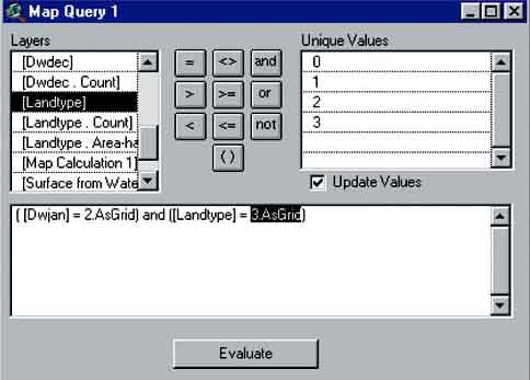
FIGURE 17.37
Number of pixels representing flooded F3
Land
How many hectares of F3 are flooded with a grid size of 10 metres?[34]
10. Save the query Theme as ‘F3jan’(menu bar: Theme/Save Data Set...).
11. Query the ‘Landtype’ with the ‘flood map of January’ for F2 Landtype. Open the Theme Table of this query and you will see that there are 17243 pixels fitting the criteria ‘F2 landtype’ and ‘flooded’. How many hectares F2 are flooded? Save the query as ‘F2jan’.
12. Add the flood map for February (‘DWFEB’) to the View. Query the ‘Landtype’ with the ‘flood map of February’ for F3 Landtype. Open the Theme Table of this query and you will see that there are 22958 pixels fitting the criteria ‘F3 landtype’ and ‘flooded’. How many hectares of F3 are flooded with a grid size of 10 metres? Save the query as ‘F3feb’.
13. Query the ‘Landtype’ with the ‘flood map of February’ for F2 Landtype. Open the Theme Table of this query and you will see that there are 12 115 pixels fitting the criteria ‘F2 landtype’ and ‘flooded’. How many hectares F2 are flooded? Save the query as ‘F2feb’.
14. Continue the exercise for all months and fill in Table 17.6.
Tabulate Areas
Querying this way can be done quicker with Tabulate Areas which is in principle a cross-table query:
1. Make sure you have all flood maps added to the View (DWJAN, DWFEB, DWMAR, etc.). Go via the menu bar to: Analysis/Tabulate Areas.... The Tabulate Areas window will pop-up (Figure 17.38).
2. Select as Row Theme ‘landtype’ and as Column Theme the floodmap of the month you want to analyse, starting with January (Dwjan). Click OK.
3. The calculated Table will pop-up (this table is saved automatically in the Tables part of the project). The areas are calculated in m2 as the property settings of the view were in meters, so dividing by 10 000 will give you the hectares.
FIGURE 17.38
The Tabulate Areas window
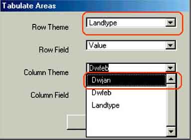
FIGURE 17.39
Calculated area in hectares
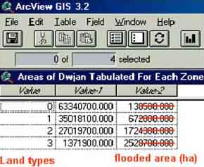
If you carried out the exercise properly you will find the areas as presented in Table 17.7. Using these data and the data in Table 17.6, the result will be an estimated catch of 111 metric tonnes/year for landtype F3 and 349 metric tonns/year for landtype F2.
TABLE 17.7
Estimated monthly flooded area for F3 and F2
landtypes in the CPP project area
|
Month |
F3 |
F2 |
|
January |
252 |
172 |
|
February |
229 |
121 |
|
March |
227 |
99 |
|
April |
236 |
123 |
|
May |
324 |
254 |
|
June |
360 |
658 |
|
July |
375 |
2 576 |
|
August |
378 |
2 793 |
|
September |
379 |
2 828 |
|
October |
370 |
1 410 |
|
November |
358 |
563 |
|
December |
302 |
259 |
The use of Radar images in floodplain fisheries in Bangladesh
Over the years developments in GIS and remote sensing have been tremendous. One of the most significant developments was radar satellite imaging able to penetrate the clouds. The major advantage is that during the flood season the extend of flooding can be assessed almost realtime from radar images. This is obviously less complicated than the method you have used during the previous exercise (interpolation of water levels over a project area with measured waterlevels at certain points, after which floodmaps need to be made).
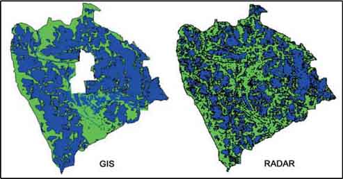
A comparison of a flood map calculated with water levels in GIS and a flood map using radar images is presented in Figure 17.40.
FIGURE 17.40
Comparison between calculated flooding
and Radar application
Querying radar images
1. Open ArcView, Open a New Project, a New View, check the working directory, and check that the map units and distance units in the View properties are set to meters. Add the Themes (Grid Data Source) ‘radarjune’, ‘radarjuly’, ‘radaraugust’, ‘radaroctober’, ‘radarseptembe’, and ‘landtype’ to the View (from the folder RW_03_Floodplain on your CD). If you want, you can load the legends ‘Radar.avl’ for the radar Themes, and ‘landtype.avl’ for the landtype Theme. The radar Themes show you the Radar images[35] for the months June, July, August, September, and October in the year 1998.
2. Query the radar Themes with the landtype Theme and calculate the flooded areas for F3 and F2 landtypes (as you have done in the previous exercise). You can do this either with Map Query (menu bar: Analysis/Map Query...) or with Tabulate areas (menu bar: Analysis/Tabulate Areas...).
3. Fill in Table 17.8 and compare the results between the calculated catches with radar images and with the generated floodmaps (GIS).
TABLE 17.8
Comparison of fisheries analysis using radar
or GIS data[36]
|
Month |
|
F3 |
|
F2 |
CPUA |
|
Total Catch Radar |
Total Catch GIS |
|
|
Radar |
Interpolated |
Radar |
Interpolated |
F3 |
F2 |
|
|
|
June |
|
172 |
1 404 |
1 042 |
22 |
19 |
|
24 |
|
July |
|
285 |
2 300 |
2 440 |
16 |
38 |
|
97 |
|
August |
|
306 |
2 428 |
2 541 |
13 |
44 |
|
116 |
|
September |
|
305 |
2 419 |
2 535 |
14 |
85 |
|
220 |
|
October |
|
172 |
1 280 |
1 182 |
220 |
99 |
|
155 |
|
Total catch |
|
|
|
|
|
|
632 |
612 |
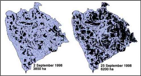
The differences between the two methods are small. The use of radar images could facilitate your work. However you have to realize one thing: Radar images give a flooded area on a given day of the month and not the average flooded area over the month as calculated by using GIS and water levels. The flooded area can be highly variable within one month, which means that the use of radar will only be accurate if more images are available per month. an illustration of different waterlevels in one month can be the radar images of the CPP area of 2 and 25 September 1998 (Figure 17.41).
FIGURE 17.41
Comparison of Radar images for two days
in September 1998
Introduction
For the development of a fisheries management strategy, fisheries scientists and policy makers want to know what the present status of fish stocks is, and what the impact of fishing on these will be. Over the last decades a number of tools, or fish stock assessment models, have been developed that can visualize the interactive processes between fishing and fish stocks. One of these is the Surplus Production model.
The traditional surplus production models are those of Schaefer (1954) and Fox (1970). Surplus production models determine the optimum level of effort that produces the maximum yield that can be sustained without affecting long term productivity of the stock, also called Maximum Sustainable Yield (MSY). Further, surplus production models regard catch per unit of effort (CPUE) in relation to the fishing effort as basic input and assumes that biomass is proportional to the catch per unit of effort (f).
The surplus production models can be applied when reasonable estimates are available of total catch (by species), the catch per unit of effort (CPUE), and the related fishing effort (f) over a number of years. A prerequisite is that the effort must have undergone substantial changes over the period covered. Detailed information on surplus production models can be found in Sparre and Venema (1992) of which the basics are summarized below.
The Schaefer model plots CPUE as a function of the fishing effort (f) on a linear model with the form:
Y= a+bX, or, CPUE = a + b* (fishing effort).
Calculated Yield, Maximum Sustainable Yield (MSY) and the fishing effort for MSY (Fmsy) can then be expressed as:
Calculated Yield = a*(fishing effort)+b*(fishing
effort)2
Fmsy = - 0.5*a/b
MSY = -
0.25*a2/b.
An example of a Schaefer curve, made for shrimp trawling in the Bay of Bengal (Table 17.9, [Mustafa and Khan, 1993]), is given in Figure 17.42.
TABLE 17.9
Shrimp trawling data from the Bay of
Bengal
|
Year |
Number of Trawels |
Shrimp catch |
CPUE |
|
1984 |
31 |
3 716 |
120 |
|
1985 |
31 |
4 178 |
135 |
|
1986 |
33 |
4 239 |
128 |
|
1987 |
33 |
3 338 |
101 |
|
1988 |
35 |
4 661 |
133 |
|
1989 |
37 |
2 621 |
71 |
|
1990 |
37 |
3 903 |
105 |
|
1991 |
40 |
3 116 |
78 |
|
1992 |
41 |
3 650 |
89 |
|
1993 |
41 |
3 237 |
79 |
FIGURE 17.42
Schaefer curve shrimp trawling in the Bay
of Bengal
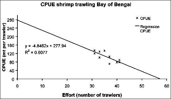
FIGURE 17.43
Yield curve shrimp trawling in the Bay of
Bengal
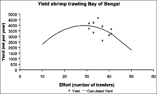
Analysis gives:
CPUE = -4.85 * (Fishing effort) + 278 ® a = 278, b = -4.85
Calculated Yield =
a*(fishing effort)+b*(fishing effort)2 ® 278 * f + (-4.85) * f2
Fmsy =
-0.5*a/b ® -0.5 * (278/(-4.85)) = 33
trawlers
MSY = -0.25*a2/b ®
-0.25 * (278*278)/(-4.85) = 3960 metric tonnes/year.
The Munro and Thompson adaptation of Surplus Production models Surplus production models are usually applied to long time series of CPUE and Effort. Munro and Thompson (1983a and 1983b), however, applied the surplus production models to a set of data from the Jamaican coral reef fisheries, all collected in the same year but representing different fishing grounds fished at different levels of effort. The basic assumptions for this adaptation of the Surplus production models are:
The studied species are not very mobile, so each area has its own stock not mixing with the neighbouring stocks.
The ecological regimes of different fishing grounds do not differ substantially, so the only differing impact on the stocks is the difference in fishing effort among the fishing grounds.
The fishery studied by Munro and Thompson (1983b) is a local trap fishery operated from canoes. Coral reef fish are not considered to be very mobile and it was assumed that each area has its own stocks which are independent of the neighbouring stocks (little mixing). The data used by Munro and Thompson and the resulting Schaefer curves are presented in Table 17.10 (Munro and Thompson, 1983a), Figure 17.44, and Figure 17.45.
TABLE 17.10
Jamaican reef fisheries data
|
Fishing ground |
Effort |
CPUE |
Exploitation |
|
A |
1.63 |
2 367 |
Under exploited |
|
B |
0.38 |
3 279 |
Under exploited |
|
C |
3.09 |
1 407 |
Under exploited |
|
D |
5.63 |
556 |
Over exploited |
|
E |
4.43 |
974 |
Over exploited |
|
F |
5.51 |
1 306 |
Over exploited |
|
G |
4.58 |
564 |
Over exploited |
|
H |
4.20 |
767 |
Over exploited |
|
I |
1.49 |
1 875 |
Under exploited |
FIGURE 17.44
Schaefer curve reef fisheries
Jamaica
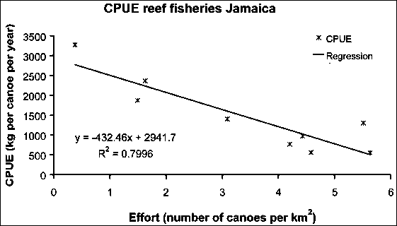
FIGURE 17.45
Yield of reef fisheries
Jamaica
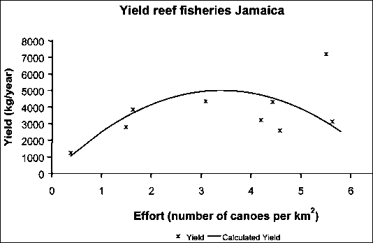
From the data and the Schaefer plot the following data can be deducted:
CPUE = 2 941.7 + [(-432.46) * (fishing effort)] ® a = 2 941.7, b = -432.46
Calculated Yield =
a*(fishing effort)+b*(fishing effort)2 ® 2941.7 * f + (-432.46) * f2
Fmsy
= -0.5*a/b ® -0.5 * (2 941.7/(-432.46)) = 3.4 canoes per
km2
MSY = -0.25*a2/b ® -0.25 * [(2
941.7*2641.7)/(-432.46)] = 5 002.5 kg per year.
The Munro and Thompson adaptation of the Surplus Production models are not commonly known and used. However, it is clear that with the present development of GIS, they offer an opportunity to get some insight of the status of stocks within a relatively short time span (keeping in mind that the basic assumptions mentioned earlier should apply).
Therefore, two examples of this application will follow, one with Pais Pesca data and one using Mediterrenean fisheries data.
Apart from fisheries on carps and clupeids there is a small but highly valuable fishery on the Pescan lobster Cherax grafiensis in Lake Kadim. This fishery has the following characteristics:
Cherax grafiensis is rather immobile. Tagging experiments have revealed that the lobsters remain in an area of about 3 km2 during their whole life.
Cherax grafiensis lives in water up to six metres deep, and its distribution is not related to other ecological factors such as phytoplankton, secchi disk, etc.
The lobsters are caught by stationary traps placed on the bottom of the lake.
During the survey of the Department of Fisheries in 1999 (see page 70), the number of lobster traps were counted (Number of traps per ha) at the sampling areas and the owners of the traps were interviewed to get information on their annual catch (kg/year).
The spatial characteristics of the fishery allow analysing the data in GIS with an adapted Schaefer curve. For this the data were distributed over nine fishing zones, which are determined by the boundaries of the fishing areas of fishers from the villages located at the shore line of each zone.
There are two ways to carry out the analysis:
Calculate the average values of fishing effort and CPUE per fishing zone with the data of the sample stations[37]. Construct a Schaefer curve and use the calculated values of a and b to calculate the Fmsy (= -0.5*a/b). Interpolate a grid of the number of traps per ha (within the boundaries of the fishing zones) and find the over-exploited areas with the query: [Number of traps per ha] > [Fmsy].
The second way is to generate the grids for CPUE and Number of traps per ha. Then carry out a grid regression between the two and use the obtained values of a and b to calculate Fmsy. The last step is to query the effort grid to find the over- and under-exploited areas (under-exploited: [Number of traps per ha] < [Fmsy]).
This second method is demonstrated below:
1. Start ArcView, Open a New Project, New View. Add the following Themes from the ‘18_Lake_Kadim_Lobster’ folder: ‘Lobster data.shp’(containing all lobster data from the different sampling sites in Lake Kadim), ‘depth.shp’, ‘fishing zones.shp’, ‘fishing villages.shp’, ‘Lake Kadim boundary.shp’, and ‘Pais pesca country.shp’.
2. Check the working directory, the projection (Equal area cylindrical), and properties settings.
3. Make the ‘Fishing zones.shp’ Theme active, and use the ‘Zoom to active Theme(s)’button in the buttonbar to zoom to this Theme.
4. As you are going to work within the fishing zones only, you will first need to make a grid of the ‘Fishing zones.shp’ Theme[38] (output grid size 100 metres, so each pixel equals 1 hectare). Save this grid as ‘Zones’.
5. Set the grid ‘Zones’ as mask. (Analysis/Properties...).
6. Make the Theme ‘Lobster data.shp’ active, and make a surface grid[39] of the ‘CPUE’ with ‘IDW’ and a 100 metres grid cell size, with the Output Grid Extent: Same As Display. Rename the new grid (Theme/Properties...) and save and rename the Theme as ‘CPUE’ (Theme/Save Data Set...).
7. Make another grid for fishing effort (‘Number of traps per ha’, you will see only ‘Number_of_’ in the drop-down field) and save and rename the grid as ‘Effort’.
8. Activate the Grid Regression extension (File/Extensions...).
9. Click on the regression button and make a regression with CPUE as dependent and effort as independent. (see the chapter: Regression analysis of Lake Kadim data using an avenue script, page 84). The results should be like Figure 17.46 and Figure 17.47.
FIGURE 17.46
Regression result outcome
FIGURE 17.47
Scatterplot regression
10. Use the obtained values of a and b to calculate Fmsy, and MSY[40].
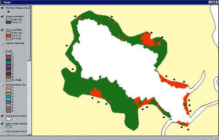
11. Find over- and under-exploited areas, using the Map Query function (Analysis/Map Query...) (over-exploited: effort > Fmsy, under-exploited: effort < Fmsy. (Figure 17.48)).
This example has given clear results. However, in the real world, cases with such nice results are not easy to find. Regressions between grids often provides a cloud of points, and zonation is often not that easy and clear-cut. But even in those cases there are some new developments which can be applied on Surplus production models in GIS. Therefore a more complex example of fisheries in the Mediterranean Sea is provided.
FIGURE 17.48
Exploitation status of lake Kadim, areas
in green underexploited, areas in red over-exploited.
Note: Calculating averages in a Theme table
ArcView has a very neat function to calculate averages within a Theme table. This is best explained through an example:
1. Start ArcView, Open a New Project, New View. Add the following Theme from the ‘18_Lake_Kadim_Lobster’ folder: ‘Lobster data.shp’ (containing all lobster data from the different sampling sites in Lake Kadim). You will see the fieldheaders: ‘Shape’, ‘Id’, ‘Zone_code’, ‘Cpue’, ‘Attractor’, and ‘Number_of_’. Check the working directory.
2. Press the header of the field ‘Zone_code’, so that it appears pressed. Go to the summarize function (menu bar: Field/Summarize..., or the summarize button in the button bar next to the calculator). The Summary Table Definition window will pop up.
3. Select the field in the dropdown list next to ‘Field:’ of which you want to know the average per ‘Zone_code’. Select ‘Cpue’. Then you need to select the function in the dropdown list next to ‘Summarized by:’ by which the field needs to be summarized, in this case ‘Average’. then press Add, and you will see the term ‘Ave_Cpue’ appear. Press OK.
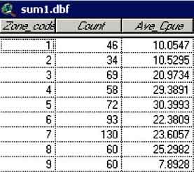
The screen of sum1.dbf appears with the average values of CPUE per zone (Figure 17.49).
FIGURE 17.49
Summary of ‘Lobster data.shp’
per fishing zone
The European Hake (Merluccius merluccius) is a highly valuable demersal fish in the Mediterranean Sea. It lives close to the bottom, usually between 70 and 370 metres at daytime but moves off bottom at night.
FIGURE 17.50
The European hake (Merluccius
merluccius)

European hake has been an important food for the western Europe population throughout history. It is primarily caught by bottom and pelagic trawls, but also with longlines, bottom-set gillnets and Danish seines. The total reported catch for this species was 71627 metric tonnes for the year 2000. The countries with the largest catches in this period were Spain (24853 metric tonnes) and Italy (9291 metric tonnes) (FAO, 2000). During the mid-1990s several experimental surveys were carried out near the Tyrrenian coast of Italy. With this data Corsi, Agnesi and Ardizzone (2001) developed another approach to surplus production models in GIS.
A Munro and Thompson plot for Hake data in the Mediteranean
Corsi (2000a) carried out an analysis in GIS on catch and effort data obtained over the period 1994-1996. The following data were used:
Port (being the main landing sites of the different fishing zones) statistics. The data encompass fishing effort expressed in gross tonnage of the trawling fleet per km2, and CPUE expressed in kg per hour of trawling.
Data of three experimental trawl surveys carried out at 130 georeferenced randomly selected sampling stations. The mean yields per hour were interpolated by means of Universal Kriging over the entire study area to derive a CPUE surface over the entire area.
A grid representing the fishing effort over the entire study area, made with deductive modeling which allocates the port’s nominal fishing effort throughout the port’s fishing ground, based on a combined function of depth and distance from the port (Corsi, 2000b).
Major fishing zones in the area.
Data of a bathymetric survey, providing the bottom depth over the study area
With the available data, i.e. spatial distribution of Fishing effort and CPUE, the Munro and Thompson approach could be used to estimate Fmsy, and to locate over-exploited areas.
1. Start ArcView, Open a New Project, New View. Add the following Themes from the ‘19_Hake_analysis’ folder: ‘Fishing zones.shp’, ‘Ports.shp’, ‘Coastline.shp’ and ‘Hake data.shp’.
2. Check the working directory, the projection and activate the Grid Regression extension[41]. While checking the projection you will get an information screen telling you: ‘It appears that your data is not in decimal degrees. Do you want to attempt to project anyway?’. Click No. This message will appear whenever your data is not in decimal degrees. For this exercise you do not need to project the data. For more information on projections, please see the chapter: Projection, on page 40.
3. The Theme ‘Hake data.shp’ contains data on the spatial distribution of fishing effort and CPUE. Make two grids from this Theme, one for effort (Theme/Convert to Grid..., Gridname: ‘Effort_Hake’, Output Gird Extent: Same As Display, Output Grid Cell Size: 1 000 Map Units, field for cell values: ‘Effort’), and the second on CPUE (same parameters, except for the name: ‘CPUE_Hake’ and the field for cell values: ‘CPUE’).
FIGURE 17.51
Regression results
FIGURE 17.52
Scatterplot regression of ‘CPUE_Hake’ vs ‘Effort_Hake’
4. Click on the regression button and make a regression with ‘CPUE_Hake’ as dependent and ‘Effort_Hake’ as independent.
From the regression analysis (Figure 17.51 and Figure 17.52) you see that the results are not valid for our purpose; the regression has a positive slope (b = 1.62).
5. Add from the ‘19_Hake_analysis’ folder the Theme ‘Depth.shp’, and make it visible (Figure 17.53). You can see that the fishing zones have a large variation in depth. Hake is a bottom dweller, which means that, for this species, the Fishing Zones are not homogenous ecologically, and thus one of the basic assumptions of the Munro and Tompson model is violated.
FIGURE 17.53
Depths at the Tyrrenean coast
6. Save your project as ‘Hake.apr’ or another name of your choice.
Developments continue and Corsi (2000a) developed a model to overcome the problem of different ecological fishing zones or varying stock densities. The model is still in its theoretical stage and its merits have to be further studied. However, its simplicity makes it of interest to include it in this manual.
A Corsi type analysis of Hake data in the Mediterranean
The basic assumption behind the analysis developed by Corsi is that the slope (b) of a Schaefer curve remains constant with different ecological zones while the intercept (a) changes with these zones.
This can be explained with the data in the spreadsheet ‘Corsi model.xls’. Open this spreadsheet ‘Corsi model.xls’ (using Microsoft Excel) from the folder ‘20_Corsi_model’ and open the worksheet ‘Schaefer curves’.
In the worksheet, you see the average fishing effort and CPUE per different fishing zones, as obtained from port statistics. Make the Schaefer curve (effort vs CPUE) for the data. Do a lineair regression on the data, of which the result should be Y = 6.16 - 5.34*X (a = 6.16 and b = 5.34), or CPUE = 5.34 * effort + 6.16.
Open the worksheet ‘hake data’. In this worksheet you see a graph (Figure 16.54) with a cloud of dots, which are the data points of ‘Effort vs CPUE’ from the Effort and CPUE grid, and three straight lines, three Schaefer curves with the estimated value of the slope; b = 5.34 and three different values of a.
FIGURE 17.54
The worksheet of hake data
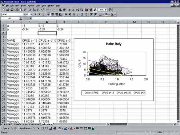
For each Schaefer curve Fmsy and its related CPUE at Fmsy (CPUEmsy) can be calculated. This basic function for the Corsi model is described by CPUEmsy = -b * Fishing effort. This function is called the attractor.
Open another spreadsheet: ‘The attractor function.xls’. Yields and CPUE are calculated for three Schaefer curves with the same slope (b) in this spreadsheet. For each curve you see (Figure 17.55) that the relation between Fmsy and CPUEmsy is lying on the straight blue line; CPUEmsy = 5.34 * Fishing effort.
FIGURE 17.55
The attractor function
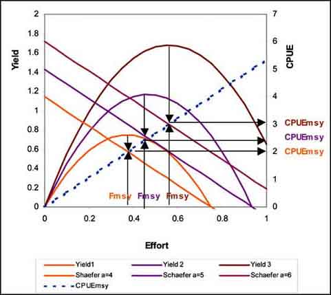
If assumed that the cloud of data points for effort vs CPUE for the Hake data is made up of an infinite number of parallel running Schaefer curves for an infinite number of fishing zones then the attractor function can be used to divide the cloud in points below the attractor line, with a CPUE below CPUEmsy (or over-exploited points) and above the attractor lines with a CPUE above CPUEmsy (or under- exploited points) (Figure 17.56).
FIGURE 17.56
Schaefer curve hake fisheries Thyrrenean
coast

Try to apply the model in ArcView:
1. Open ArcView, open the previously saved project ‘Hake.apr’. Add the Theme ‘Attractor.shp’ from the ‘20_Corsi_model’ folder to the View. Open the Theme Table.
2. Start editing the table. Add the numeric Field ‘Attractor’ with 4 decimal places.
3. Calculate the field (Field/Calculate...) by entering ‘[effort] * 5.34’. Stop editing of the table and save the edits.
FIGURE 17.57
The query for under-exploited areas in the Thyrrenaen Sea
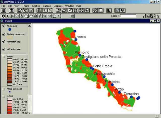
4. Open the Theme properties and make the query ‘[CPUE] > [Attractor]’, which gives you the under-exploited data points. Change the color of the data points in green.
5. Copy and paste the Theme into the same view, make only the newly pasted Theme active, open the Theme properties again and make the query ‘[CPUE] < [Attractor]’, which gives the over-exploited data points. Change the color of this Theme in red. Now you have the distribution of over- and under-exploited areas in the Thyrrenean Sea according to the Corsi model (Figure 17.58).
FIGURE 17.58
Over- and under-exploited areas in the
Thyrrenean Sea according to the Corsi model
Note on the use of this model in general
For the application of surplus production models in GIS of course the same cautious approach as used in traditional applications of surplus production models should be adhered to, as they tend to give falsely optimistic answers. Please refer the handbooks on this subject; Gulland (1985), Pitcher and Hart (1982), Quin and Deriso (1999), Hilborn and Walters (1992).
|
[28] This method classifies
polygon features by finding breakpoints so that the total area of the polygons
in each class is approximately the same. [29] The following abbreviations are used as field names in the different Themes:
30] The original exercise was made by
Paul Eastwood, Fisheries GIS Unit, Department of Geography, Canterbury
Christ Church University College, UK, with data provided by Arturo Ruiz,
but is slightly adapted for this manual. |