2. Steps to analysis of information
| First step 1 |
Review the questions.
The questions generated before the information was gathered should be reviewed. Why was this particular information necessary? What questions was it to answer? What kinds of decisions are to be made based on this information?
Review the questions
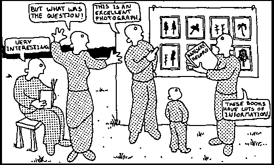
It is common for people to work very hard planning for the information they need and then, once the information is collected to not look back and renew their understanding of the central issues and key questions.
Important results that were not anticipated should not, however, be ignored. Sometimes putting information together will raise important, unforeseen and relevant questions. These can be noted for future reference and pointed out in the presentation of results.
| Second step 2 |
Organize the information.
The mechanics of organizing information for analysis will vary according to the thinking processes of different people. Sometimes it is best not to force a certain way of thinking. On the other hand, there is a certain logic that can be followed.
• Gather together all relevant information that has been collected.
• If necessary, sort information into parts which belong together.
• Some may have already been analyzed. Some may be partly analyzed, and some may need analysis.
| Third step 3 |
Decide how to analyze information.
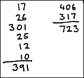
Analysis of parts may be simply adding up numbers and averaging them or comparing information to examine the relationship of one thing to another, or two things together.
Decide how to analyze information
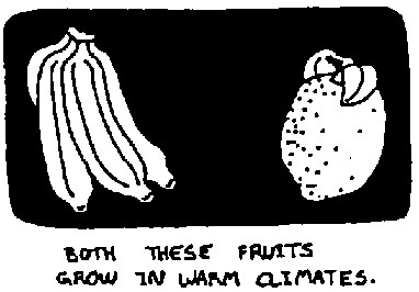
Analysis can also take note of similarities
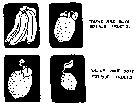
It can contrast information by setting two things in opposition so as to show the differences

It can relate pieces of information to establish relationships between them
| Fourth step 4 |
Analyze quantitative information.
It is likely that quantitative (numbers) information will be computer by hand, or with the use of adding machines. Two straightforward ways to analyze information are Tally Sheets and Summary Sheets.
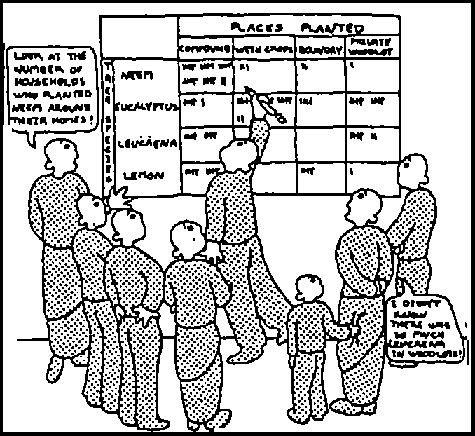
Tally sheets
Tally sheets are useful for summarizing information such as production figures, survival, figures, and nursery sales. It is especially important to think carefully about the pieces of information that, when paired, will answer the questions that were originally asked.
The tally sheet is an especially good way to analyze information when literacy is not high. Sketches and/or symbols can be used to show the columns. When the tally sheet is prepared at a meeting, or in a group, patterns emerge in a way which everyone can see.
Analyze quantitative information
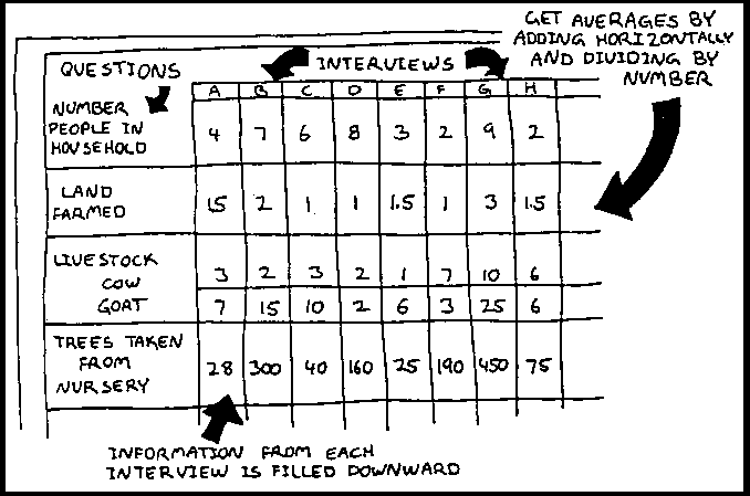
Summary sheets
To show information individually in order to see clearly the differences between each piece of information, a Summary Sheet can be used. They are especially useful for analyzing information from interviews.
Summary sheets
| Fifth step 5 |
Analyze qualitative information.
Analysis of qualitative (descriptive) information is a creative and critical process. The way the information has been gathered will probably determine how it can best be analyzed.
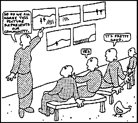
For example, if drawings of a community have been done at the beginning, middle and end of the project, can be analyzed by presenting a series of drawings to a number of individuals and asking them to:
• validate the drawings (are they truly representative, and if not, why not).
• rate the difference (very good, good, not very good).
Analyze qualitative information
| Sixth step 6 |
Integrate the information.
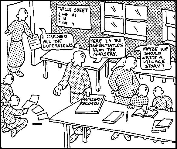
Putting the analyzed parts together in a way that tells the complete story can be done by the team that has been assigned to gather and analyze information. Partial analysis can be presented to the larger community group for completion.
Integrate the information
Chapter seven: Presentation of results
1. The importance of presenting results.
2. Who will receive the results?
3. When and where are the results needed?
4. How will results be presented?
5. Some guidelines for presentation of results.
6. Written presentation of results.
7. Visual presentation of results.
8. Oral presentation of results.
1. The importance of presenting results.
PAME's focus on the community assures that the community and field staff benefit by identifying, gathering and analyzing information. But, the job is not done until the results are delivered to the intended audience, and decisions made.
Too often, valid, reliable, vitally important results are not used. This is not only a waste of resources (information planning, gathering, and analysis) it also means that important decisions are made without adequate information.
It is important that decision makers get the relevant information, and that the information is received on time. It is also important that the results are presented in a way that is understandable to the people for whom they are meant.
The importance of presenting results
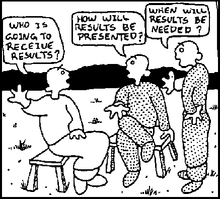
2. Who will receive the results?
There are many potential information users. The community must decide who will receive information.
(A) Project beneficiaries
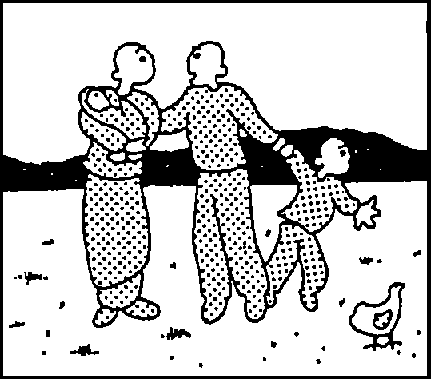
Individuals or groups in the community who have participated directly in the project
(B) Community
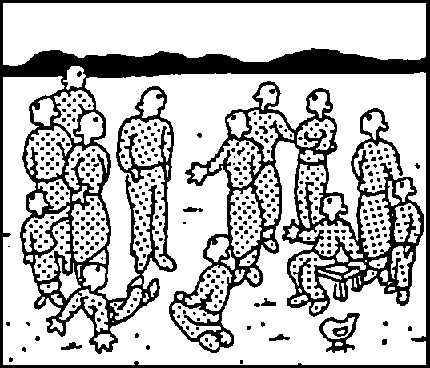
Community members who have not directly participated, who may not directly benefit from activities, but who may be very interested in knowing how things are going.
(C) Other communities
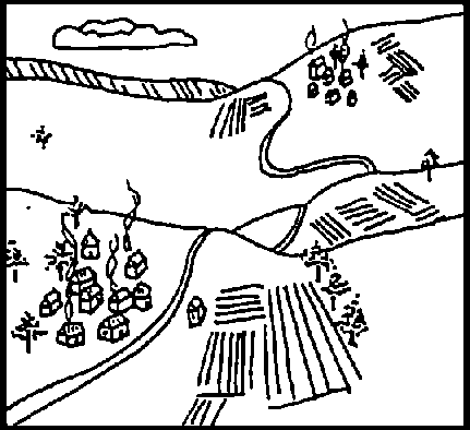
Communities nearby, within the country or even outside the country can benefit from the lessons and experiences of others.
(D) Forestry staff
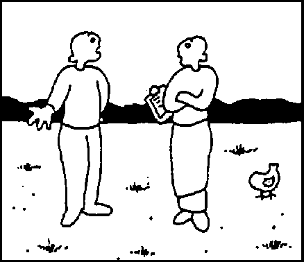
Field staff, project administrators, country directors and staff from other sectors will be interested in the experience of the community.
(E) National forestry services
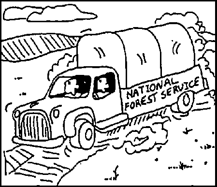
National forest services are interested in community forestry development in their country. They will be interested in knowing collectively, or even individually, how forestry activities are doing.
(F) Donors
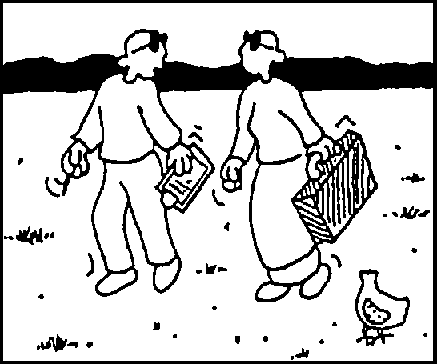
Government agencies, non-government organizations (NGOs), individual funders and other development agencies working in similar or related activities will be interested in the results.
(G) General public
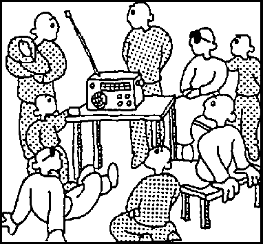
People within or outside the country may be interested in the community's experiences.
(H) Research organizations
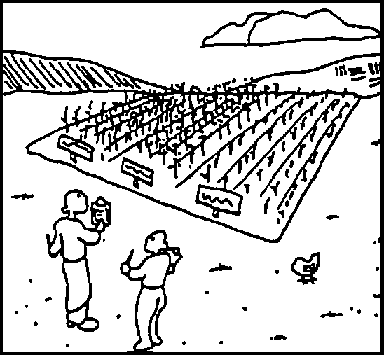
Researchers within or outside the country will be interested in results that help to focus their attention on relevant research.
The presentation of results can vary according the "users". In some cases it may not be up to the community to prepare results in any form other than what is useful to them. If results are required by others, it must be with the consent of the community. If a great deal of time is required to prepare results for others, the community may have to be compensated in some way. Whenever results leave the community, this should be done with respect for the "owners" of the information, and their input should be acknowledged.
If outsiders request information, they should be prepared to provide resources for the presentation and translate the information into a form that is understandable to them. For example, the insiders might present results in the form of a popular drama If others outside the community also require the results: the drama could be taken to nearby communities with outsiders supplying the transportation; the drama could be videotaped for other countries, with outsiders supplying the necessary resources; the drama could be photographed and tape-recorded to produce a slide/tape show, or video.
3. When and where are the results needed?
There may be time constraints that limit the ways that results can be presented. If results are needed fairly quickly for a decision making the presentation may not be so elaborate.
4. How will results be presented?
The way the results are presented will depend on: the kinds of information that have been collected, (quantitative or qualitative); the information gathering tools that were used; whether it is results from Participatory Assessment, Baseline, Monitoring or Evaluation; and the resources that are available.
Quantitative/qualitative results.
Quantitative results (numbers) are more easily presented in visual form, such as tables or graphs, while qualitative results (descriptions) can make use of presentations such as stories, case studies or dramas. Both types of information can be integrated for presentation to complement and support each other. Think of a televised news story. Quantitative information (numbers) are often reported alongside quotes or interviews to effectively communicate a message.
Information gathering tools used
The way to communicate results may be closely linked with the information gathering tools that have been used. For example, if a Community Case Study (Tool 7) was done on the management of a nearby natural forest, the case study could be presented in written form, read aloud, or acted out for the community and video-taped and edited for distribution to a wider audience.
If possible, the results should relate to the information gathering tool which has been used. People are then familiar with it. For example, if Ranking, Rating and Sorting (Tool 10) was used with picture cards, use these same picture cards when presenting the results.
Methods used
The methods that are used will have a bearing on how the results will be presented. In some instances, the information may just be roughly analyzed to give immediate information, and then stored for future use. In other cases, it may be more fully analyzed and integrated.
| Results of Participatory Assessment: | are mainly for immediate use, but should be documented and stored for future use. |
| Results of Participatory Baseline: | may not have to be presented in a final form until incorporated with evaluation results. |
| Results of Participatory Monitoring: | may be presented monthly, seasonally and/or annually to the community. These may also be incorporated with evaluation results. |
| Results of Participatory Evaluation: | evaluations are generally presented in complete "story" form, where the "parts" have been incorporated into the "whole", and include both qualitative and quantitative information. |
Methods used
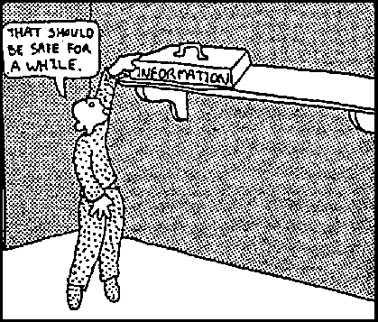
| When results are going to be used later, always store them in a safe place, avoiding damage by sun, water, pests, dampness. Make two copies and store separately. Use good quality materials. |
Resources available
The skills of the people, the time available to spend on preparing a presentation, and access to resources such as cameras, tape recorders and paper will all have a bearing on how the results can be presented.
5. Some guidelines for presentation of results.
Results should be interesting
Use a form of communication that catches the attention of the audience.
Results should be understandable
Communicate in the language of the intended audience. This is not just a question of Spanish, Swahili, French or Hindi, but also a question of "jargon ". Whenever possible use common names which everyone understands.
Results should be convincing
The results should not be the opinions of only a few. It is important to present facts and information verified by community members who were not involved in the process of collection or analysis. Have as true a picture as possible.
Results should be timely
In order to reach those who make decisions, results should be presented in time to provide them with information before final decisions are made.
Results should be timely

Results should be participatory
The community should decide what and how to communicate to other interested parties. It is their story and it will be all the more powerful if they tell it in their own way. There should, of course, also be room for the story of the project staff
Results should be presented in a form appropriate to the audience
| There are three main ways to present results: | ||
| Written | Oral | Visual |
| Reports | Drama | Photographs |
| Case Studies | Tape Recordings | Drawings |
| Community Newsletters | Video | Video |
| Slidetape | Slidetape | |
| Story-telling | Cartoons | |
| Graphics | Graphics | Graphics |
6. Written presentation of results.
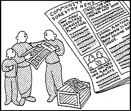
If a written report, case study or community newsletter is chosen to present results, there are some things to consider. A Community Case Study can be used in the school programme, or in adult literacy classes. It may be one of the few locally relevant reading pieces. When presenting written results:
(a) Once you have identified your theme, stick to it.
(b) Identify the audience, then use imaginative language, introduce stories related to local practice, things that will hold the readers interest.
(c) Identify the communication barriers that might exist between the writer and the reader and be sensitive to them (language, jargon, sensitive issues).
(d) Include dialogue, quotes from people, illustrations. When people are described, they should be not merely numbers, but mobile characters who are active decision makers, people who question, adopt or share innovations. Pictoral reports of activities or photographs will also add interest to written results.
(e) Be brief and easily readable. Use short sentences and clear writing.
Written presentation of results
7. Visual presentation of results.
Visuals can present some results clearly and concisely. They can be used for written reports, newspapers, slides, handouts at meetings, posters, and wall-charts.
Visuals help show information quickly, make written reports more interesting, enhance important points in a report and present the total picture in a small space.
A number of visual presentations of results are possible: tables, graphs; histograms; horizontal and vertical bar charts; pie charts; map charts; pictograms; and cartoons. The choice will depend on the information that is to be presented and the intended audience.
Choose the best method for the purpose. For example, graphs will show trends better than a table, while bar charts are effective, when comparing differences between similar information.
Tables
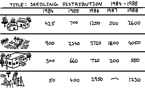
Organizing and listing information in a way which shows the relationships between the information is called a table. Words and numbers are possible in tables. Plans, activities, and statements of progress can be presented in a table. Numbers such as survival rates of seedlings by species are also easily presented in a table. Tables which present only a few items of information are most effective. Too much information may confuse the reader.
TITLE: SEEDLING DISTRIBUTION, 1984-1988
| 1984 | 1985 | 1986 | 1987 | 1988 | |
| HOUSEHOLDS | 425 | 700 | 1250 | 500 | 2600 |
| FARMS | 900 | 2340 | 3720 | 1800 | 4050 |
| SCHOOLS | 300 | 660 | 720 | 200 | 550 |
| COMMUNITY | 50 | 400 | 2950 | - | 1230 |
Tables can easily be interpreted by people with low literacy if symbols and/or pictures are used. This helps people to see, understand and remember the information.
Seedling distribution, 1984-1988
| When presenting a table: 1. Give the table a full title. |
Graphs
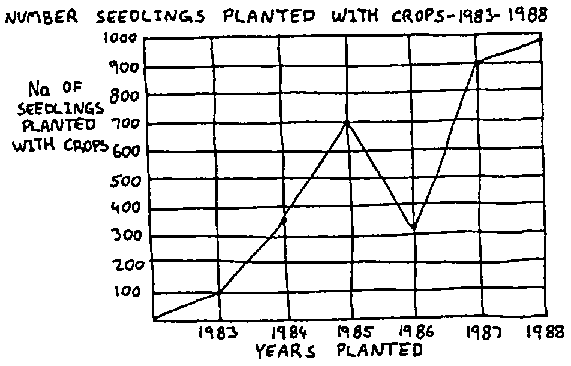
Graphs organize items of information visually and draw lines or bars to show relationships and comparisons. They can represent results clearly and effectively in a small space. Graphs can show whether changes have occurred and when, so that trends can he clearly seen.
Number seedlings planted with crops, 1983-1988
Graphs are also used to show different results or sets of information at the same time.
Number seedling planted
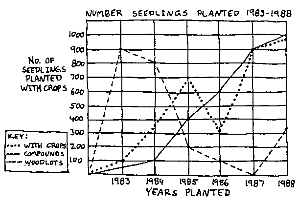
| When presenting a graph: 1. Label the graph so that it reads consistently. |
Histograms
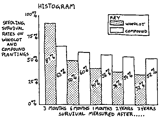
Limited and precise numerical information can be effectively presented with a histogram. The horizontal scale shows the particular characteristic being presented, and the vertical scale shows the frequency with which the characteristic occurs.
Histogram
Charts
Results that can be presented in tables or graphs can also be presented in charts. Charts are visual presentations that compare different items of information at the same time. They are often easier to read than tables or graphs. There are a number of different charts: vertical and horizontal, charts, bar charts, pie charts and map charts.
Bar Charts
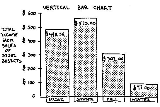
Vertical and horizontal bar charts are useful to compare different items of information at the same time. The length of each bar indicates the quantity that the bar represents. Unlike histograms, bar charts have spaces between the bars.
Vertical bar charts
Horizontal bar charts
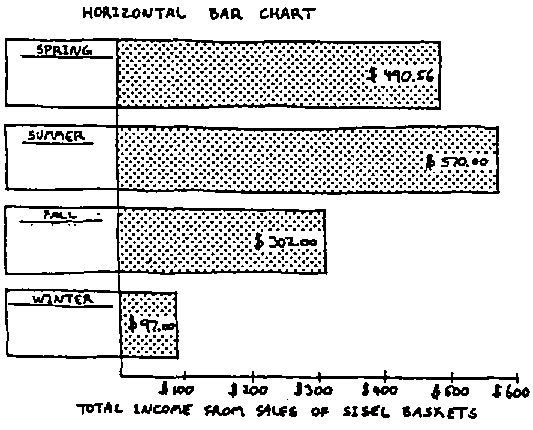
| When presenting bar charts: 1. Arrange the bars in either ascending or descending order to make
the chart clear. |
Pie charts
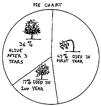
To present information for comparison, pie charts are useful as they show the parts in relation to the whole. A familiar round object such as an orange or fruit which is easily separated into parts or segments can be used.
Pie chart
Map charts
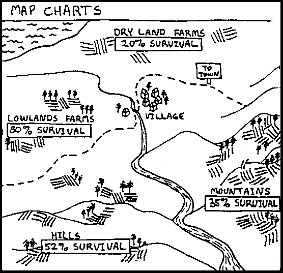
To help people to understand fairly complex relationships map charts are useful. By using different patterns or colors, it is possible to visually compare information.
Map charts
Pictograms
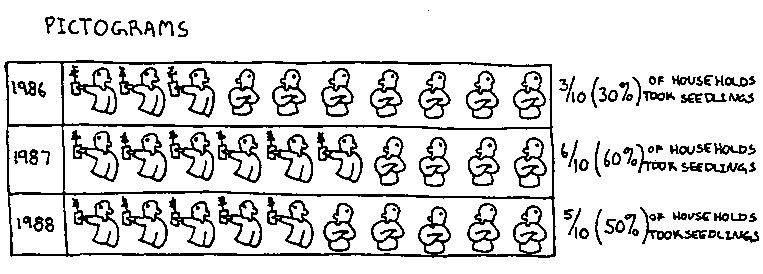
A pictogram is a type of bar chart that uses pictures or symbols to represent the information. Each symbol may represents an item or a particular unit of information.
Pictograms
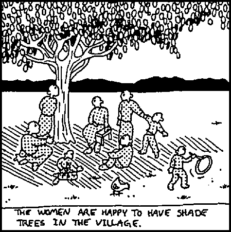
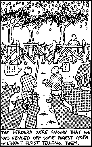
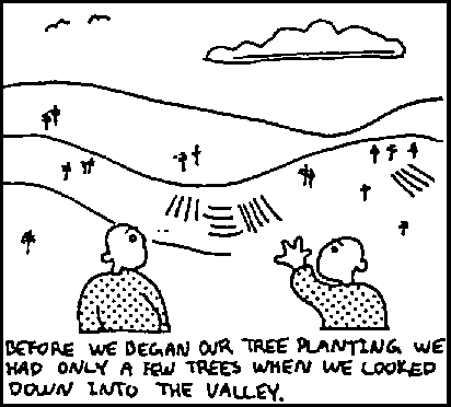
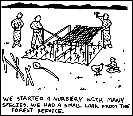
Cartoons
It can be very effective to present information using cartoons, especially when the information is descriptive. The audience should be familiar with cartooning. It generally requires some skill to produce a good cartoon, but it is well worth it as people often remember something that is interesting and amusing. Humor can also take the edge off sensitive issues.
The women are happy to have shade trees in the village
The herders were angry that we had fenced of some forest area without first telling them
Photographs
Good photographs which pertain to the subject can enhance any presentation. If photographs were one of the information collection methods, they can be sorted and labeled to support the message and they can be displayed for a larger audience.
Photographs 1
Photographs 2
Photographs 3
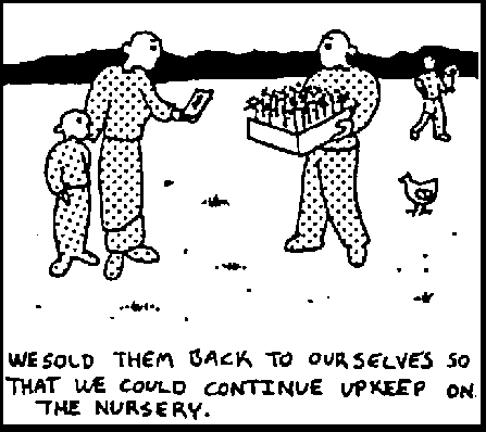
Photographs 4
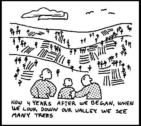
Photographs can be put in protective albums and provide a visual documentation for the community. The albums can also be shown to other communities during farmer to farmer visits.
8. Oral presentation of results.
Drama, puppet theatre, story-telling, songs, and meetings can all be used to present information in an interesting and understandable way. In a community with low literacy and/or a story-telling culture, oral presentation with some visuals may be the most appropriate method of presentation.
Oral presentations can be enhanced by combining them with visuals. For example, a puppet theatre with the characters explaining the information by using a bar graph!
Written presentation (such as a case study) can be restructured and presented in the form of a drama or puppet show.
Oral presentation of results
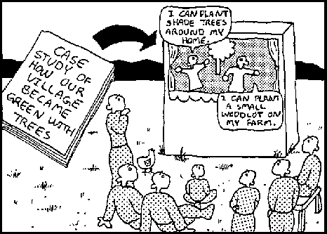
Oral presentations can be tape-recorded and photographed. In this way results can be presented to other communities (used as extension), or other interested groups. Video presentations combine both oral and visual and are an effective way to present results.
| Results should be presented in a way that the audience
finds: • useful (timely and relevant), |